Devices
Create prototypes in ProtoPie Studio for a variety of devices and device frames. Choose from the most popular devices for iOS, iPadOS, Android, and desktop. Or set up a custom size for all other screen types.
The resolutions in the following list refer to portrait mode.
Mobile & Tablet
By default, prototypes for iOS, iPadOS, and Android display their respective device frames when previewed on the cloud. Learn more about ProtoPie Cloud.
iOS & iPadOS
Here is a list of the iOS & iPadOS devices that ProtoPie supports:
iPhone 14 Pro Max — 430 x 932 px
iPhone 14 Pro — 393 x 852 px
iPhone 14 Plus — 428 x 926 px
iPhone 14 — 390 x 844 px
iPhone 13 Pro Max — 428 x 926 px
iPhone 13/13 Pro — 390 x 844 px
iPhone 13 Mini — 375 x 812 px
iPhone 12 Pro Max — 428 x 926 px
iPhone 12/12 Pro — 390 x 844 px
iPhone 12 Mini — 375 x 812 px
iPhone 11 Pro Max — 414 x 896 px
iPhone 11 Pro/X — 375 x 812 px
iPhone 11 — 414 x 896 px
iPhone 8 — 375 x 667 px
iPhone 8 Plus — 414 x 736 px
iPhone SE — 320 x 568 px
iPhone 7 — 375 x 667 px
iPhone 7 Plus — 414 x 736 px
iPad Pro — 1024 x 1366 px
iPad — 768 x 1024 px
Android
Here is a list of the Android devices that ProtoPie supports:
Samsung Galaxy S20 — 360 x 800 px
Samsung Galaxy S10 — 360 x 760 px
Samsung Galaxy S8/S9 — 360 x 740 px
Samsung Galaxy S7 — 360 x 640 px
Samsung Galaxy Note 5 — 360 x 640 px
Google Pixel 5 — 393 x 851 px
Google Pixel 4XL — 411 x 869 px
Google Pixel 4 — 393 x 829 px
Google Pixel 3 — 411 x 822 px
Google Pixel 2 — 411 x 822 px
Google Pixel — 411 x 371 px
Google Nexus 6P — 411 x 731 px
Desktop, Web & TV
Find below the device sizes that ProtoPie supports for desktop, web, and TV:
Desktop — 1280 x 1024 px
Desktop HD — 1440 x 1024 px
HD 720p — 1280 x 720 px
HD 1080p — 1920 x 1080 px
Selecting a Device

Click on the device name in the toolbar.
Choose the desired type of device in the Select Device menu.
Select the device.
Choose the orientation.
Orientation
Choose between two types of orientation:
Portrait
Landscape
Customizing a Device
If you can't find the device size you need for your prototype, you can set up a custom device size.
Click on Custom within the Select Device menu.
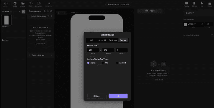
Enter the desired Width and Height values.
Fill in Density (screen pixel density: @2x, @3x, @4x, etc)
Optionally, activate the device's System Status Bar.