INDUSTRIES

Automotive

Aviation

Finance

Gaming

MedTech

IoT

Digital Products

USE CASES

For Enterprise

For Individuals

For Teams

For education

KEY FEATURES

Hardware & System Integration

Beta

ProtoPie MCP

Multi-Device Prototyping

Interaction Logic

Developer Handoff

ProtoPie AI

New

User Testing

PLUGINS

Figma

Sketch

Adobe XD

INSIGHTS & INSPIRATION

Blog

eBooks

Clients Success Stories

Events & Webinars

ProtoPie Gallery

PRODUCT LEARNING & SUPPORT

ProtoPie School

Download ProtoPie

Product Documentation

Community

INDUSTRIES

Automotive

Aviation

Finance

Gaming

MedTech

IoT

Digital Products

USE CASES

For Enterprise

For Individuals

For Teams

For education

KEY FEATURES

Hardware & System Integration

Beta

ProtoPie MCP

Multi-Device Prototyping

Interaction Logic

Developer Handoff

ProtoPie AI

New

User Testing

PLUGINS

Figma

Sketch

Adobe XD

INSIGHTS & INSPIRATION

Blog

eBooks

Clients Success Stories

Events & Webinars

ProtoPie Gallery

PRODUCT LEARNING & SUPPORT

ProtoPie School

Download ProtoPie

Product Documentation

Community

Menu

Component Guides

A component guide is a helpful document that you can create for your team members to reference when using a component from your interaction library. It allows you to provide a description and enables others to see the overridable variables, Send responses, and Receive triggers along with their corresponding messages that are utilized in the component.

Editing Component Guides

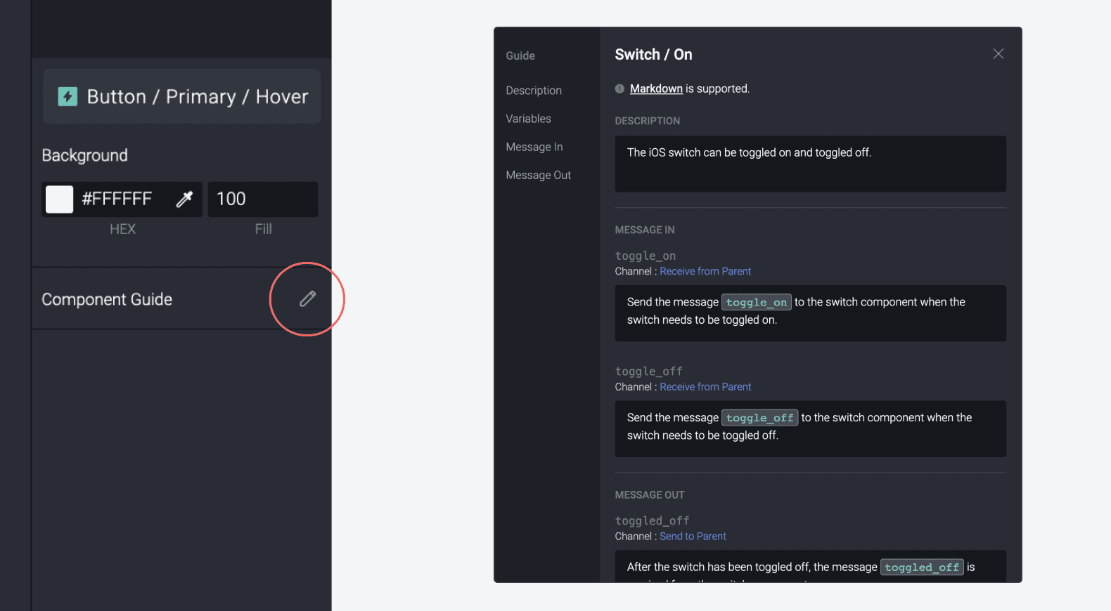
Click the pencil icon in the property panel of the component to edit the component guide. Simple markdown is supported (except for hyperlinks, images, tables, and grammar).

{'_type': 'localeString', 'en': 'component guide editing'}

Description

Write a description about what the component is for and how it should be used.

Variables

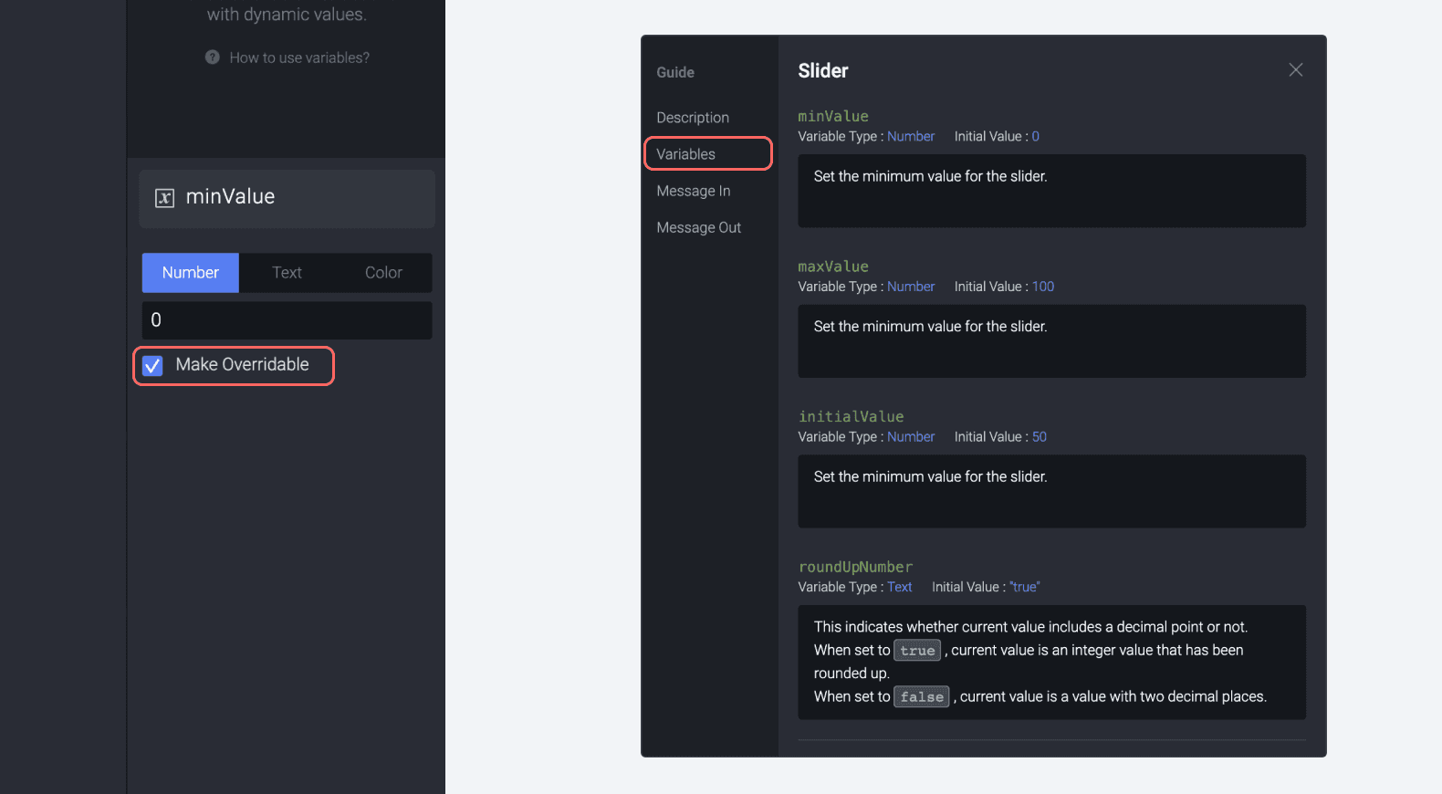
When a component has overridable variables, they'd be automatically displayed in the component guide. The variable type and initial value would be included as well.

{'_type': 'localeString', 'en': 'component guide variable'}

Message Out

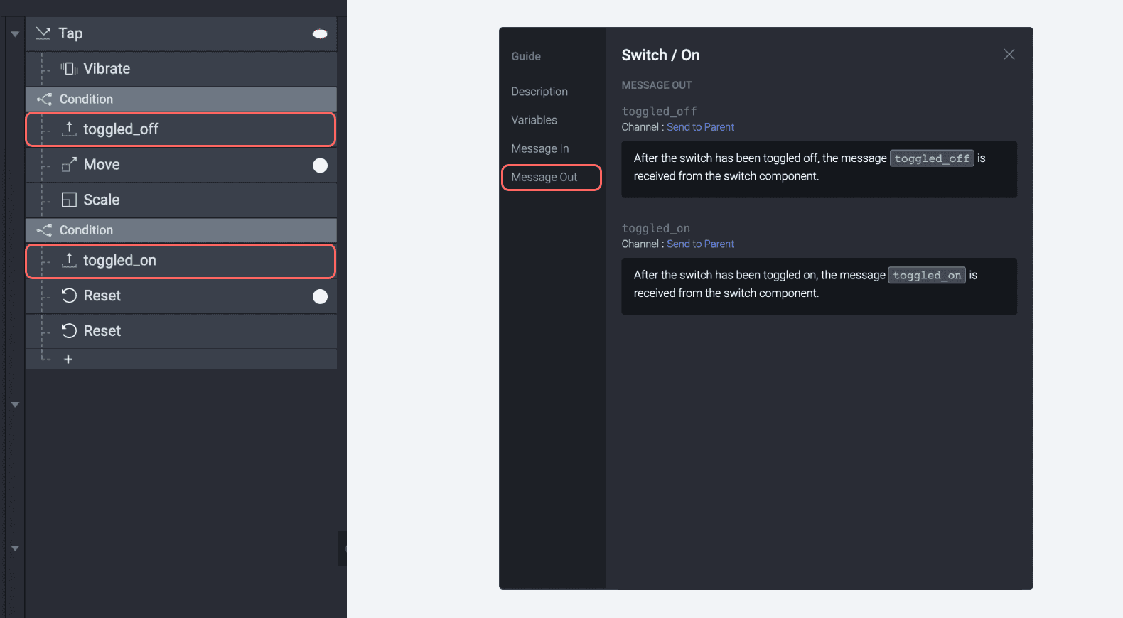
When you use Send responses with the Send to Parent or Send to Current Scene channels, they'd be automatically displayed in the component guide.

{'_type': 'localeString', 'en': 'component guide message out'}

Message In

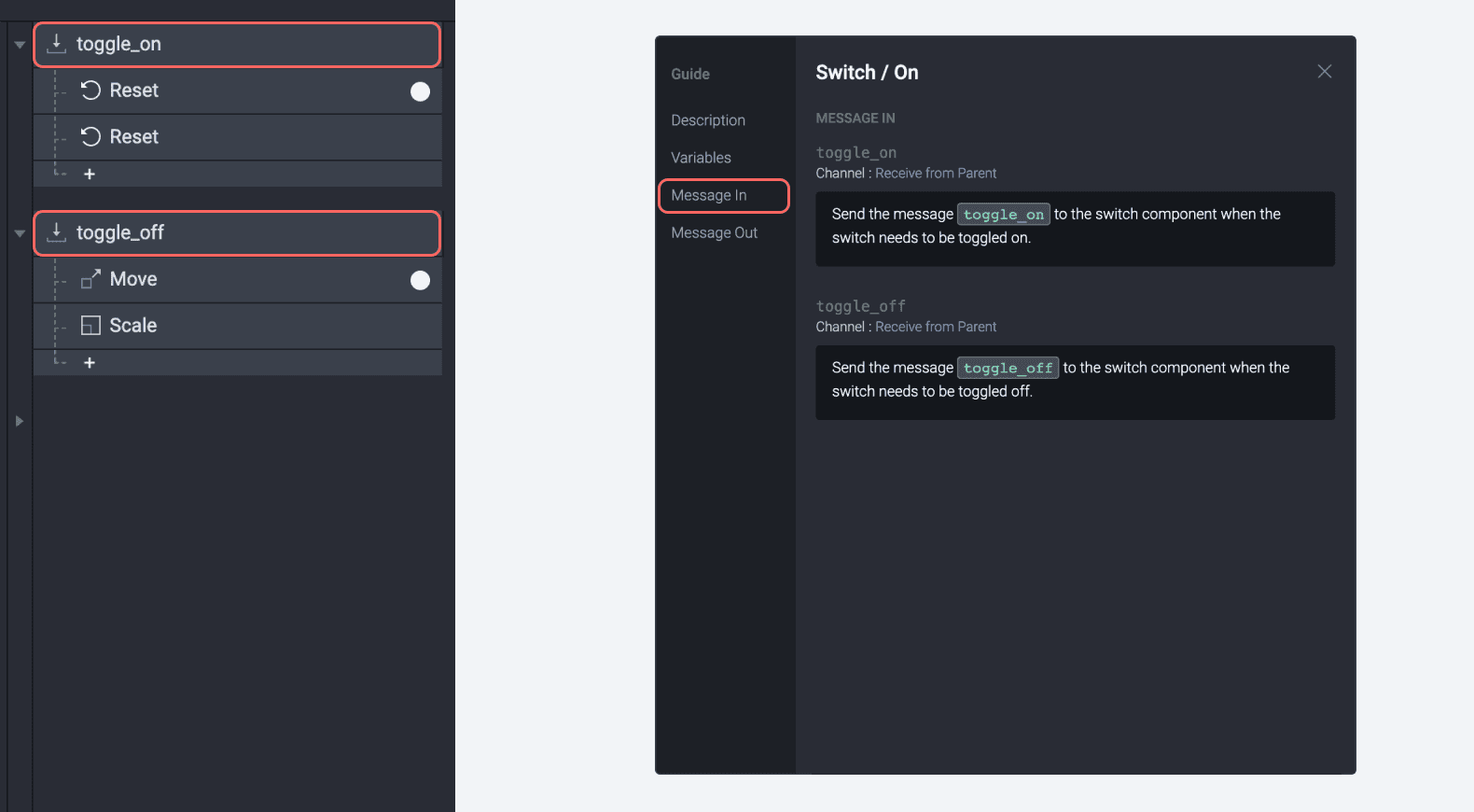
When you use Receive triggers with the Receive from Parent or Receive from Current Scene channels, they'd be automatically displayed in the component guide.

{'_type': 'localeString', 'en': 'component guide message in'}

Previewing

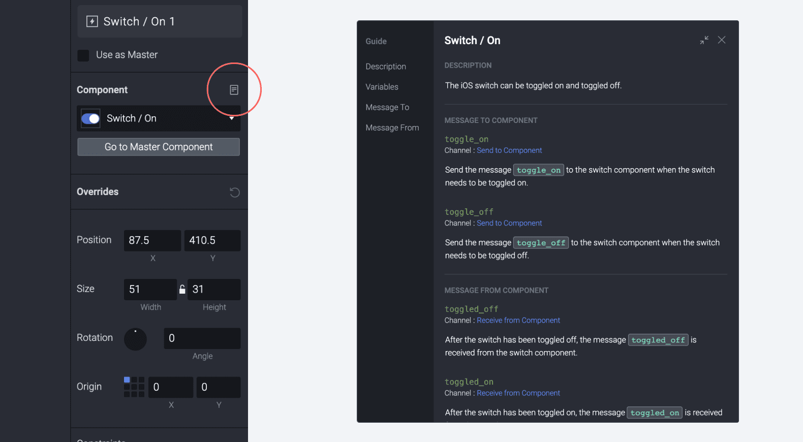
When you use the component as an instance, you can see access the component guide by clicking on the component guide icon in the property panel.

{'_type': 'localeString', 'en': 'component guide preview'}

Minimizing

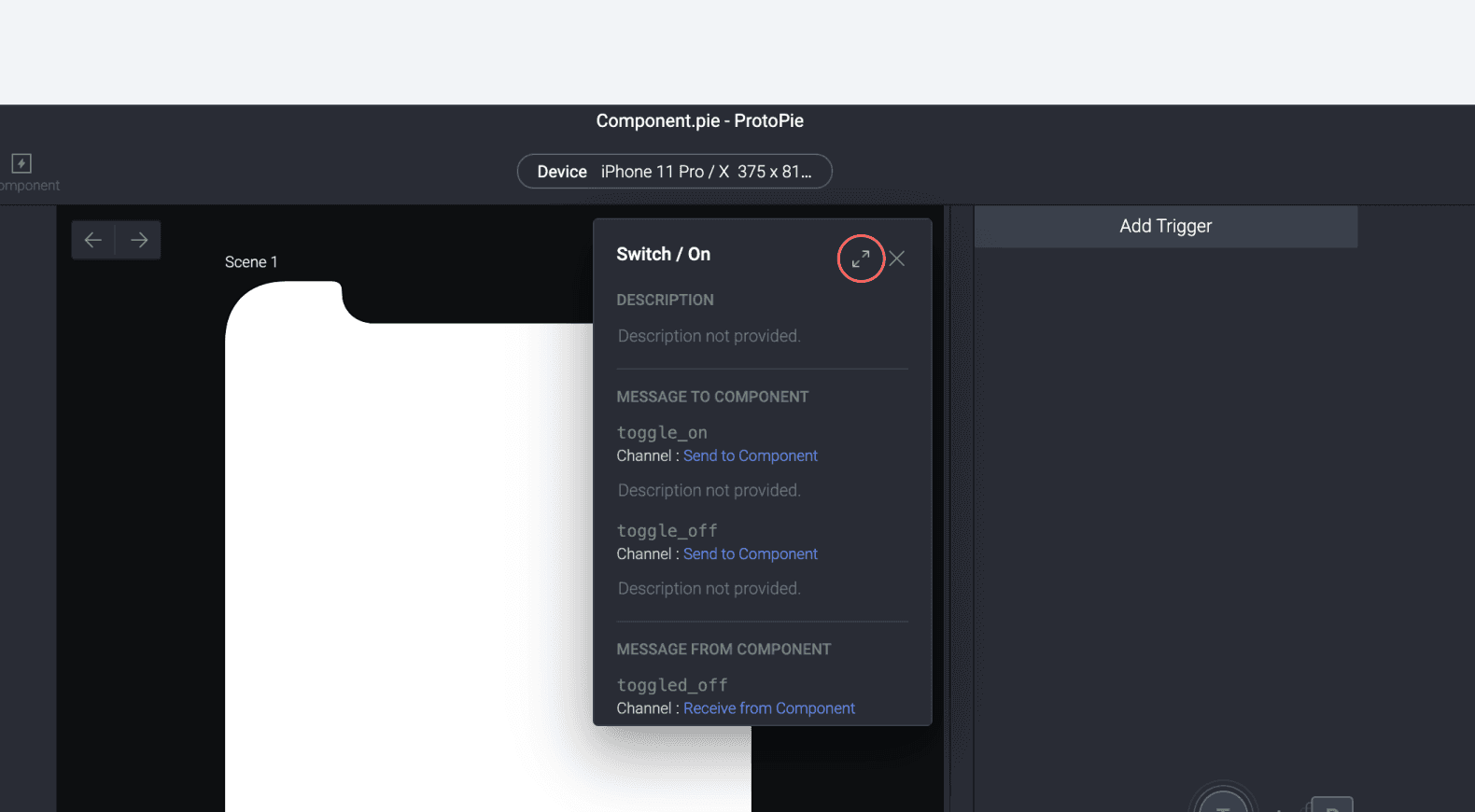
When you use the component as an instance, you can see access the component guide by clicking on the component guide icon in the property panel.

{'_type': 'localeString', 'en': 'component guide preview minimize'}