
Prototyping is crucial for developing connected car mobile apps, ensuring they meet user needs and offer seamless experiences.
This article explores how MBition, a Mercedes-Benz subsidiary, uses ProtoPie to prototype the Mercedes me mobile application. You'll learn about their design process, how they build design systems with ProtoPie component libraries, and why ProtoPie Connect is ideal for prototyping connected automotive experiences.
Check out the recording of our livestream "Prototyping Connected Experiences: A Look at the Mercedes me App" below or keep reading to discover valuable insights and workflow examples from MBition's design process.
Overview
Meet MBition: shaping the future of automotive UX design
Prototyping the Mercedes me App: MBition's innovative approach
What is the Mercedes me App?
Insights into the Mercedes me App prototyping process
9 best practices for using ProtoPie component libraries
How to structure ProtoPie component libraries
Benefits of using ProtoPie component libraries
Prototyping in-car connected experiences using ProtoPie Connect
Meet MBition: shaping the future of automotive UX design
MBition is a Mercedes-Benz subsidiary with a dedicated UX design team shaping the future of car user experiences. Founded and based in Berlin, MBition is an integral part of Mercedes-Benz's software hub, actively engaging in automotive research and development. The team is driven by the ambition (pun intended) to create innovative and seamless user experiences for Mercedes-Benz infotainment systems, one prototype at a time. With a secondary base in Sofia, Bulgaria, MBition employs over 900 workers of diverse nationalities across both sites.
You may wonder what MBition is all about. One line sums it up: "Designing the Future of Mercedes-Benz Infotainment Systems." In this context, infotainment (a mix of "information" and "entertainment") refers to the content provided to a car's users through one or multiple displays.
Check out the video below to see some examples of this in practice.
A good eye would have caught a few of the infotainment elements in the car presented in the video, including the
Instrument cluster;
HUD (Head-up-display);
HU (Head Unit);
PD (Passenger Display).
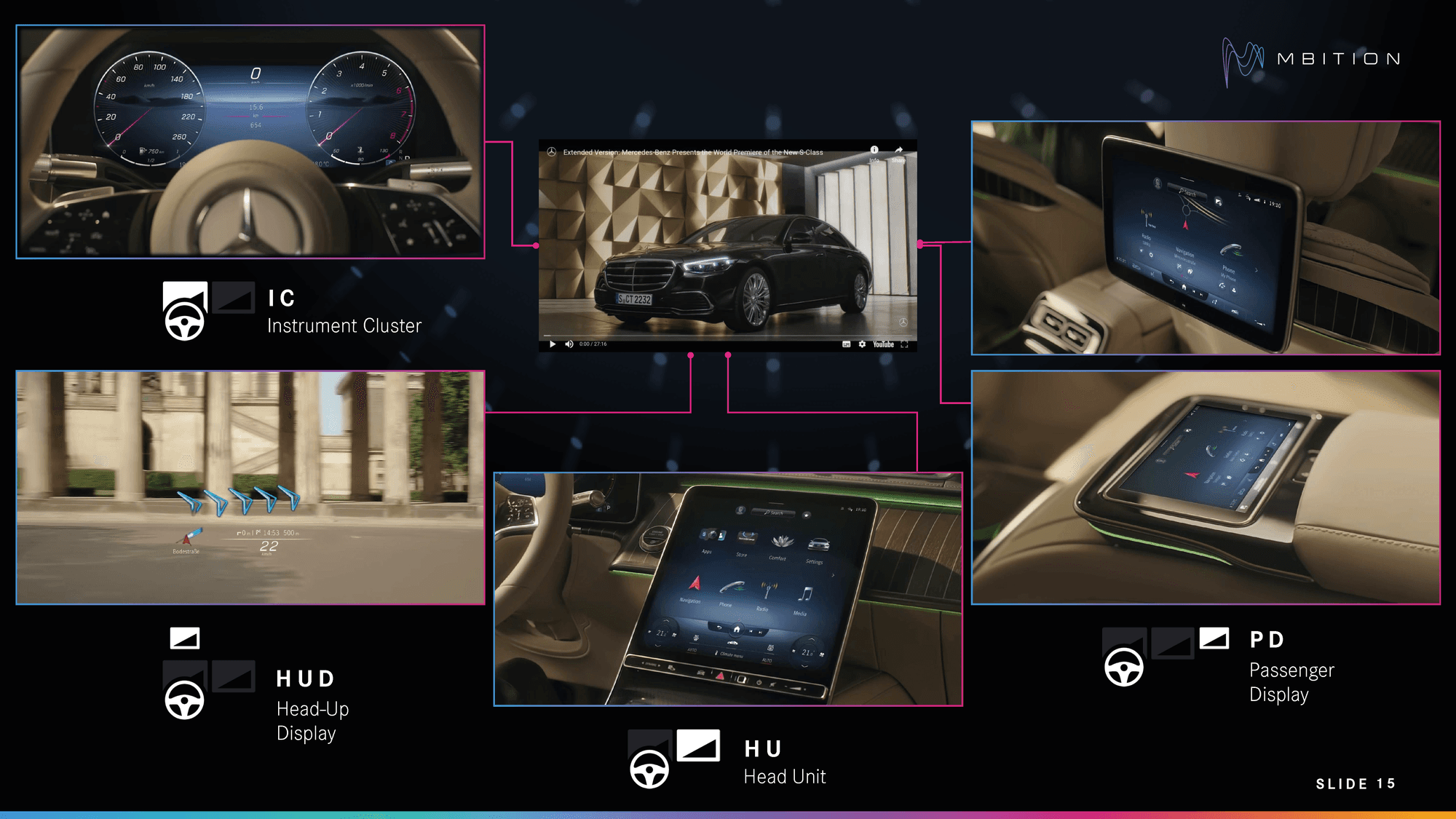
The Mercedes-Benz infotainment system.
The video also reveals one more product—the Mercedes me App—which we will learn more about in the next sections.
Prototyping the Mercedes me App: MBition's innovative approach
What is the Mercedes me App?
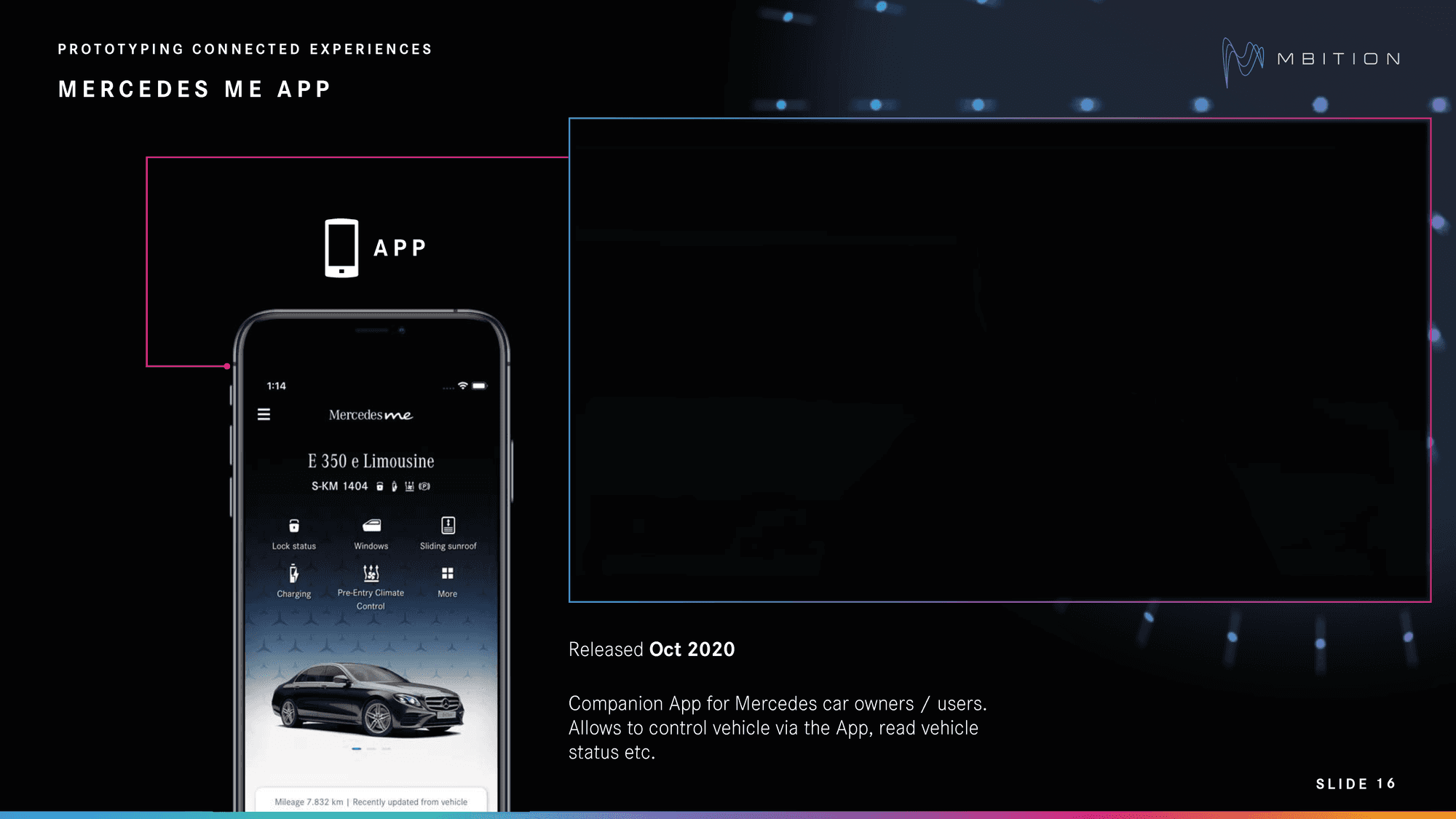
The Mercedes me app was first released in October 2020 as a companion app for Mercedes car owners.
In October 2020, the Mercedes me App was introduced as a companion app for Mercedes-Benz owners. The app enables users to interact with their cars in several ways, including controlling the vehicle and checking its status. Users can pair their vehicle with the app and access services such as Remote Engine Start, Remote Door Lock and Unlock, Locate Vehicle, and more, all while on the move.
In our livestream, Prototyping Connected Experiences: A Look at the Mercedes me App, we spoke with UI/UX designers Szymon Kościelniak and Feri Irsanto Pujianto from MBition. They shared their insights and best practices for using ProtoPie, the go-to tool in their design stack.
"Mercedes me was the first product that I started to prototype with ProtoPie at MBition," says Szymon. "We tried some different tools, but we ended up with ProtoPie, which I'm quite happy to work with."
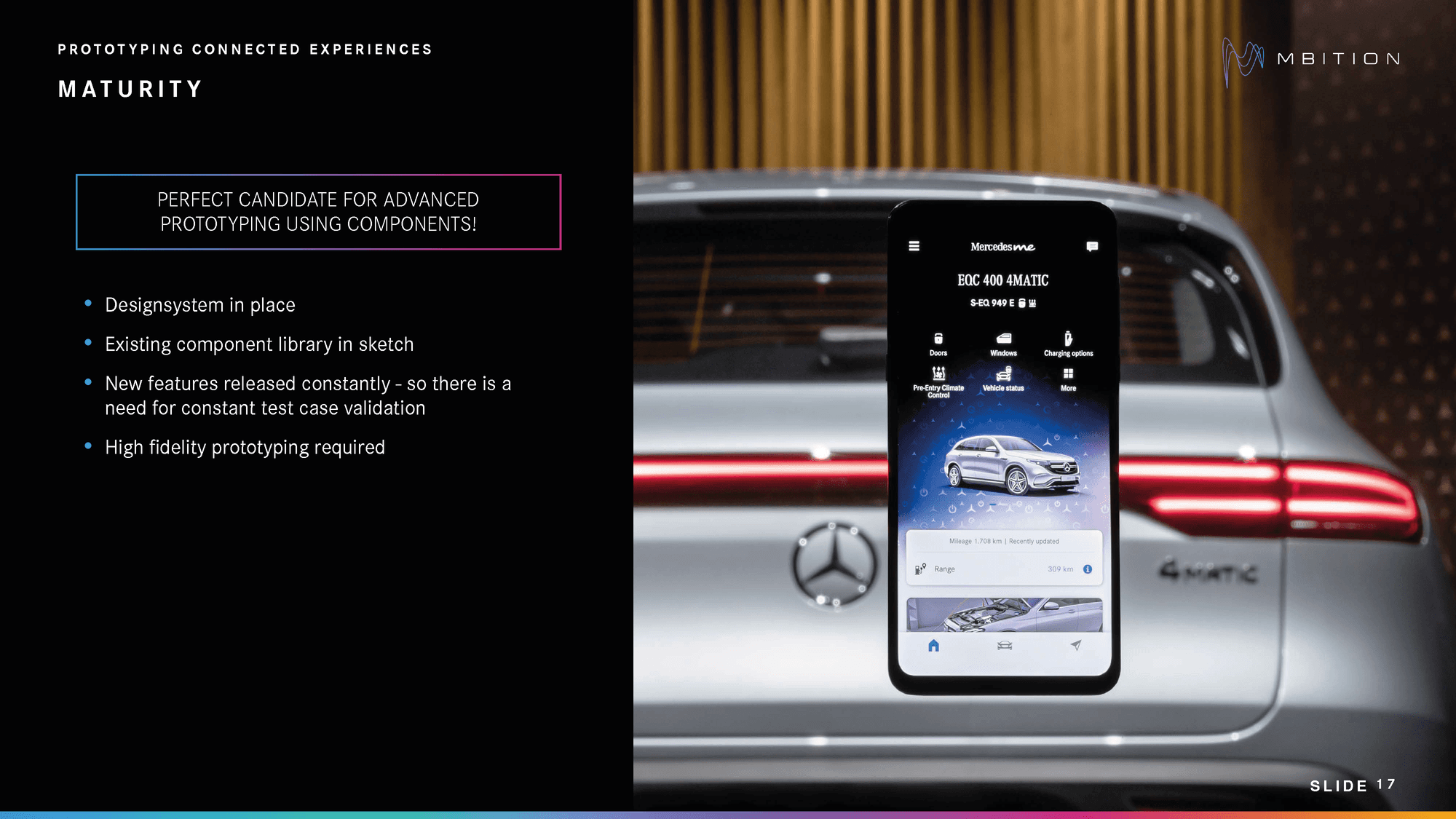
Why ProtoPie was the perfect candidate for prototyping the Mercedes me App.
He explains that when they started prototyping, they wanted to get it right from the start because they knew their limitations, such as
A relatively small team;
Time pressure;
The need for high-fidelity prototypes to convince stakeholders.
The MBition team did have solid foundations to build on, including a design system with a component library in Sketch. However, with new features released regularly, the designers needed to constantly validate test cases. In other words, they needed a high-fidelity prototyping tool that could help them develop functional and interactive prototypes quickly and easily, leading them to ProtoPie.
Insights into the Mercedes me App prototyping process
In this section, we'll have a look at the workflow behind creating mobile app prototypes at MBition.
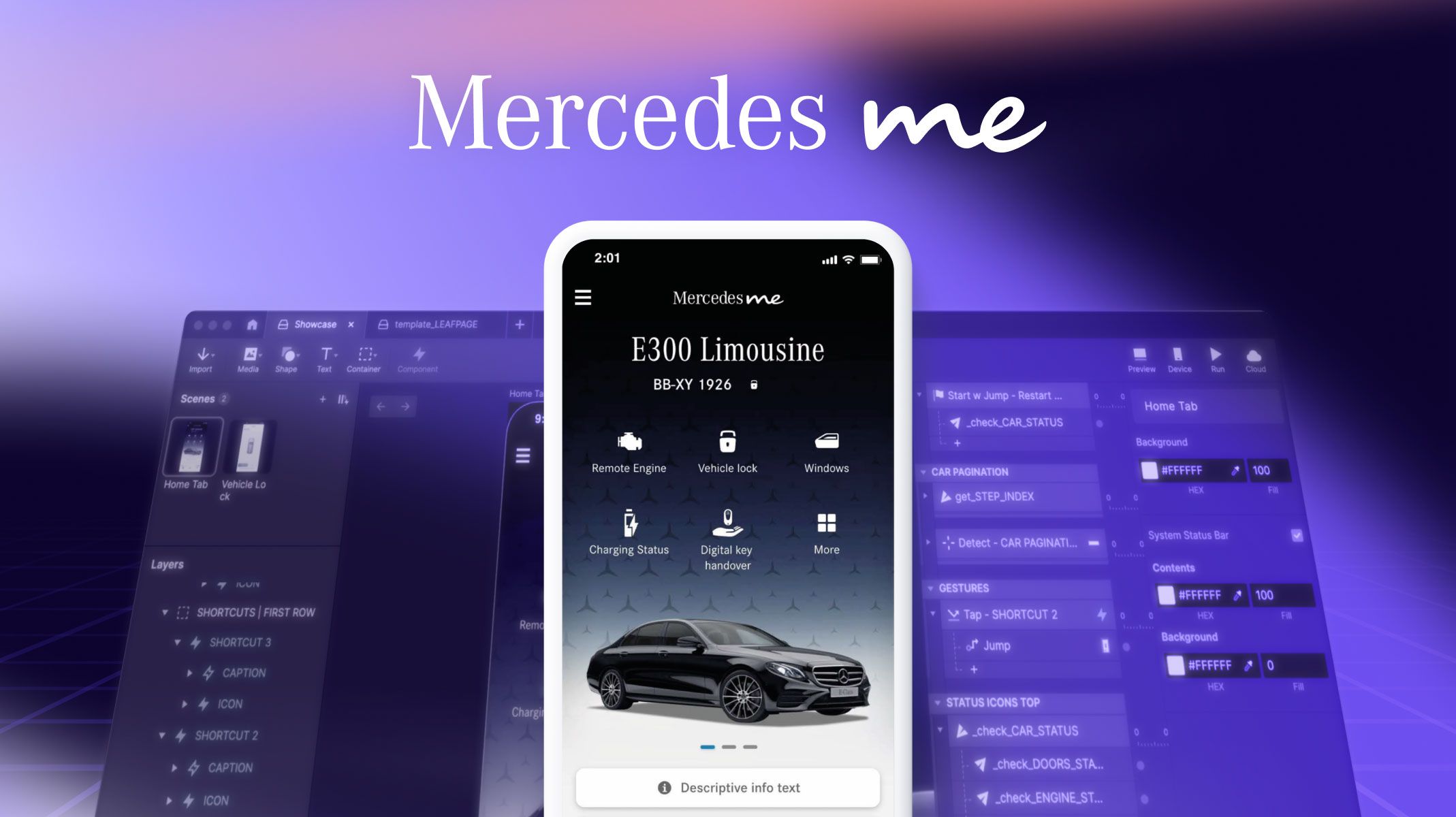
Below is a prototype showcasing the home tab. In the current state, the user can operate the vehicle lock feature.
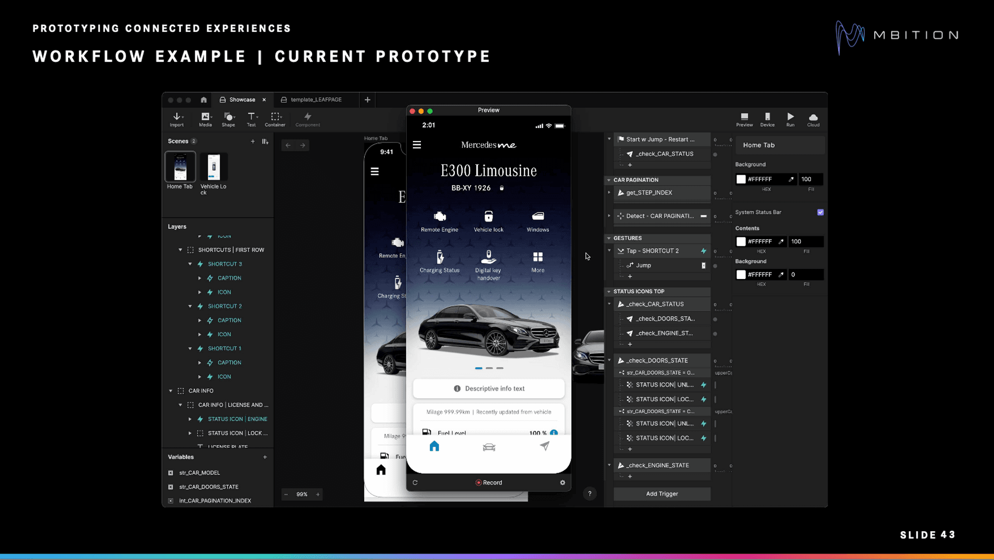
Workflow example from the Mercedes me App prototype.
1. Using a Sketch concept
"Let's say we want to expand our prototype and add the remote engine feature," says Feri. "We start off by looking at the concept of the feature from our concept team. In this example, the concept is simplified."
The concept below includes a start press, sending the page to pending, followed by starting the engine with a user interface that includes a stop button.
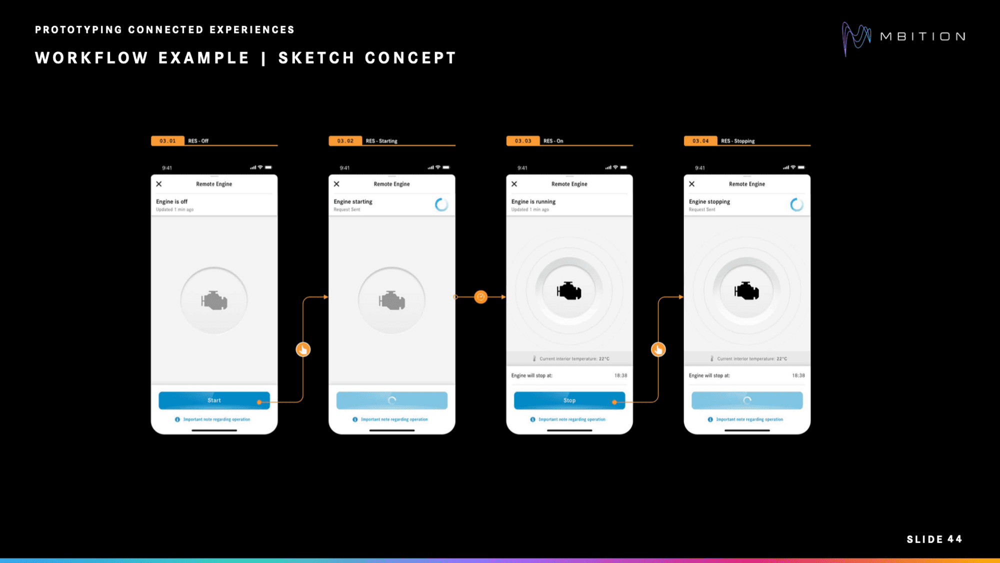
Workflow example for the remote engine feature.
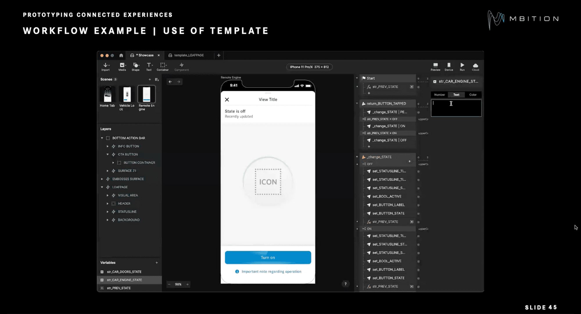
2. Using a template
"We start off building in ProtoPie using the templates we have created, showcasing different patterns of the pages," says Feri. "So the template not only consists of design layouts but also a logic of basic interactions."
The following steps consist of:
Finding the right template.
Copying the scene to their profile.
Renaming everything (e.g. variables, values, warnings).
Checking if the variables work based on the same logic.
Renaming the scene based on the feature they want to create, replacing placeholder titles.
Replacing the icons, button labels, and other generic text.
Adding a Tap trigger and Jump response.
Duplicating the Tap trigger in the home tab.
Creating a Jump response to the remote engine page.
The team started off using their predefined template consisting of design layouts but also a logic of basic interactions.
3. Using the Sketch export feature
Sometimes, components might not be necessary if the element is not planned to be interactive in the prototype. "In that case, we can just use the export function or directly export the element from Sketch using the [ProtoPie] plugin," says Feri.
In the illustration, the info line and the cell item elements should be visible when the engine is active.
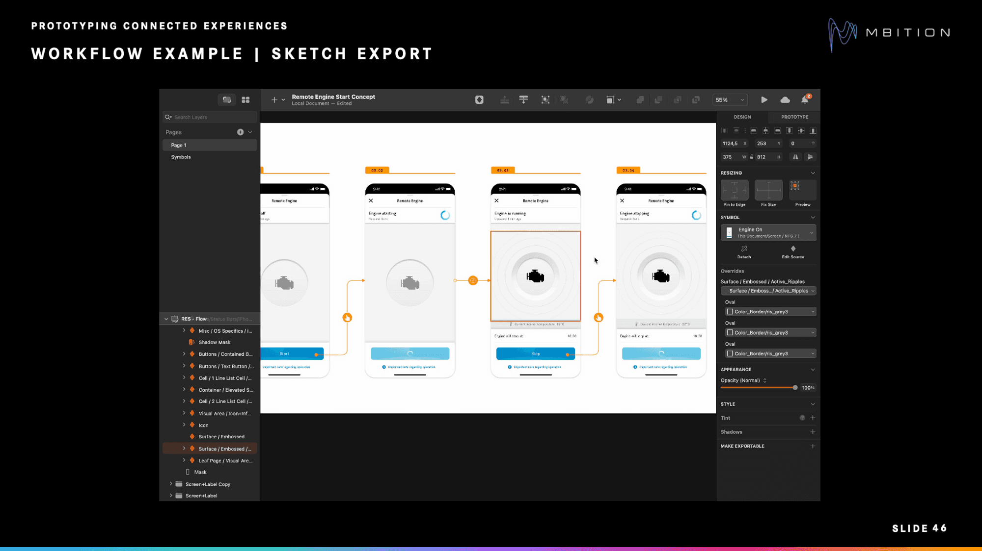
When exporting from Sketch you can choose which elements to export.
These are the steps involved in the process:
Use a positive response based on the state of the engine.
Set up everything regarding constraints, ensuring it stays at the bottom.
Rename the containers and elements for clear signals.
Set everything to zero capacity.
Determine how to scale the bottom action bar when it's active, saving the value (206 in this case).
Based on the engine state, scale the bottom action bar to a height of 206 and apply the opposite response for the info line and cell items. In this case, both are set to 100.
Rename the response to ensure clarity.
After that, do the opposite for the off and engine state, change it to zero, and scale back the bottom action bar to 150
9 best practices for using ProtoPie component libraries
The MBition team decided to use ProtoPie component libraries for their prototyping approach.
During the mobile app prototyping process, they established a few best practices that helped make the team's design workflow more productive and transparent, reducing the time and effort needed to develop a functional prototype.
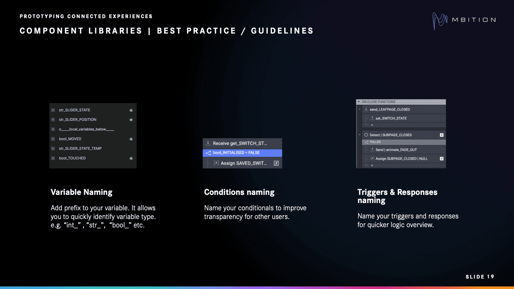
Naming variables, conditions, triggers, and responses is key to building a well-organized component library.
1. Name your variables
By adding a prefix to your variable (e.g., “int_,” “str_,” “bool_”), you can quickly identify variable types much faster than having to click and check the inspector every time.
2. Name your conditions
In a similar fashion, naming your conditionals improves transparency for other users on your team.
3. Name your triggers and responses
For a quicker logic overview, be sure to also name your triggers and responses.
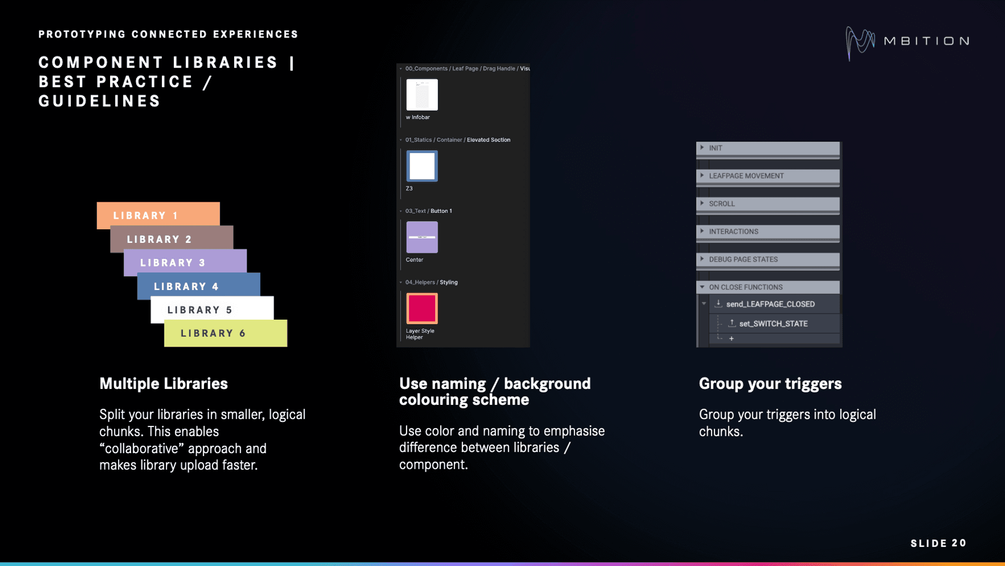
Splitting libraries into smaller, logical chunks enables a collaborative approach and makes library upload faster.
4. Use multiple libraries
The MBition team had many components, which meant they found it handy to split their libraries into smaller, logical chunks. This enables a collaborative approach and speeds up library uploads, allowing different team members to work on different areas simultaneously.
5. Use a naming/background coloring scheme
MBition used specific naming and color coding within their libraries to emphasize the difference between libraries/components.
6. Group your triggers
Grouping your triggers into logical chunks is especially valid for cases where you have a lot of logic and would need a better overview. It also allows consistency across components for a more productive workflow.
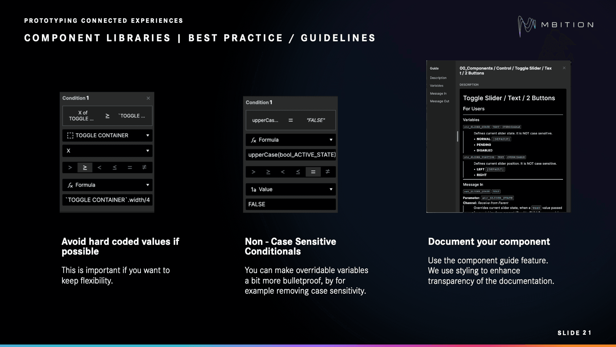
Using dynamic values instead of hard code is especially important if you want to keep flexibility.
7. Avoid hard-coded values
Using dynamic values instead of hard code is especially important if you want to keep flexibility.
"I've seen many users prefer hard code and whenever they come back to a prototype, they need to rebuild the prototype because the element was just moved a little bit," says Szymon.
8. Use non-case-sensitive conditionals
You can make overridable variables a bit more bulletproof by removing case sensitivity.
"We try to bring string values in conditionals to the same formats," says Szymon. "For example, always use the uppercase. So if someone is writing in lowercase or beginning in camel case, it doesn't matter at the end."
9. Document your component
The component guide feature in ProtoPie is useful as a tool to document your components for team members to refer to.
At MBition, styling enhances the transparency of the documentation, which is very important if you work with users or multiple colleagues who contribute to the library.
How to structure ProtoPie component libraries
The MBition team divided its component library into smaller chunks. Here's an illustration of the different categories that make up their component library, followed by how they can appear in relation to each other.
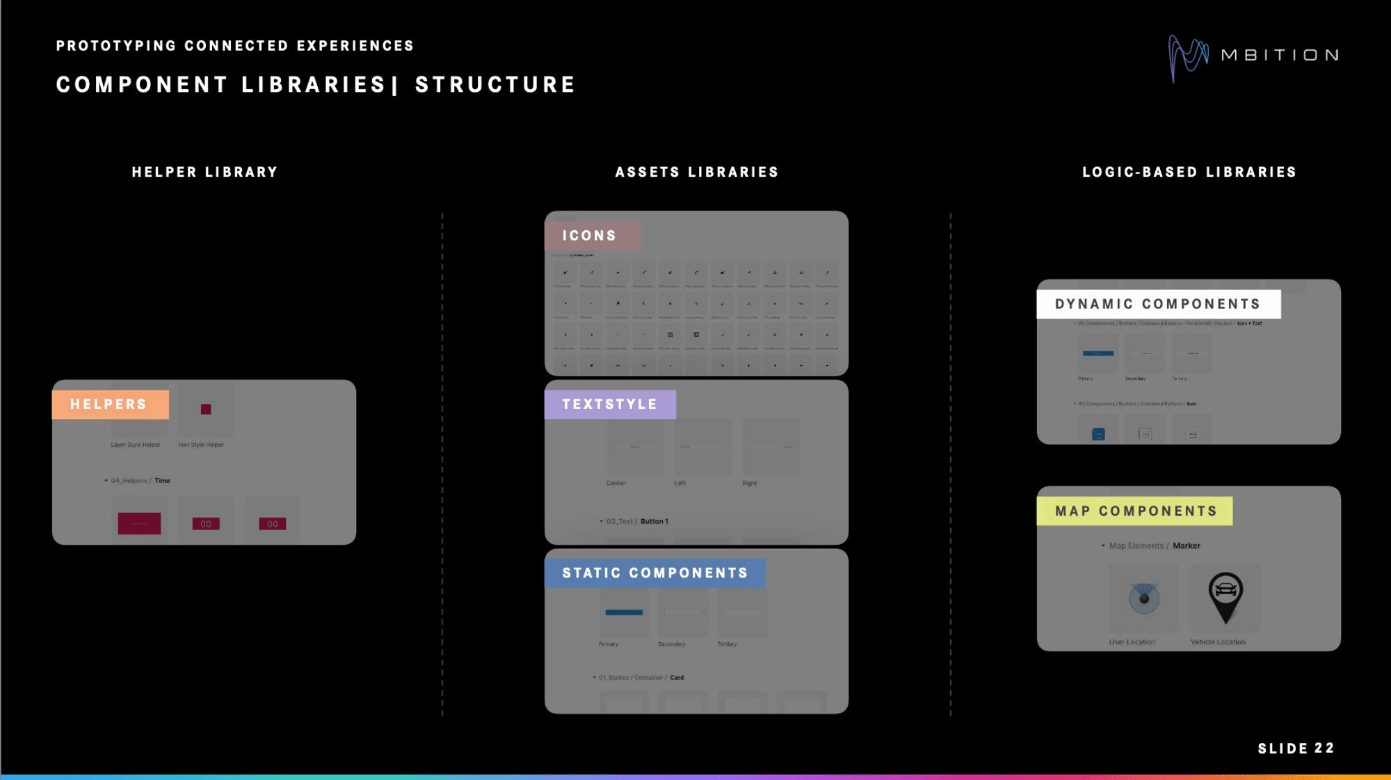
The component libraries were split into Helper, Assets, and Logic-based libraries.
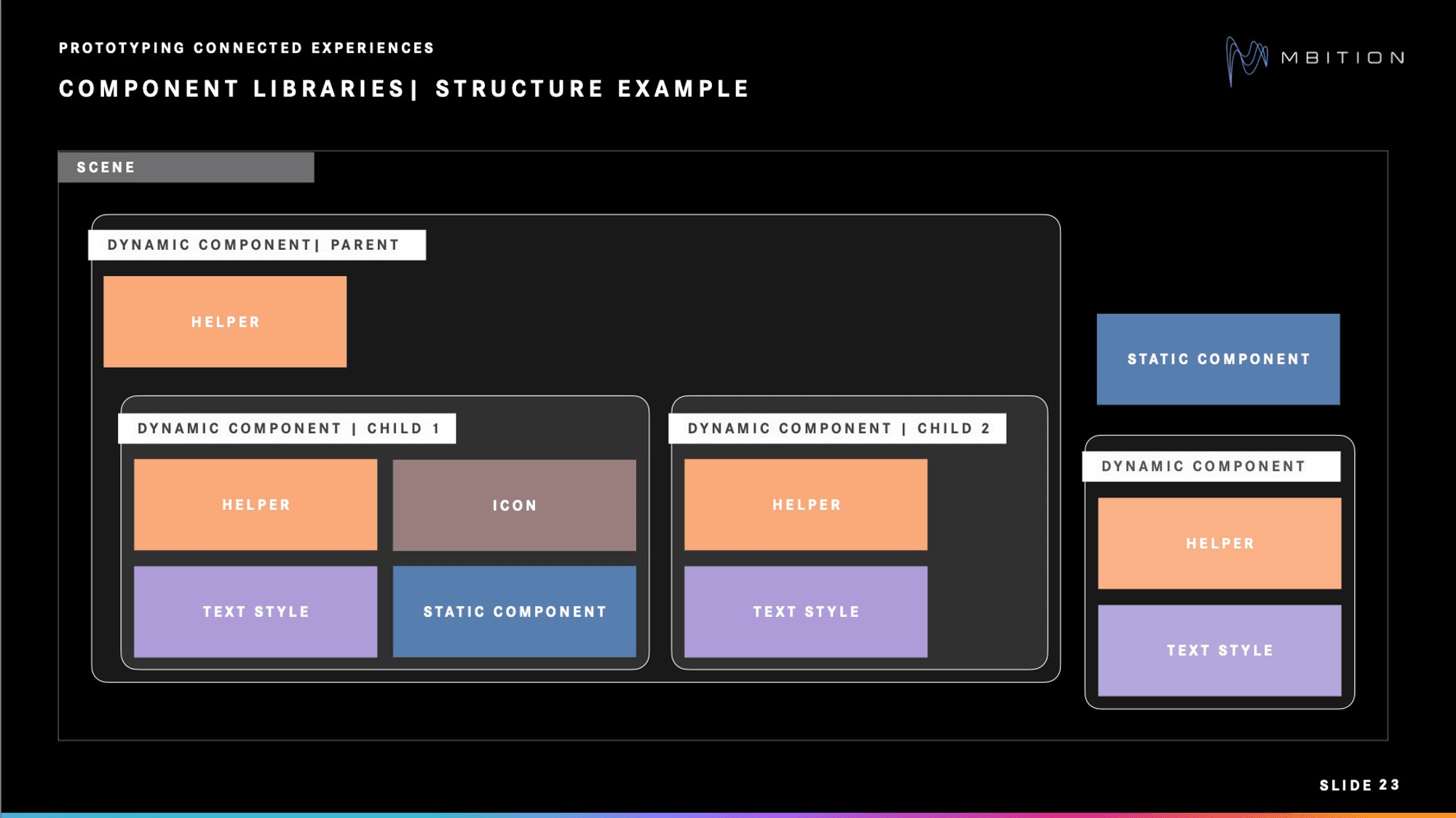
A dynamic component could include elements from helper and asset libraries, such as text style.
For example, a dynamic component could include elements from helper and asset libraries, such as text style, as seen in the bottom right corner.
Let's have a look at the individual libraries.
1. Helper libraries
Helpers are strictly functional and designed to receive and throw back data. They do not include design elements and lack assets or other components. Typically, helpers are used as child elements within different components.
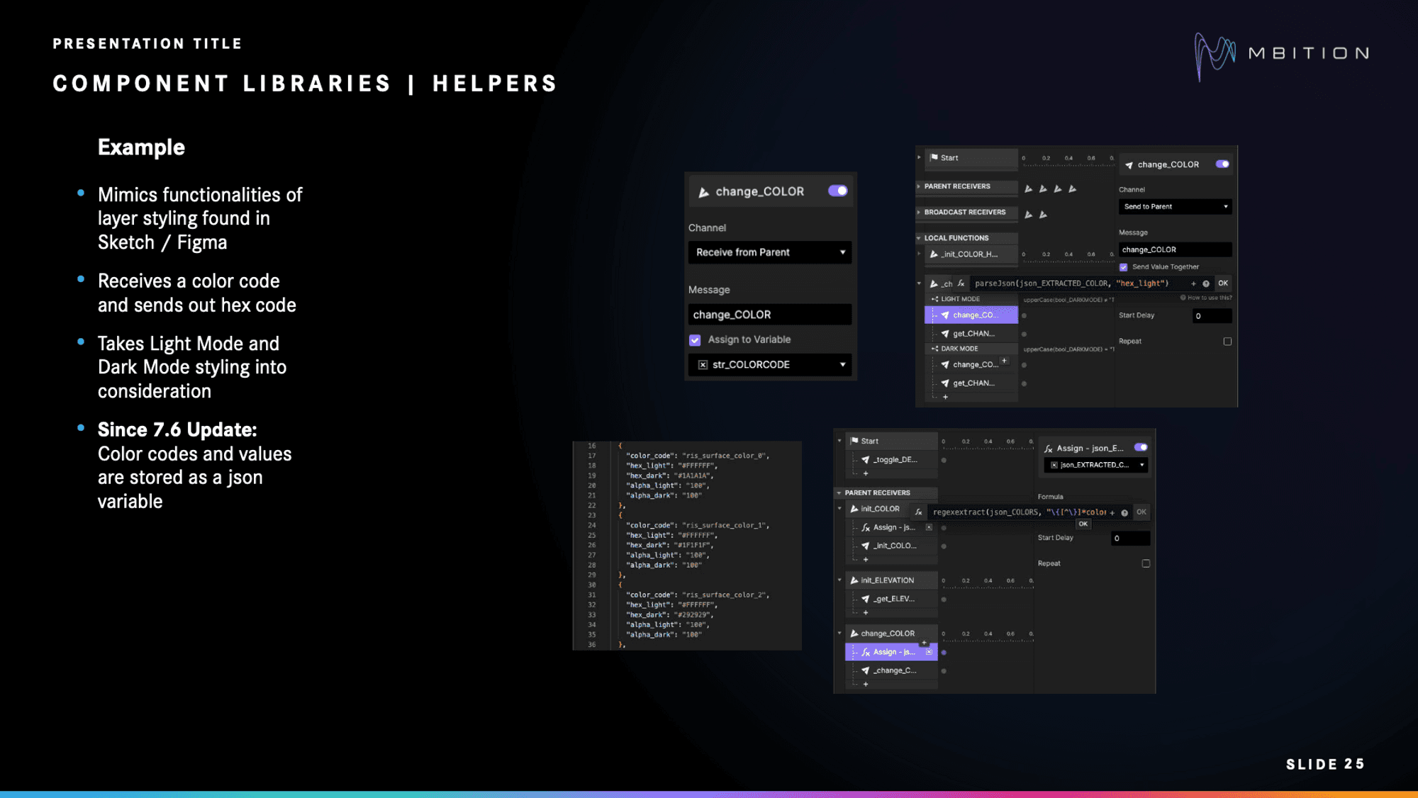
Typically, helpers are used as child elements within different components.
A simple example is a timer helper that sends a signal when the timer finishes counting.
A more complex example is a layer style helper that replicates the layer styling functions of design tools like Sketch or Figma. It takes a color code as input and outputs a corresponding hex code, accommodating both Light Mode and Dark Mode styles. The key benefit of the style helper is its ability to control all components simultaneously, eliminating the need to change the color of each one individually. This is where the ProtoPie parseJson function comes in handy, as it enhances the efficiency of managing and retrieving essential information such as color codes and values.

Light Mode and Dark Mode.
2. Asset libraries
Assets libraries are a collection of various components, including:
Icons: Icons use minimal logic, allowing for easy replacement via the override function in ProtoPie. They are responsible for tasks such as initializing the color, receiving color-setters from the parent component, and applying coloring with the help of helpers.
Text style components: These follow a similar logic as icons but with additional features. They mimic the design system and can receive setters from the parent component to modify the text. These components also automatically rescale or adjust their layout based on the length of the text and send back their height to the parent.
Static components: Require minimal logic and primarily focus on initializing color and styling. They use helpers for applying color and can have specific styling for Light Mode and Dark Mode. These components consist of vectors, PNGs, or video materials, allowing for easy application of visual design changes without disrupting the component logic.
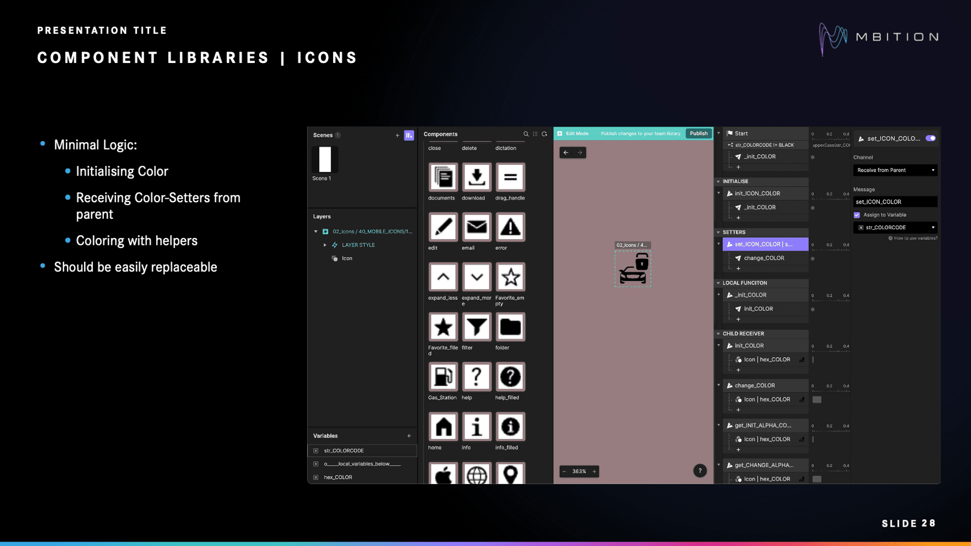
Library of icon components.
3. Logic-based libraries
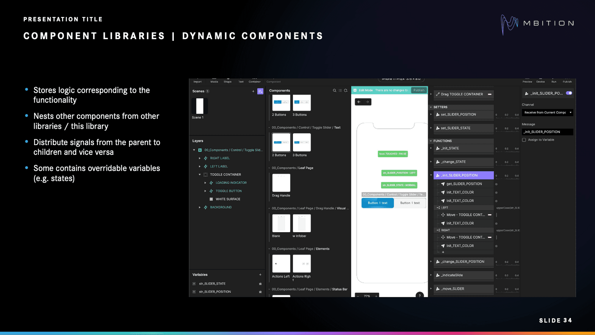
Dynamic components can nest components from other libraries or within the same library.
Dynamic components store logic for functionality and can nest components from other libraries or within the same library. They distribute signals between parent and child components and may have overridable variables such as states.
Here are some examples:
The Control Slider component stores variables for states and positions. It can be overridden by parent components using setters, and values are sent back to parents. Successful interactions trigger signals to parents.
Similarly, the Slider and Status Line components store state, position, status, title, and subtitle variables. They can be overridden by parents. The Status Line component also auto-scales based on text height.
By combining components, different components will communicate through the send/receive concept to enable interaction. For example, the toggle slider is responsible for setting the door state of opening and closing. Depending on the state, the signals are then distributed to individual components such as the status line, the car illustration component, and the slider itself.
On the other hand, map components are logic-based components specific to maps. They use the same concepts from the dynamic components library but on a bigger scale.
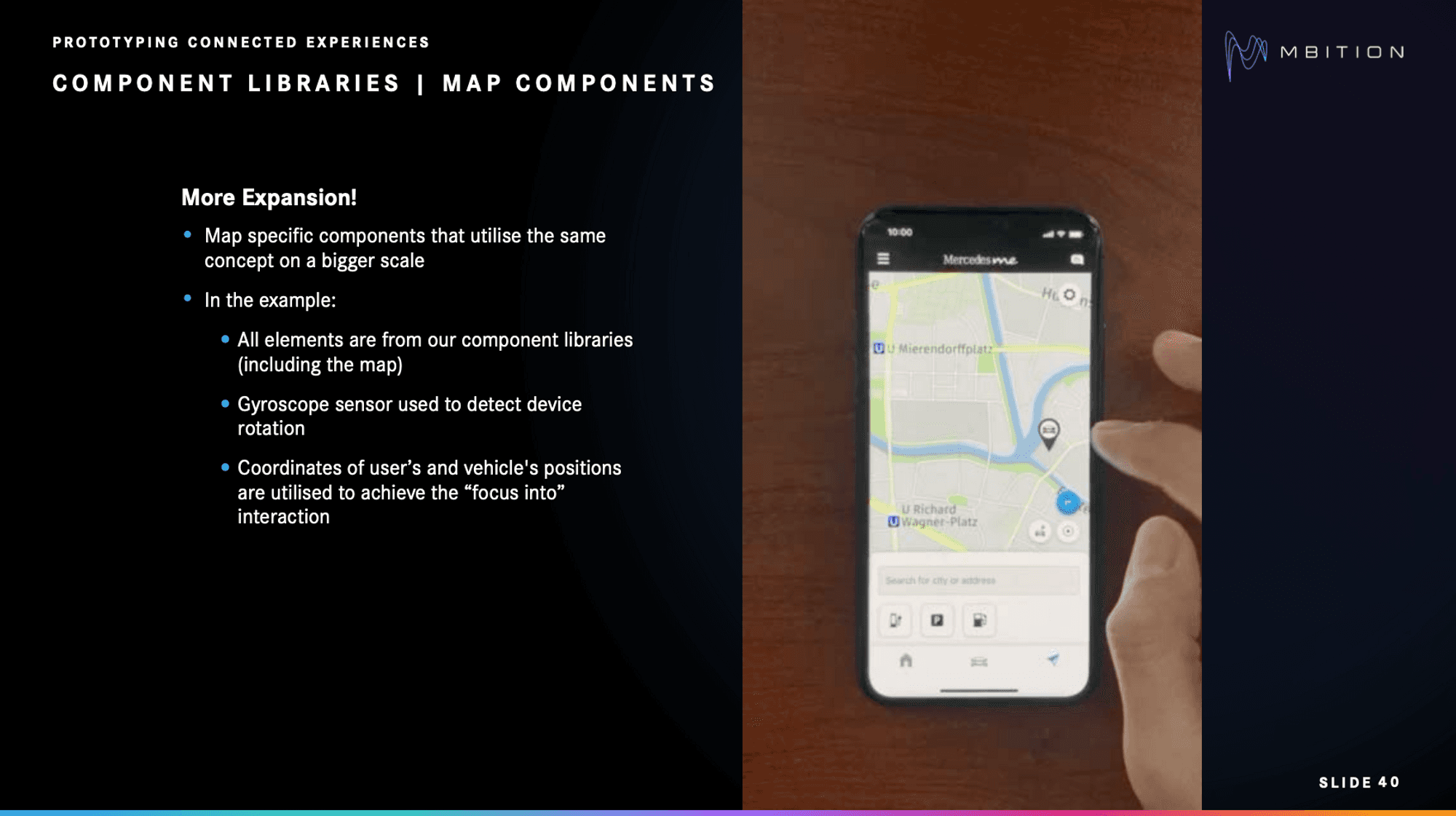
Example of map component used inside the Mercedes me App.
In the example shown above, all of the elements come from the component libraries. It uses a gyroscope sensor to detect device rotation, leveraging coordinates of user and vehicle positions for the "focus into" interaction.
In the example shown above, all of the elements come from the component libraries. It uses a gyroscope sensor to detect device rotation, leveraging coordinates of user and vehicle positions for the "focus into" interaction.
Benefits of using ProtoPie component libraries
Feri tells us that, from the beginning stages, the design team knew they needed to "minimize the disadvantages of high-fidelity prototyping, such as the high effort of creating a prototype and low maintainability." He says that their approach to prototyping with component libraries in ProtoPie gave them several benefits.
It saves time. Having an approach allows the team to save a lot of time that they normally would’ve spent on creating prototypes from scratch.
It is easy to maintain. Thanks to guidelines and common rules/routines, the MBition team is able to maintain bigger prototypes.
It is user-oriented. Should other colleagues plan to work on the prototype, they can jump on board with less friction.
It is scalable. More features can be added to the prototype, as the concept matures.
It's collaborative. Different people can work on different libraries without generating merge conflicts.
There's no code required. High-fidelity interactions do not require coding—just logical thinking.
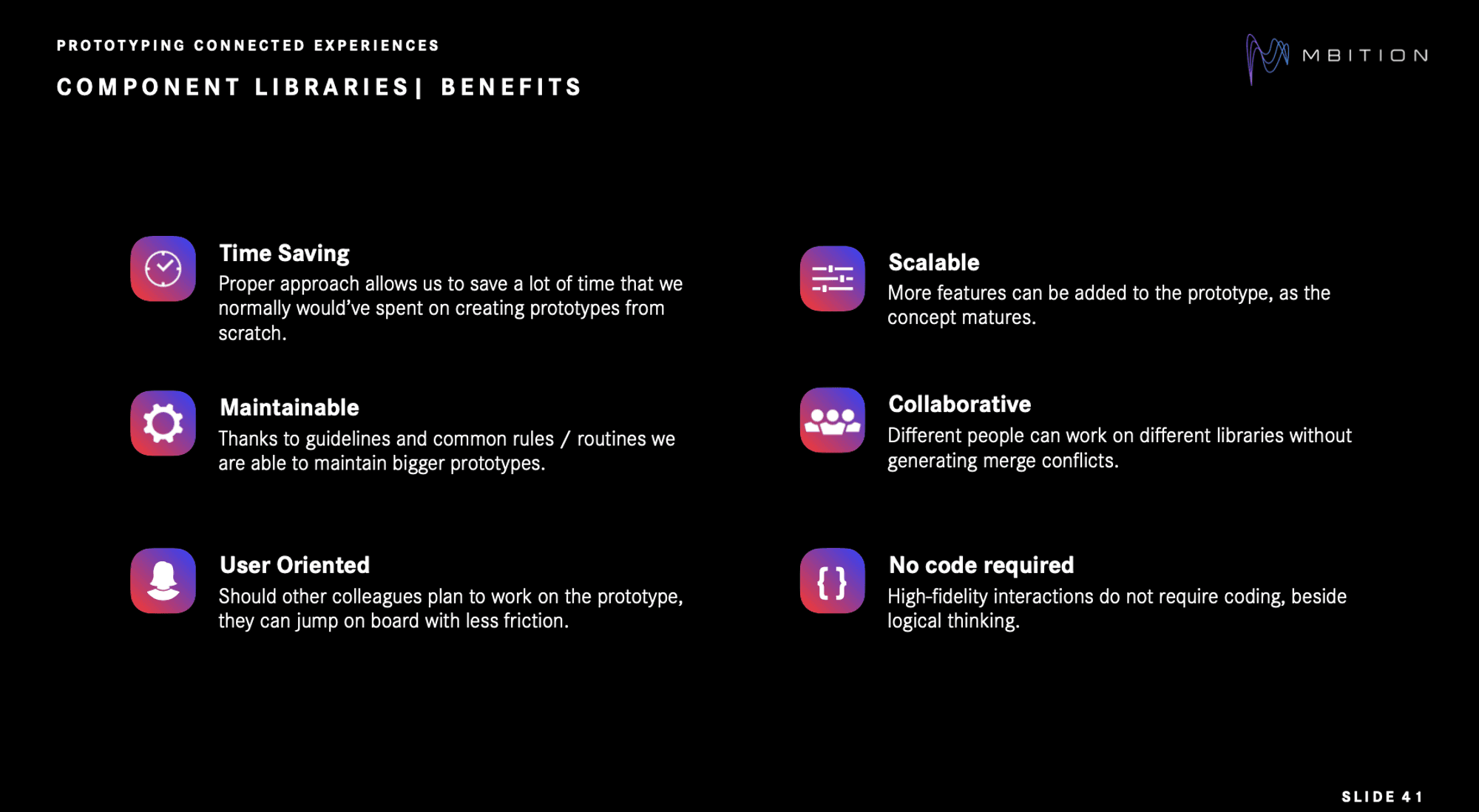
Benefits of component libraries in ProtoPie.
Prototyping in-car connected experiences using ProtoPie Connect
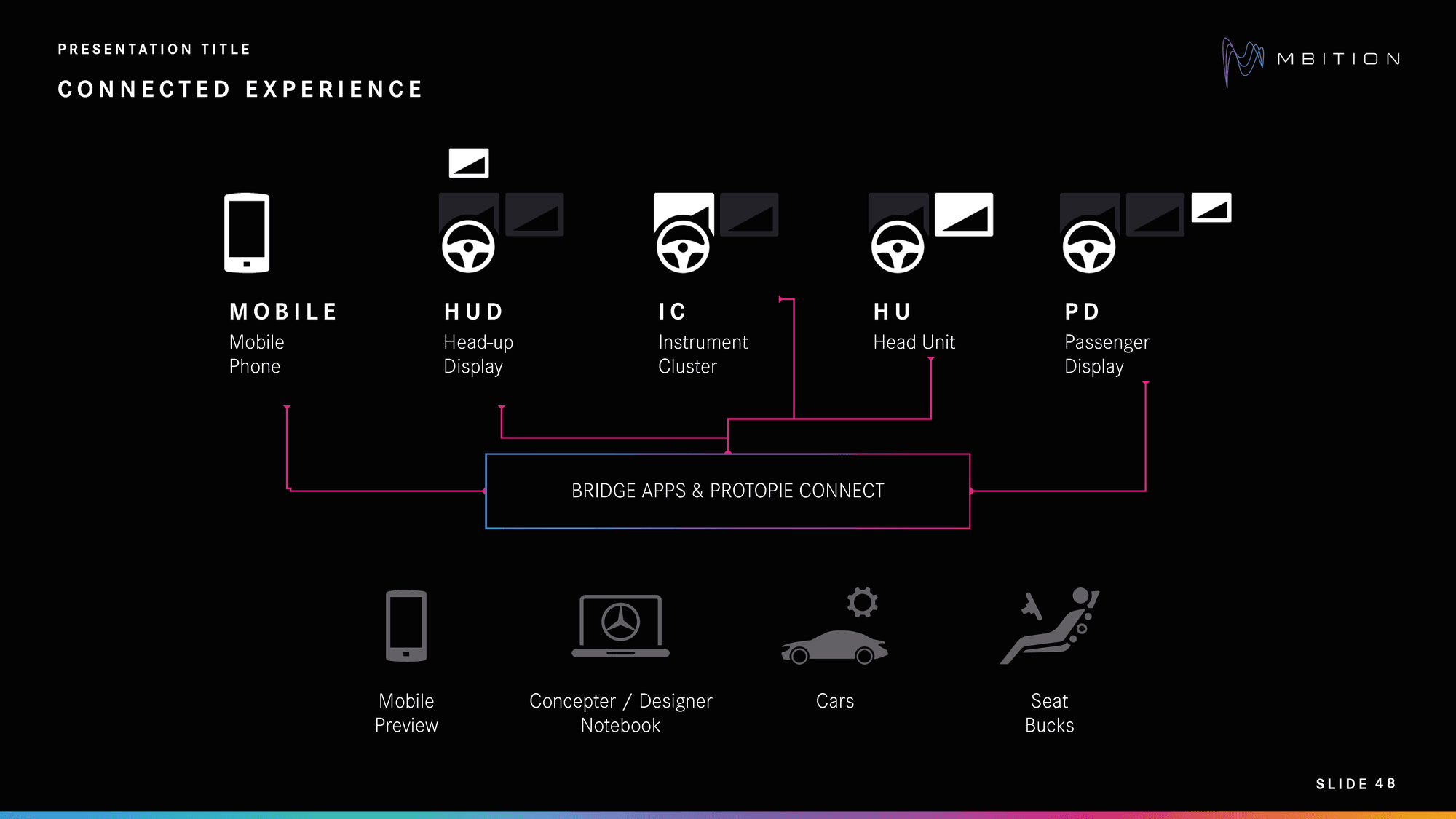
Bridge apps & ProtoPie Connect inside the Mercedes-Benz ecosystem.
So then, **what are connected experiences **in the context of MBition?
The video at the beginning of this article showed several devices that can either be found in a car or used in connection to a car. Thanks to ProtoPie Connect, it's possible to prototype targeting all of those devices, and even have them communicate with each other.
Using bridge apps to feed prototypes with car data or different interaction points is also possible.
"The nice thing is that you can test the same prototype on mobile devices, tablets, laptops, and also in the real car with a proper setup," says Szymon.
Szymon adds, "I can only recommend exploring this huge world of possibilities whenever you have ProtoPie Connect. Find time to use it, play around, and build your own bridge apps."
Finally, let's return to the video for another second. Remember the phone in Lewis Hamilton's hand?
You guessed it—the prototype was made with ProtoPie.
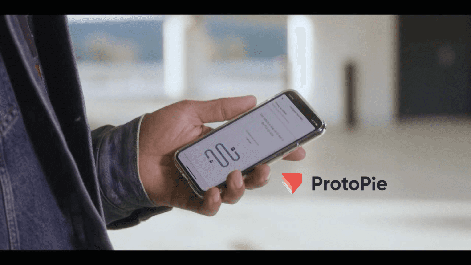
Prototype made with ProtoPie.
Improving car user experiences with ProtoPie
Automotive UX prototyping is essential for the automotive industry's development and innovation. It allows companies to bring new ideas to life, refine their designs, and enhance user experiences.
With ProtoPie, companies can dramatically reduce development time, foster better collaboration between design and engineering teams, and deliver cutting-edge vehicles that captivate customers. Book a demo and discover how ProtoPie can transform your in-car prototyping process.


