

Many companies use a design system in order to speed up the design process and to ensure consistency across their work. The downside to using a design system with a traditional UI design tool like Sketch is that your library is static. A library component can only ever show one state. By creating and sharing an Interaction Library with your team, you can take your design system to another level entirely. You may already know that ProtoPie allows you to create fully interactive components. By creating an Interaction Library, you can share your dynamic components with your entire team for them to reuse in their Pies.
What you'll need
You'll need a Pie with one or more components created. You can create your own, or in order to follow along with this guide, use this example Pie:
[Interaction Libraries Pie File]
If you intend on sharing your library with other team members, you'll need to be subscribed to a Team or Enterprise plan. Subscribers to the Individual plan can only make personal libraries.
What you'll learn
By the end of this tutorial you'll know how to do the following:
Create a new Interaction Library and publish components to it
Share your library with your team
Document library components with the Component Guide
Add and publish additional components to your library
Time to complete: ≤30 minutes
Step 1: Open your Pie with Components in it
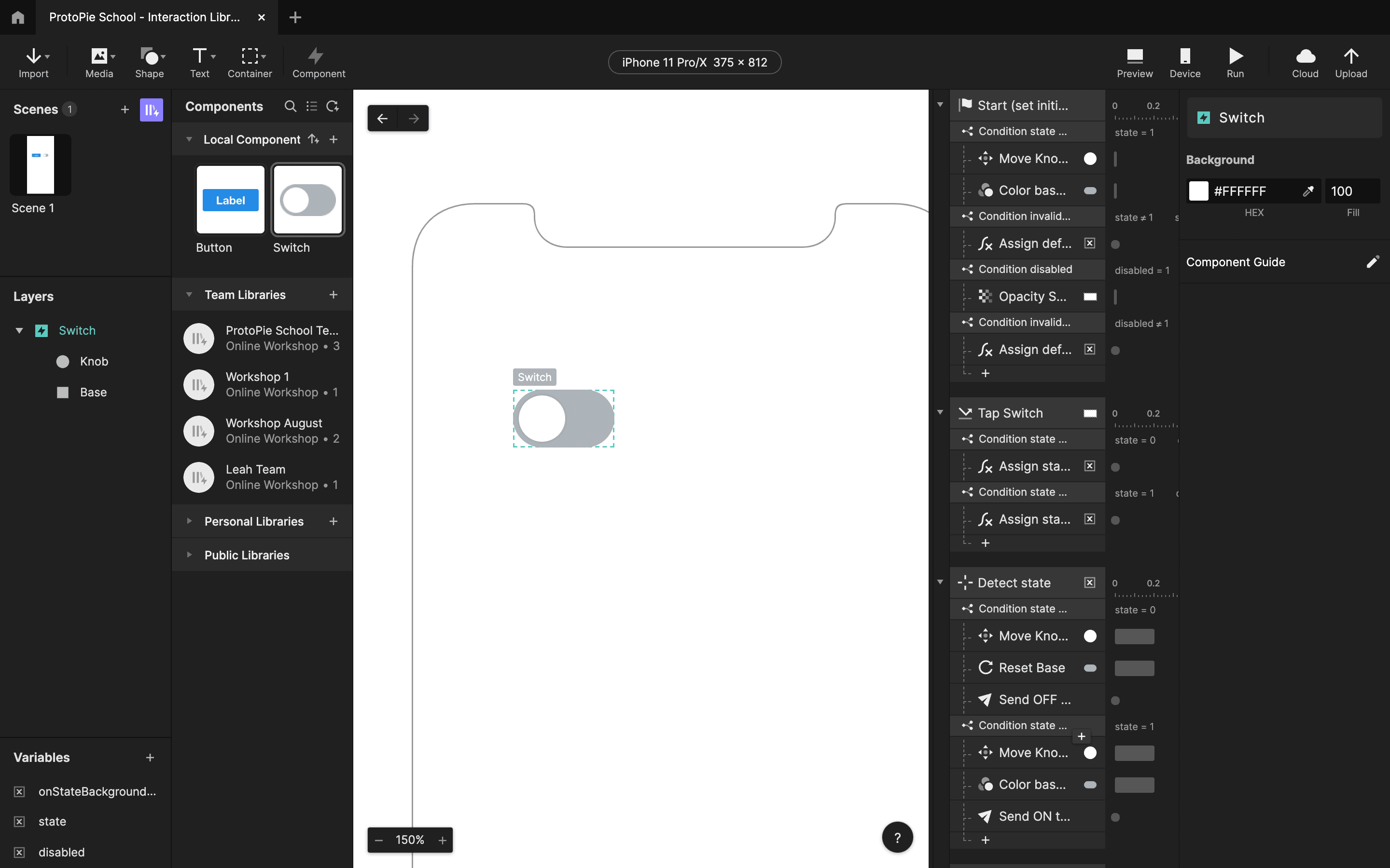
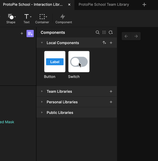
Open the example Pie above. There are two local components inside: a Button component, and a Switch component.
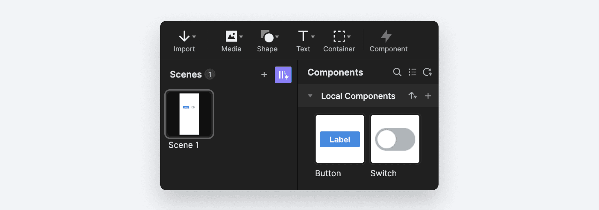
Each of these components has logic built in to make them interactive. For example, double-click the Switch component. It has all sorts of Triggers and Responses built in that make the Switch component functional and flexible.
Step 2: Create a new Interaction Library
Underneath your local components, you'll see three more groups listed:
Team Libraries: These are Interaction Libraries you'll share with your team. These are available to Team and Enterprise plan subscribers.
Personal Libraries: These are Interaction Libraries that are just for your personal use. No one else can see them. They work the same way as Team libraries except that you can't share them with your team.
Public Libraries: These are built-in libraries that are included in ProtoPie studio. More on these a little later.
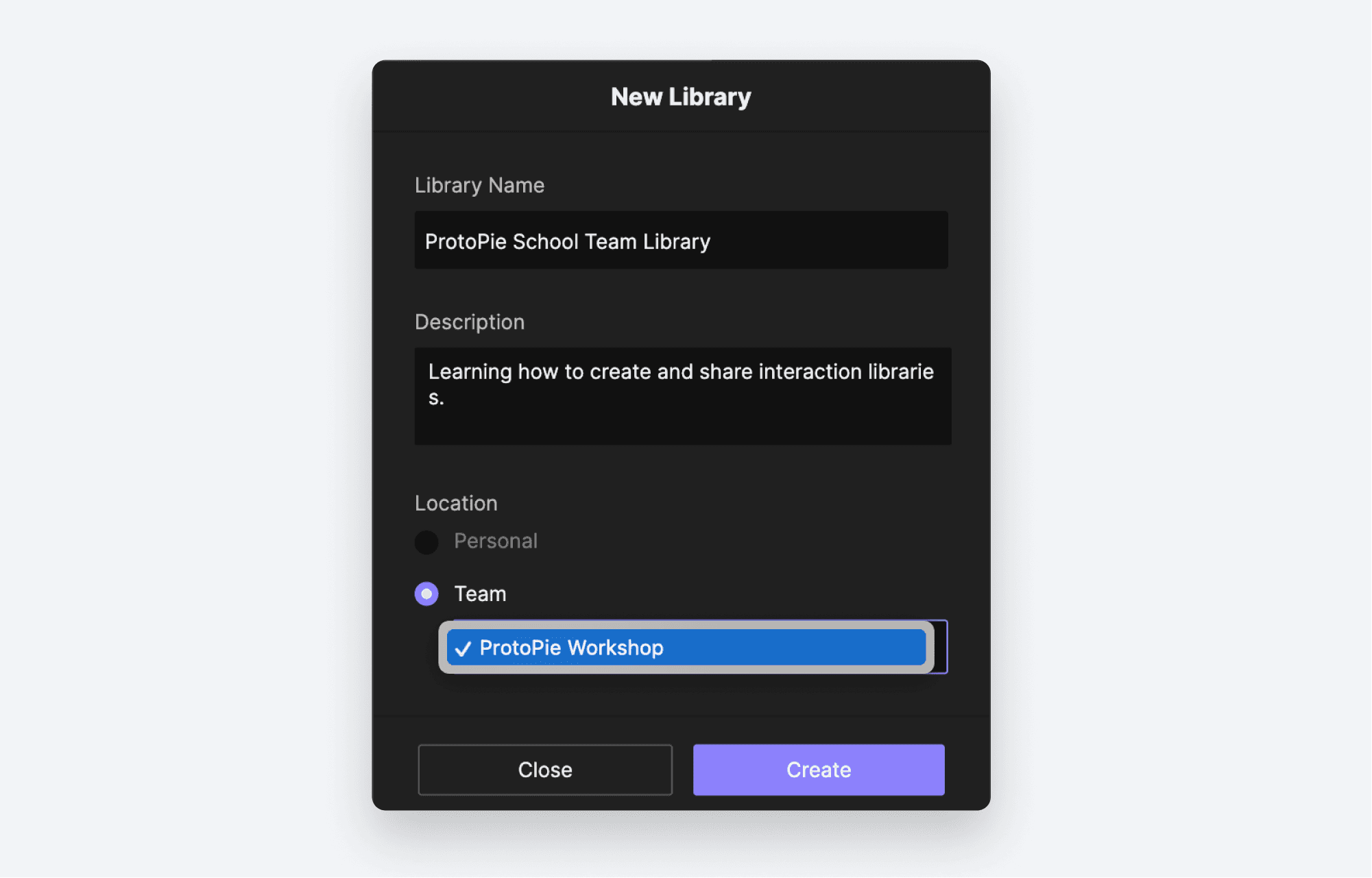
We'll be working with a Team Library in this tutorial. Create a new Team Library by clicking the +** **icon beside the Team Libraries group.
You can now give your Library a name and description, and you can choose which team members you'll be sharing it with. Click Create when you are done.
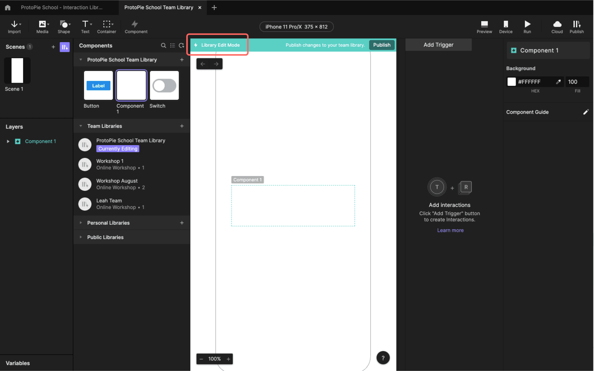
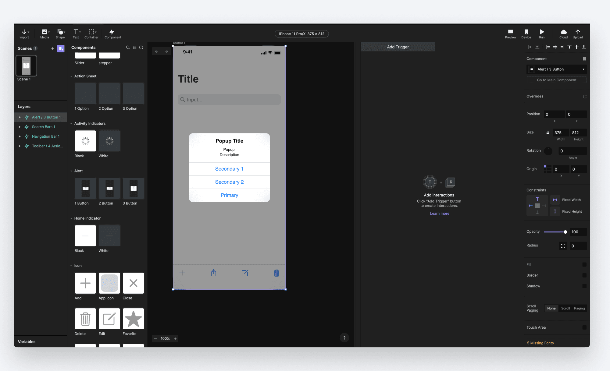
A new tab opens up with your newly created library in edit mode. You'll know you are editing your library as there is a blue bar at the top of your scene that reads Library Edit Mode.
Step 3: Add your first component.
Click on the first tab to return to the example Pie file. In your components panel, click the Switch main component. Right-click, and choose Copy. Then click on the tab for your Library, and paste your component.
The Switch component should now appear in your library, and if you double-click it, you'll notice that all of the Triggers and Responses came along with it.
Step 4: Document your Component with The Component Guide
Once you've added a component to your library that you intend to share with others, it's important that they know how to use it. This step is entirely optional, and if your component is simple, then this might be overkill. But for complex interactions, the Component Guide is a great way to help others get started with your components.
Still in the **Library Edit Mode **screen, double-click the Switch component to edit it. On the far right, you'll see something labeled **Component Guide. **Click the pencil icon beside it.
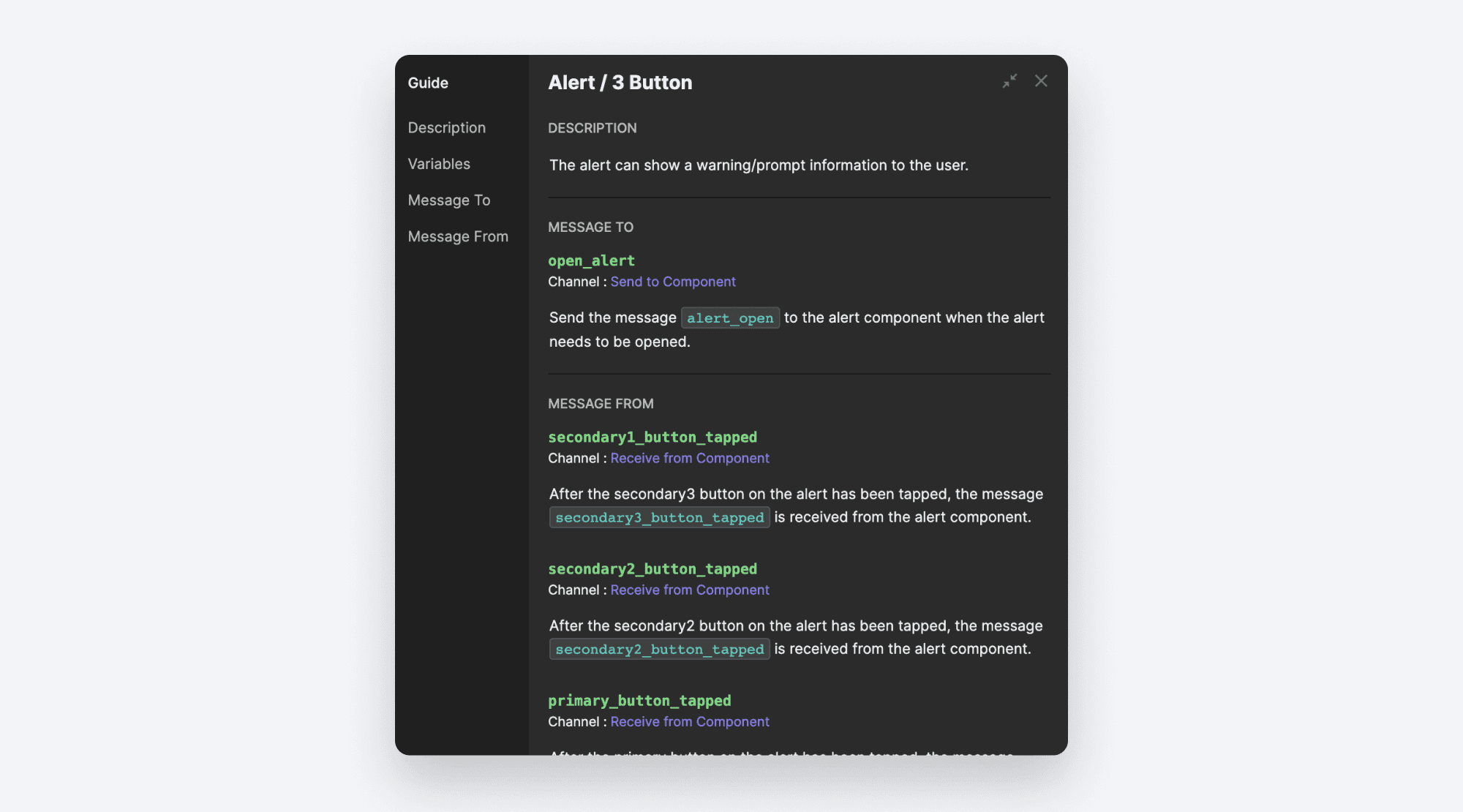
In the window that pops up, you can now explain how your component works. Give it a general description. Any variables that can be overridden are listed next, and you can describe how to use them.
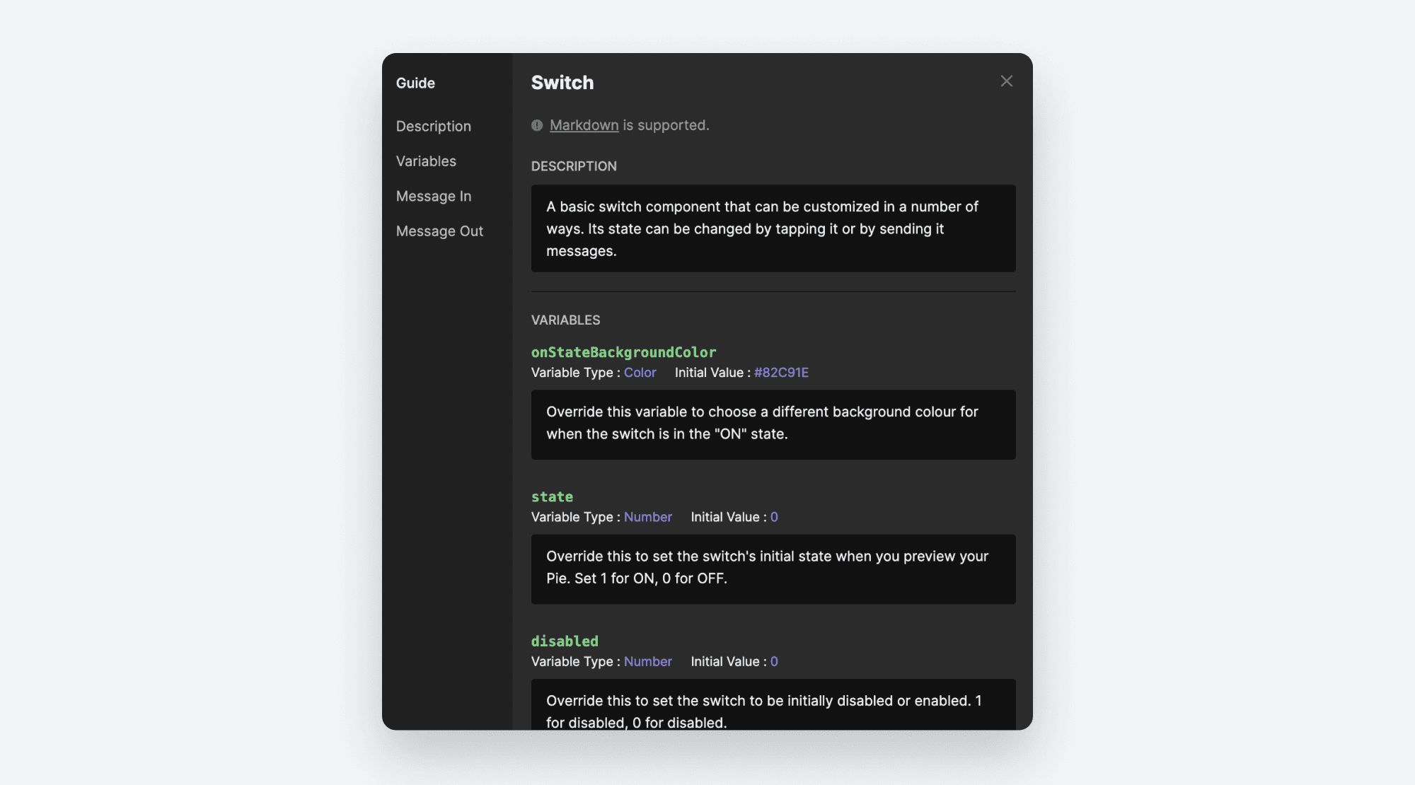
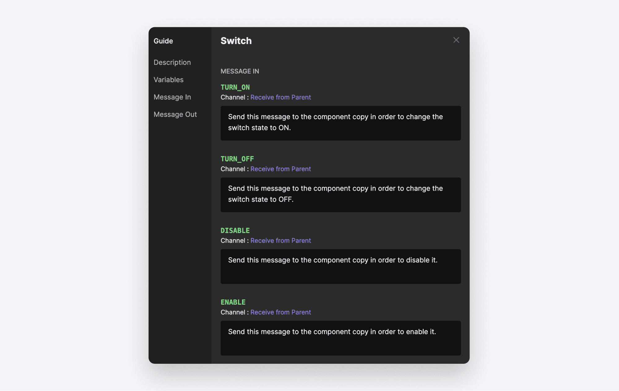
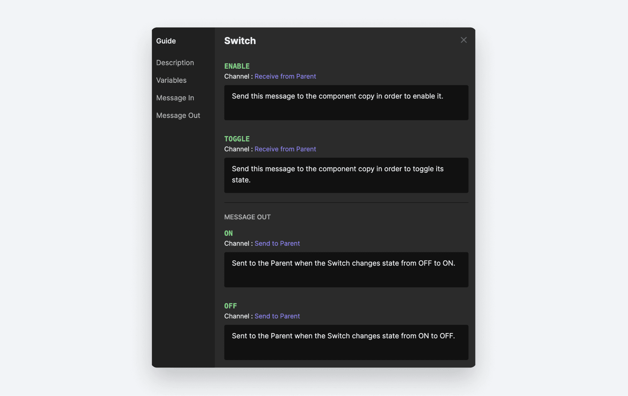
If your component can receive messages, you can explain how each message works in the** Message In **section.
Similarly, if your component Sends messages, you can document these in the Message Out section.
Step 5: Publish your Library
Any changes to your library wont be visible to anyone else until you publish them. You can alternatively save your changes if you're not ready to publish just yet, but know that these changes are saved to the cloud, as that is where the Interaction Library lives.
In the blue bar above your stage click the** Publish** button. If you haven't saved your changes yet you'll need to do that first.
You'll now have the chance to describe your newly published changes.
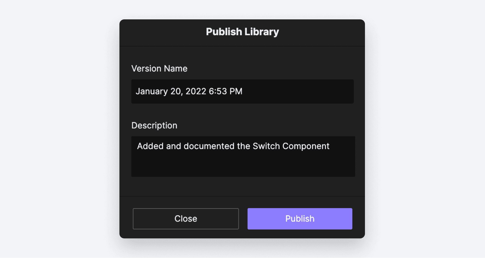
Fill in the details, then click Publish.
You should see a confirmation at the bottom of the screen that your changes published successfully. Now all of your team members can see these updates! You can go ahead and close this library for editing. Choose File → Close.
Using your new Library
Now that you've published your library, let's see how we can use it. Create a new Pie. If it's not open already, open the components panel by clicking the component icon.
Your new Library should now be listed under Team Libraries. All of your team members you shared to when you created the Library will automatically have access to this.
Click on the library and you'll see all of the included components.
You can drag these into your Pie just like local components. Drag the Switch component onto your scene.
Remember the Component Guide? We can view it from here. Look in the inspector panel on the far right. Beside the label Component there is an icon that looks like a white box with two lines in it. Click it.

Here you'll see all of the documentation you added in **Step 4 **above.
Adding more components to your Library
In order to add additional components to your library, you can just follow the same steps as above. But first, you'll need to know how you can open your Library for editing once again. Click the tab for our original Pie, the one with the local versions of the Button and Switch components.
Let's add the Button component to our library. Like before, right click the Button component, and choose Copy.
Now expand the Team Libraries group to reveal the new library you created. When you hover your mouse over the library, an ellipsis icon will be revealed. Click it, and choose Edit Library. Your library will once again open in** Edit Mode.**
Like we did before, paste your component. Edit the Component Guide if you wish.
You can delete components from your library as well. When a new library is created, ProtoPie adds a blank Component 1 to the Library by default. If you want to remove it, right-click it and choose** Delete.**
It should be noted that you can always directly create components in your library. You don't need to copy them in from a Pie file. Click the** + **icon beside your Library name to create a new empty component, double-click it to edit it, and go nuts!
Finally, publish your changes.
Public Libraries
ProtoPie comes with some built-in libraries ready to use. These are listed under the** Public Libraries** group in the Components panel. You can use these exactly the same way as your Team Library. Simply drag components from the library directly on to your scene.
*You'll find libraries for Material Design as well as an iOS UI kit. *
As with your own component library, you can consult the component guide for more details on how they work.
Easy as Pie!
Now you're ready to build out your own Interaction Library and share it with your team. Congrats!
Resources
How to Make a Toggle Button with Condition: Learn how conditions in ProtoPie to work to make toggle buttons, and much more.
Checking items in a Checkbox Form using Components and Send & Receive: In this lesson, you will learn how to use the checkbox component effectively to check and uncheck items in your prototype.
Making a TV Controller Using Components: This tutorial will help you make a TV controller that can be operated using your keyboard (left and right arrow keys).
Prototype a Dropdown Menu using Components for a Faster Workflow: ProtoPie will help you achieve a faster workflow for creating dropdown menus by using components that reduce repetitive tasks. ProtoPie also uses send and receive functions to seamlessly share information between inputs. Have fun!


