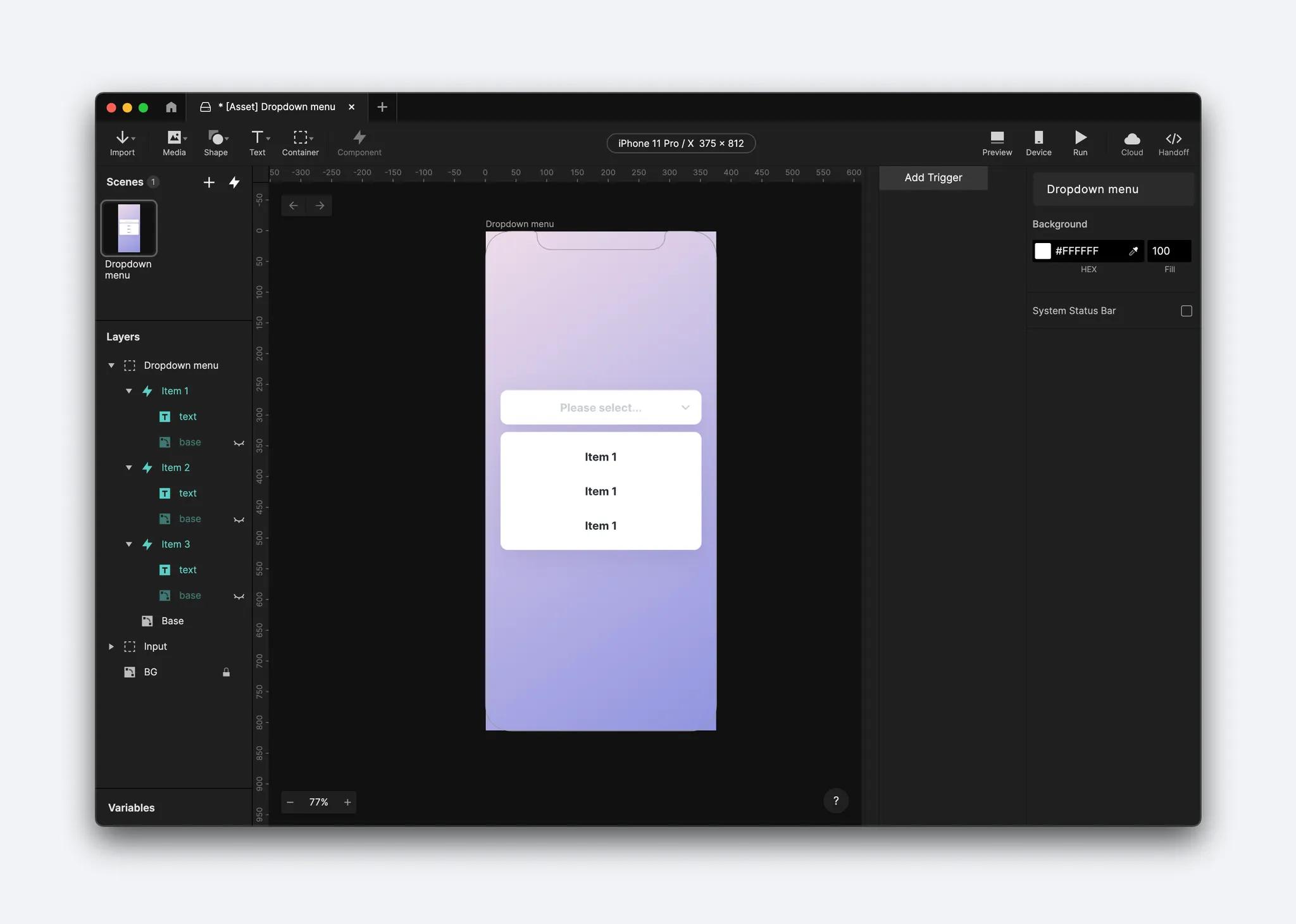
Dropdown menus are an essential selector element because they condense lists into a menu that can easily expand and contract. When the menu is activated with a click, a "drop-down" displays the list of values until the user selects their choice, and the menu returns to show that single item.
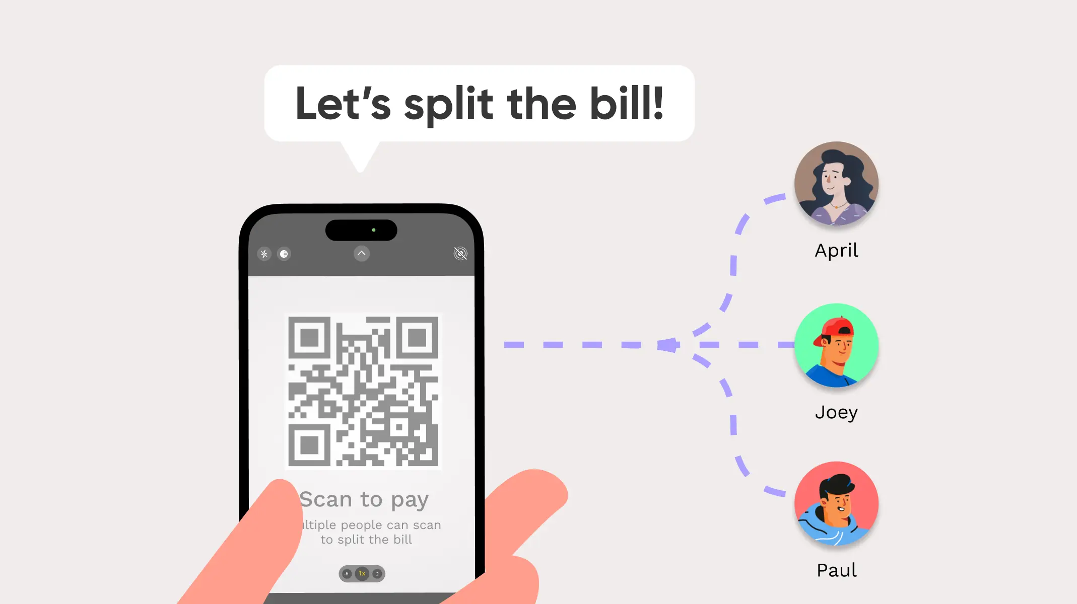
Retail sites often use dropdown menus to organize lists like calendar dates or size selections to deliver a clean interface and easy usability for users.
ProtoPie will help you achieve a faster workflow for creating dropdown menus using components that reduce repetitive tasks. ProtoPie also uses Send and Receive functions to seamlessly share information between inputs. Have fun!
Overview
Step 1. Turn the item into a component
Step 2. Create the item hover state
Step 3. Display the selected value in the text field using Send and Receive
Step 4. Enable the menu to expand and collapse by setting up a conditional interaction
Step 5. Make the menu disappear on selection
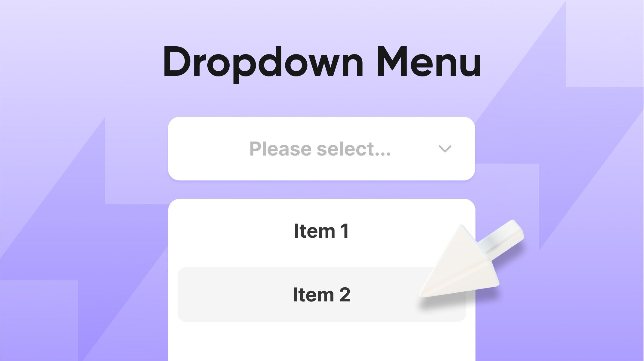
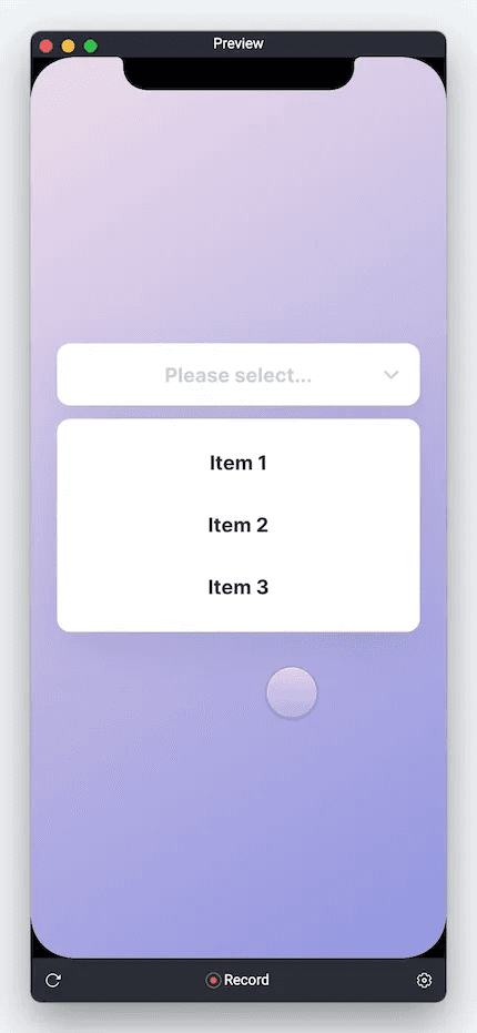
In the end, you’ll be able to make something like this👇
[Starting Pie File] [Completed Pie File]
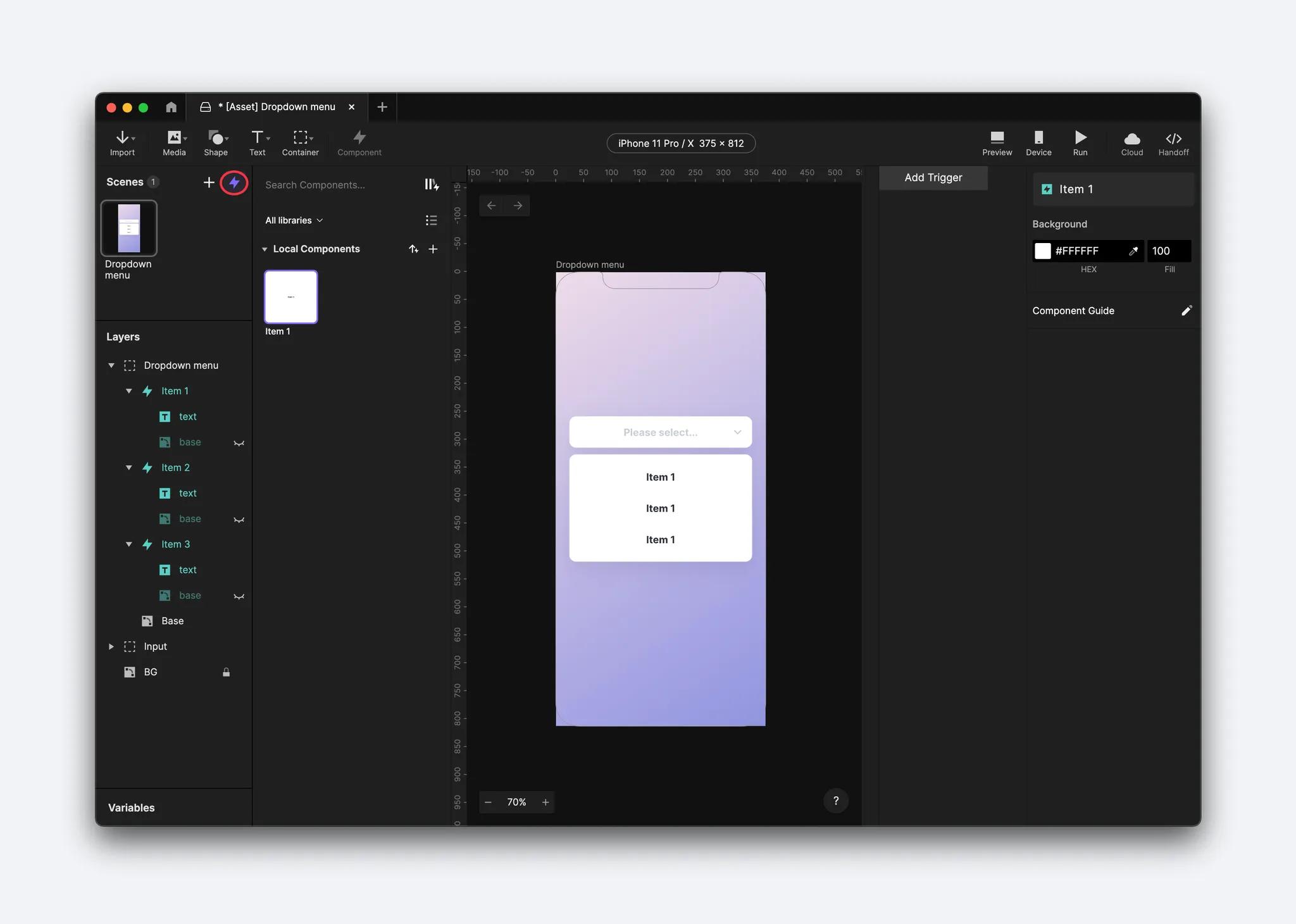
Step 1. Turn the item into a component
To start, delete list items two and three because you are going to be creating and using components. Components are saved layers and interactions that you can reuse. They save you from doing repetitive work and accelerate your prototyping.
With list
Item 1remaining, select and convert it to a component. The layer's icon will turn from a grey container icon into an aqua-colored component icon.Copy and paste these components to create three items and drag them down to create your list.
Step 2. Create the item hover state
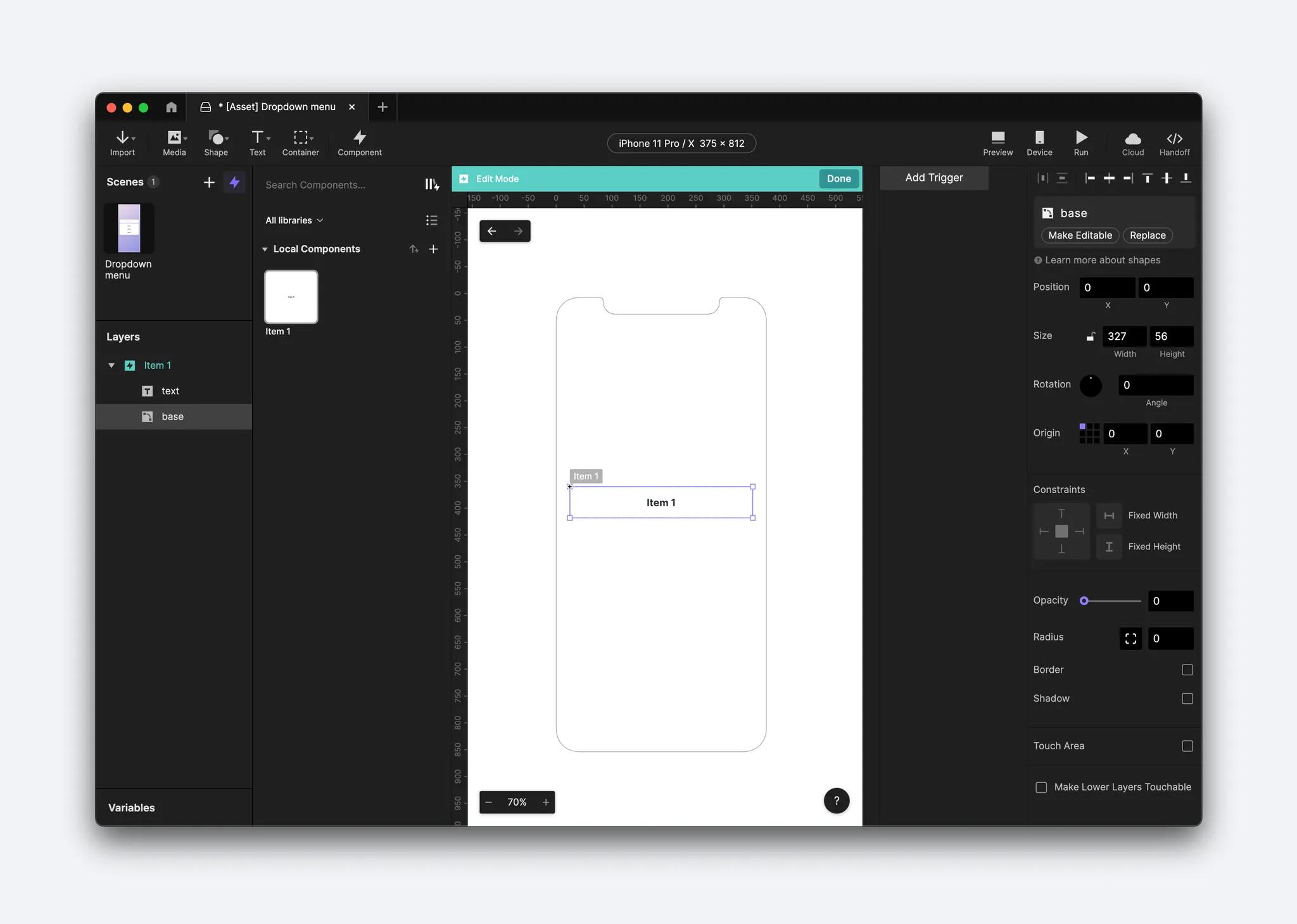
Click the lightning icon (located next to the Scenes Panel on the left) to open the Component Panel. Then, double-click on the Item 1 component to enter Edit Mode.
In the Layers panel, make the base layer visible and set its opacity to 0.
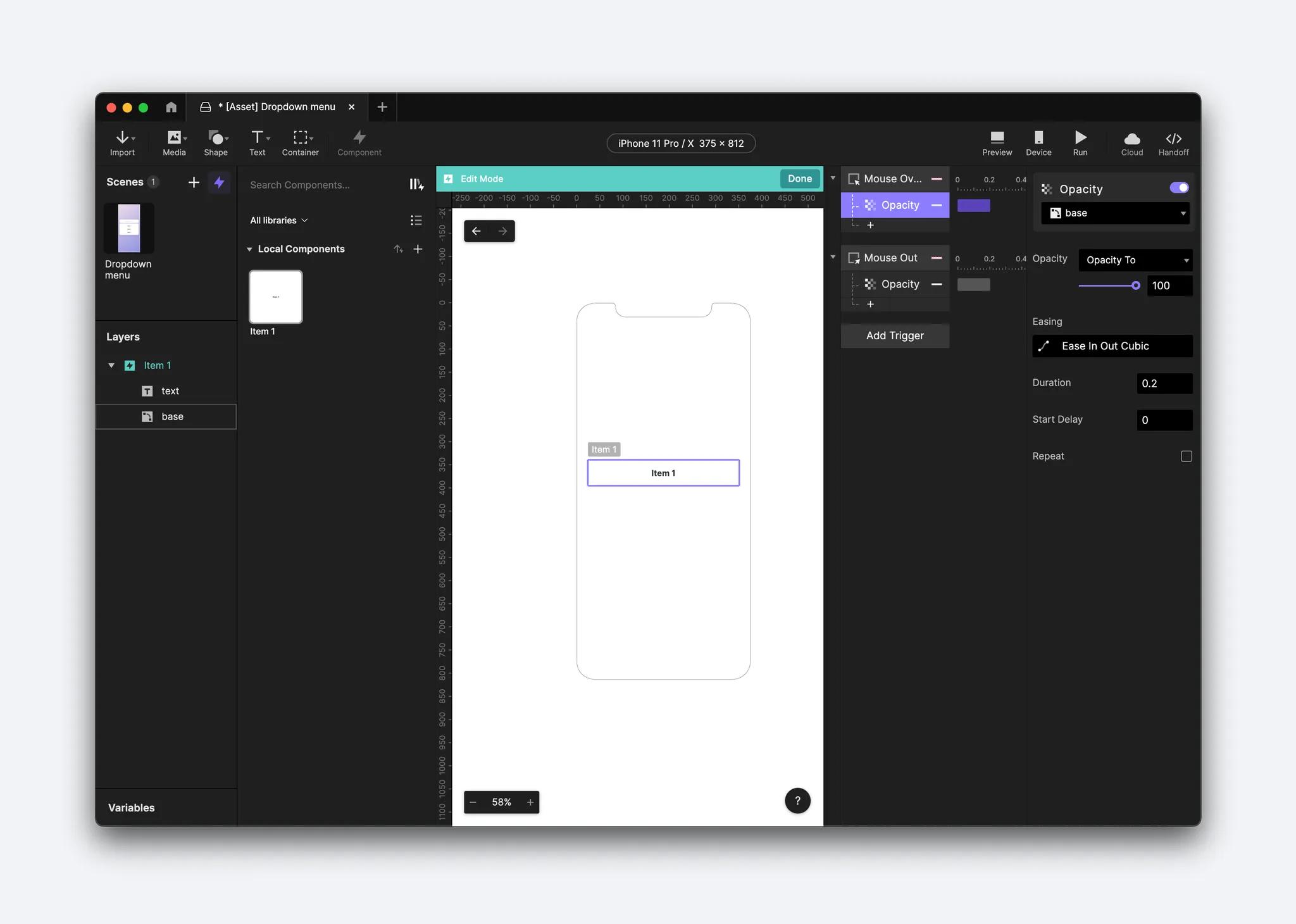
Add a Mouse Over and a Mouse Out trigger to the Item 1 component.
Add an Opacity response for each trigger, both linked to the base layer. For the Mouse Over trigger, set the Opacity response to 100, and for the Mouse Out trigger, set the Opacity response to 0.
Make the text layer editable in the component (this step is only needed if you've imported assets from another design tool).
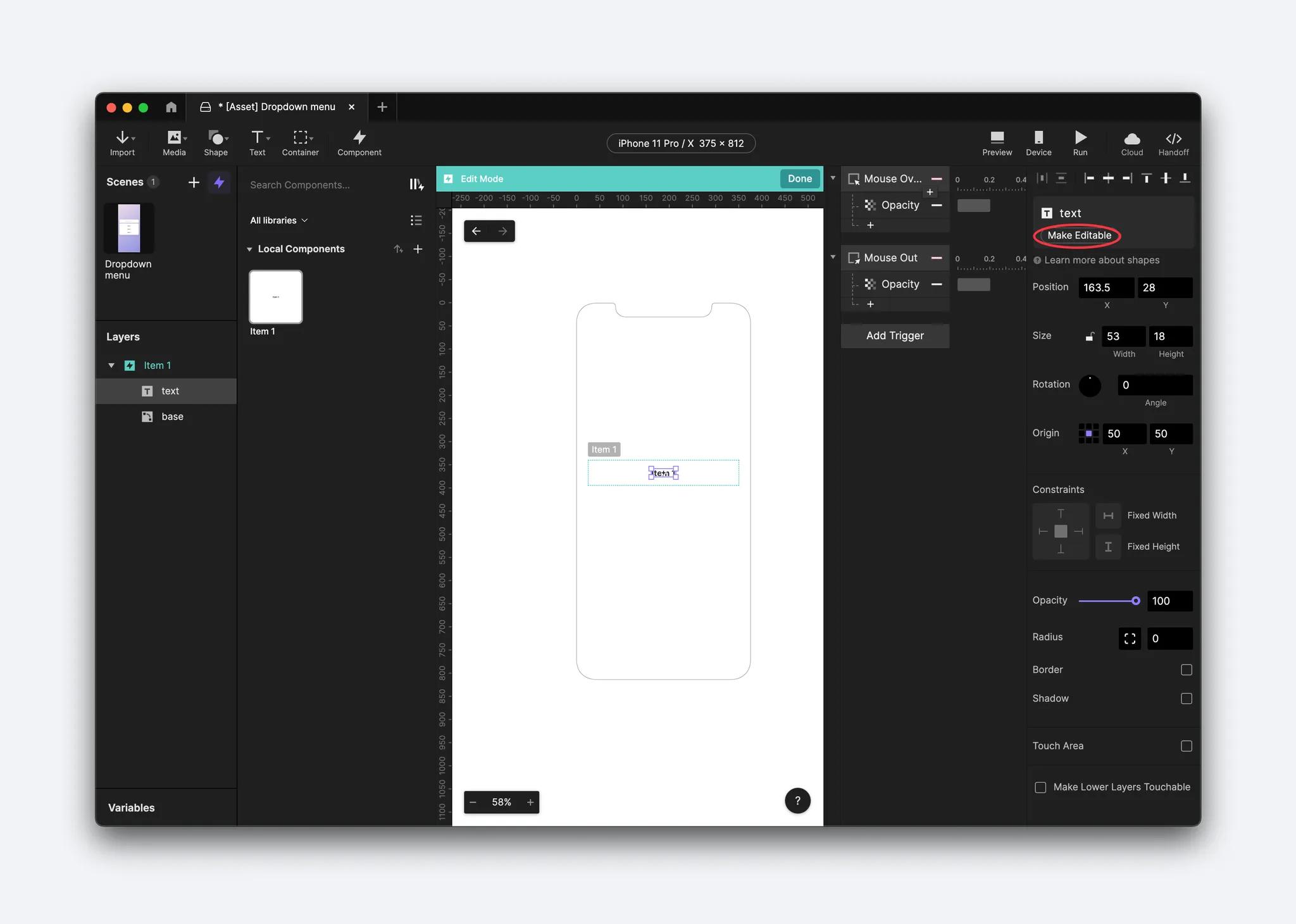
Go to the main scene (Dropdown menu), where you can customize the text of each component.
Check the preview to confirm that the opacity changes when you hover your mouse. All items should respond to the hover effect since any changes made to the main component automatically sync with each instance of it.
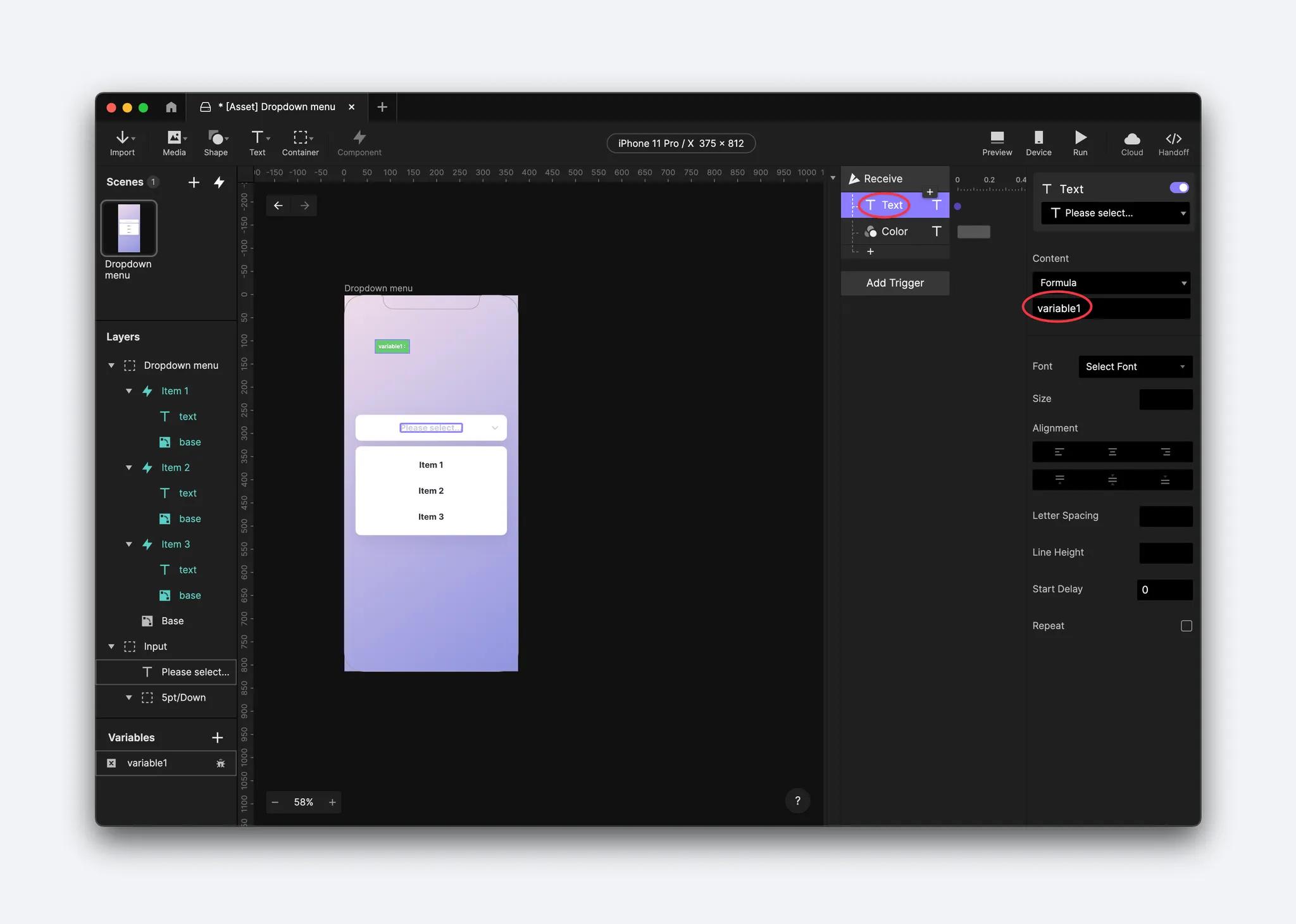
Step 3. Display the selected value in the text field using Send and Receive
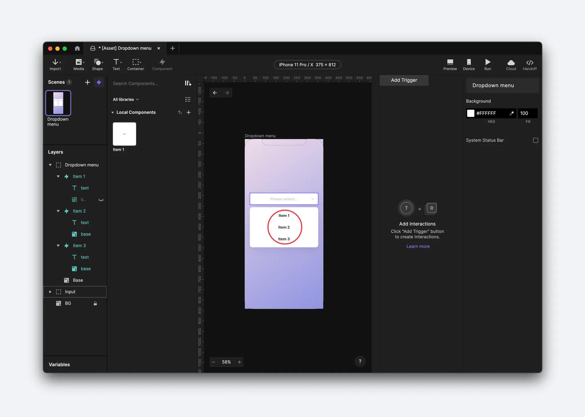
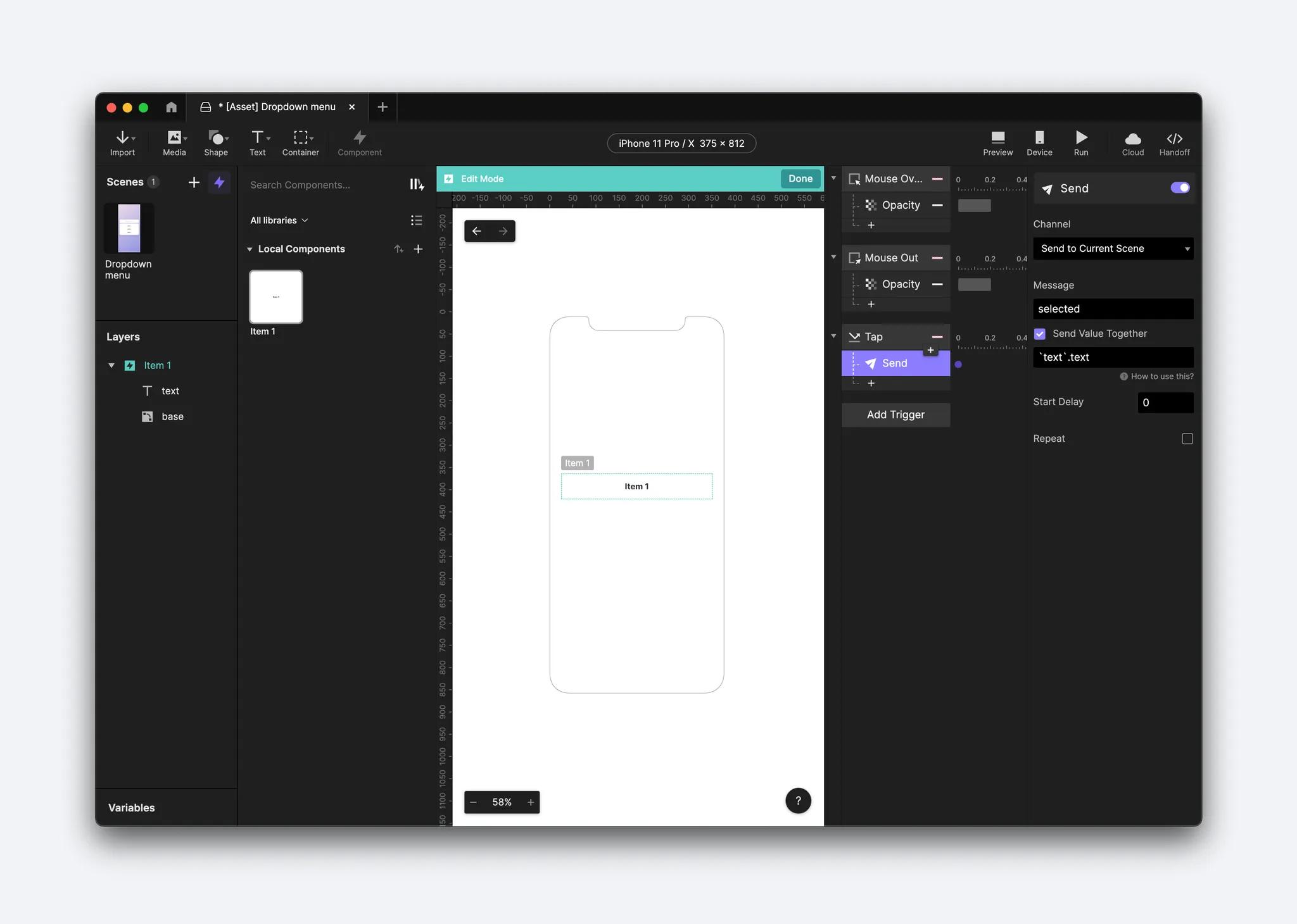
Return to the main component and add a Tap trigger to the component itself.
Add a Send response inside this trigger.
💡 Tip: In ProtoPie, components are isolated from each other and scenes. To overcome this limitation, we need to use Send and Receive functions. In this step, you are creating a Send response in order to share information between your component instances. In this case, we'll use Send and Receive to specify which item is selected and let the main scene trigger deliver a response based on that.
Under Channel, select Send to Current Scene because you are sending and receiving in one scene, but open the channel menu to the options for where you can send information.
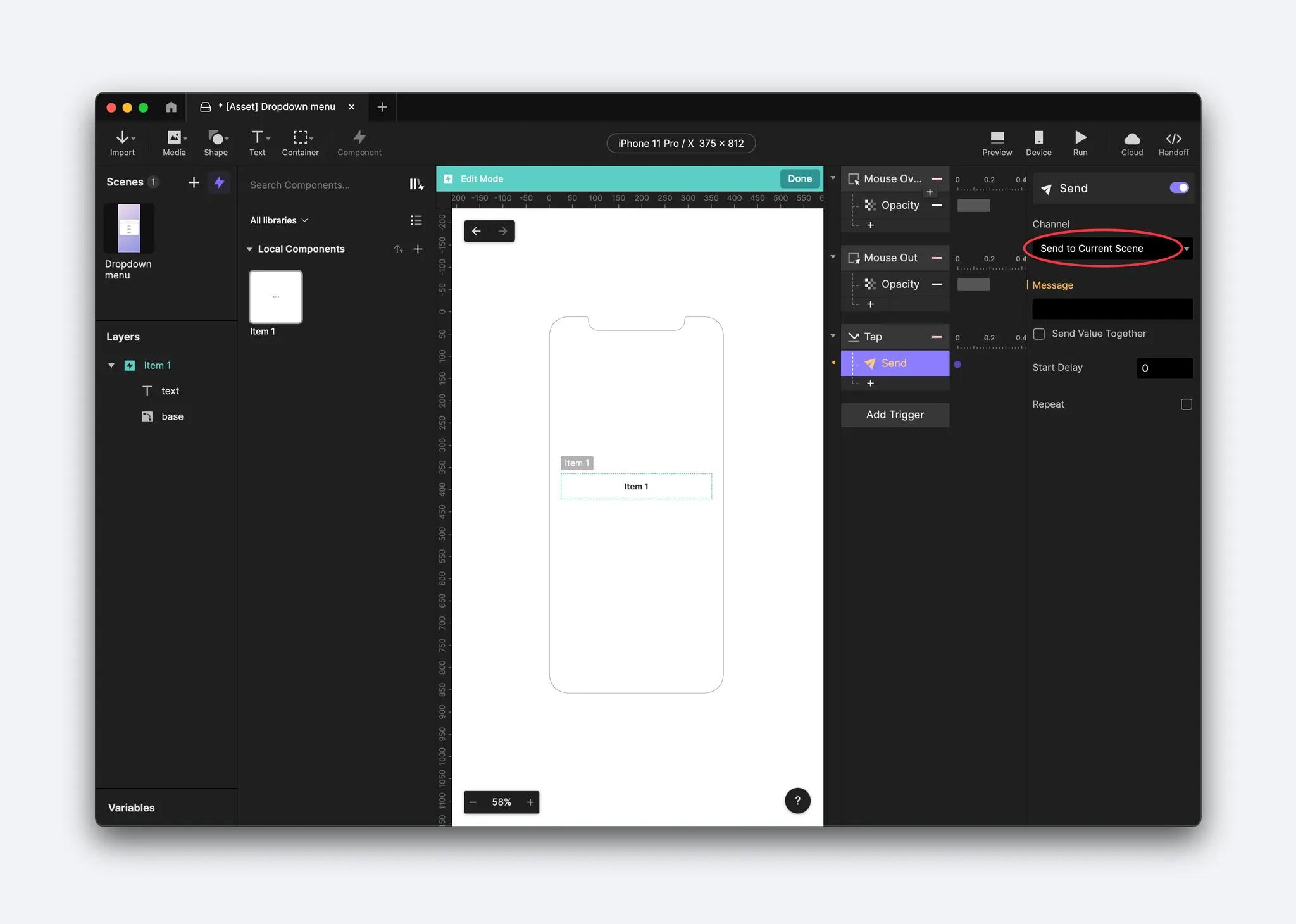
Give your message a name such as selected. Then check Send Value Together because we want to know which component has been selected.
The formula you will be using here is
'text'.textThis means you will be sending the value of the text layer and the message to the component's text layer.
Go back to the main scene and add a variable for all scenes. It is important that you change the variable in the property panel into a text format because that is the format you'll be using. You'll use this variable to store the value sent from the component.
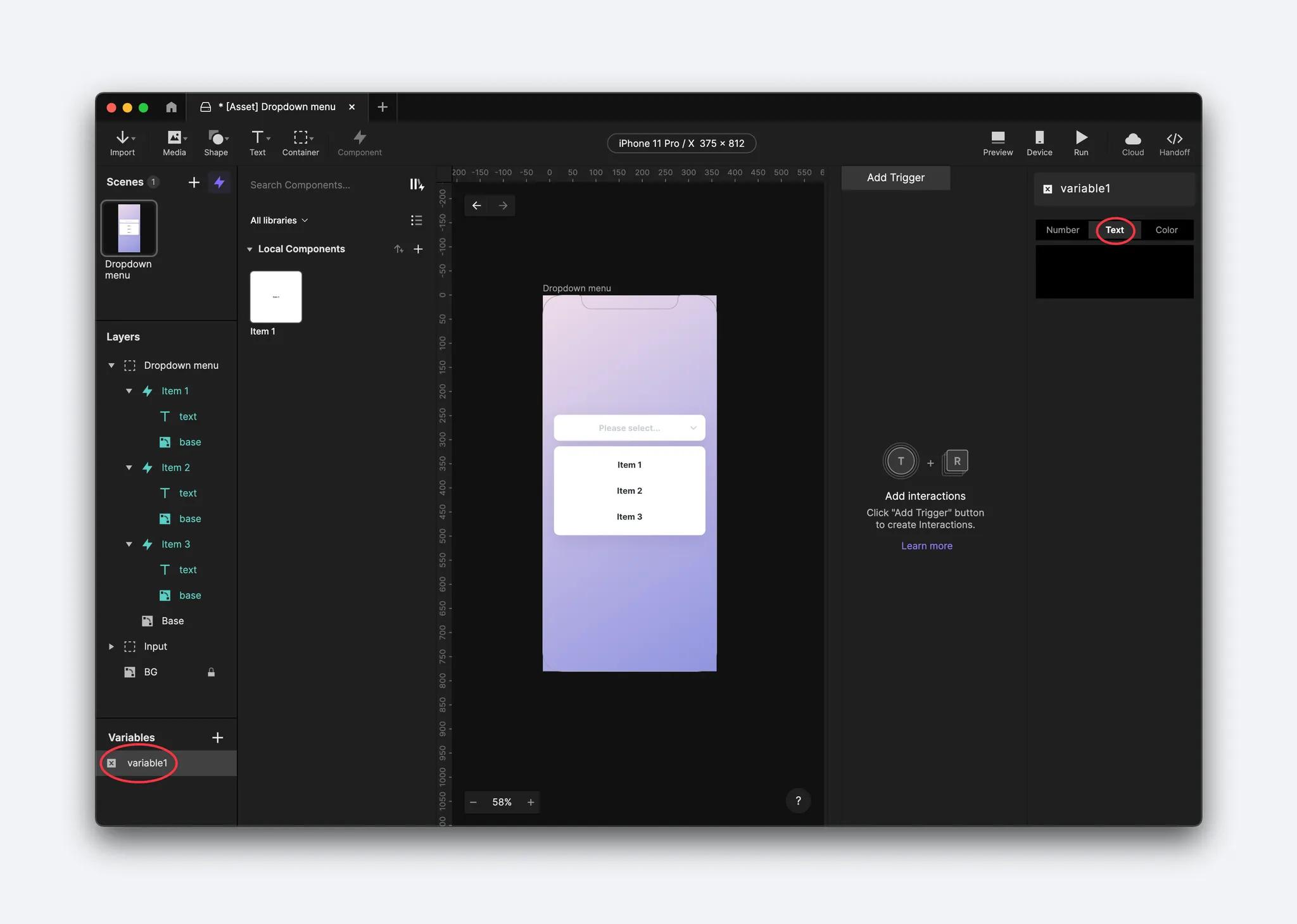
Add a Receive trigger, select your text value to send in the message, and assign the text value to the variable you just created.
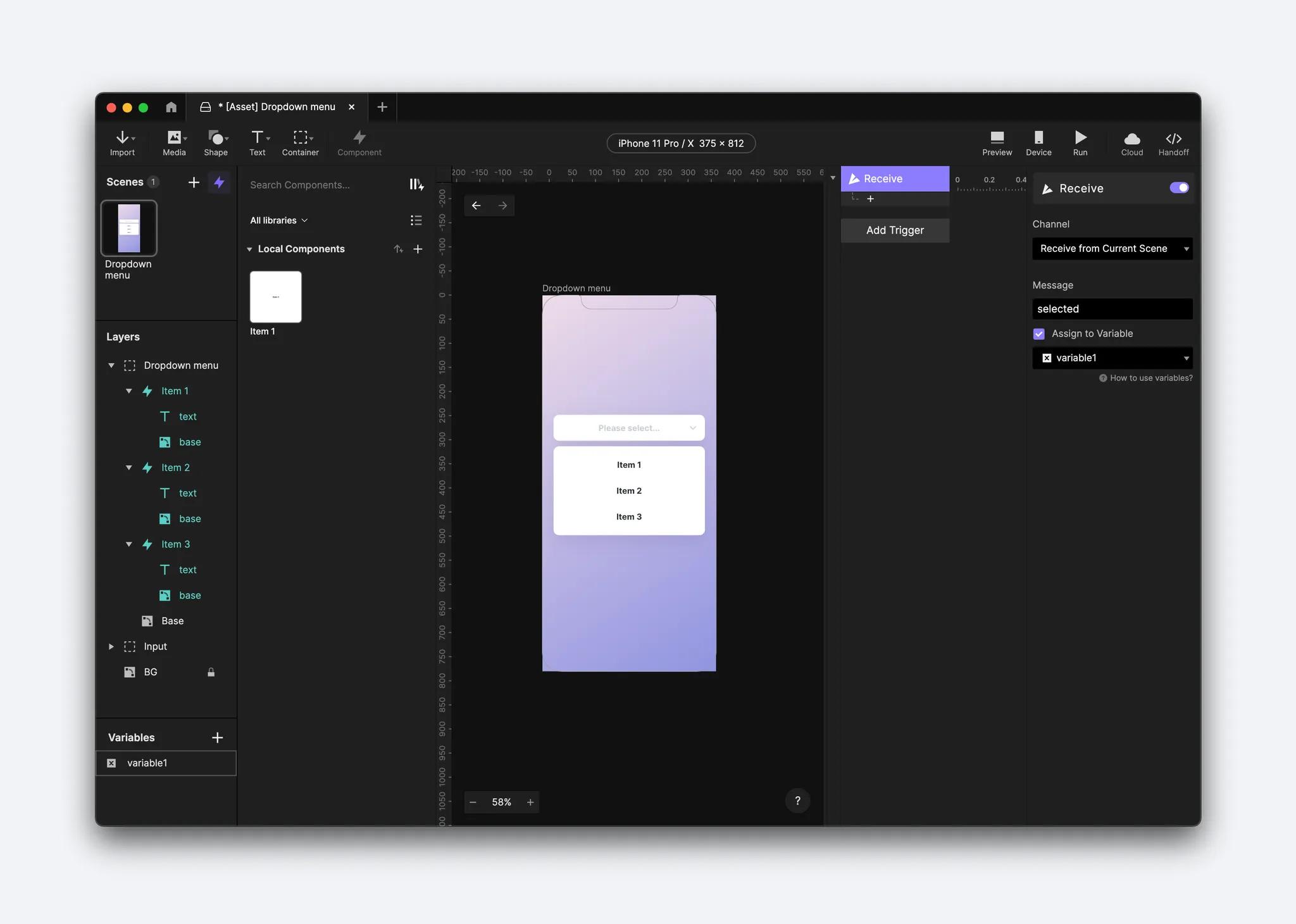
Under the Variables panel, you can click on the bug icon to have the variable displayed in your Preview window. This debugger tool lets you check things are working properly. As you click on any item, the selected value should be displayed in this variable.
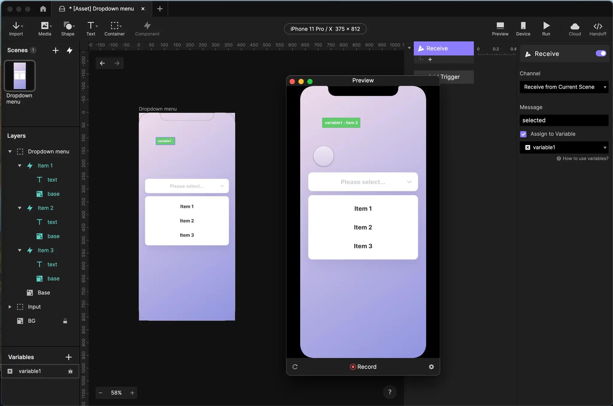
Go to the Input layer and convert the text layer to be editable. Then, add a Text response in the Receive trigger with the text layer as the input field.
Using a formula, change the value to be the variable itself. You can also add a color response to customize your text. In this example, we chose a dark grey (#2C3038).
Step 4. Enable the menu to expand and collapse by setting up a conditional interaction
Let's add more interactions to the dropdown menu itself.
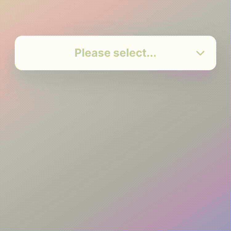
First, set the opacity of the dropdown menu to 0. This is the initial state.
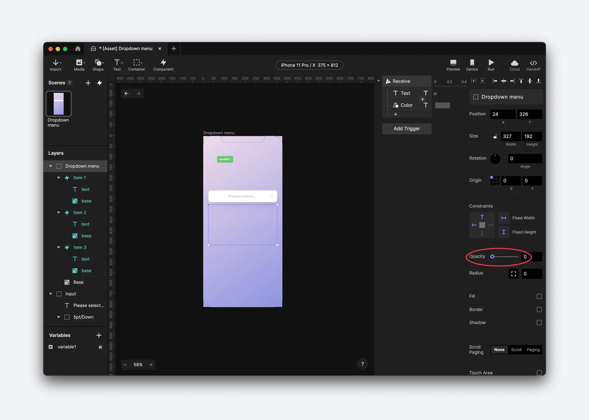
Add a Tap trigger to the input container. Add a Condition linked to the dropdown menu. In this demonstration, we are using
Fill Opacity, but you can also try others.
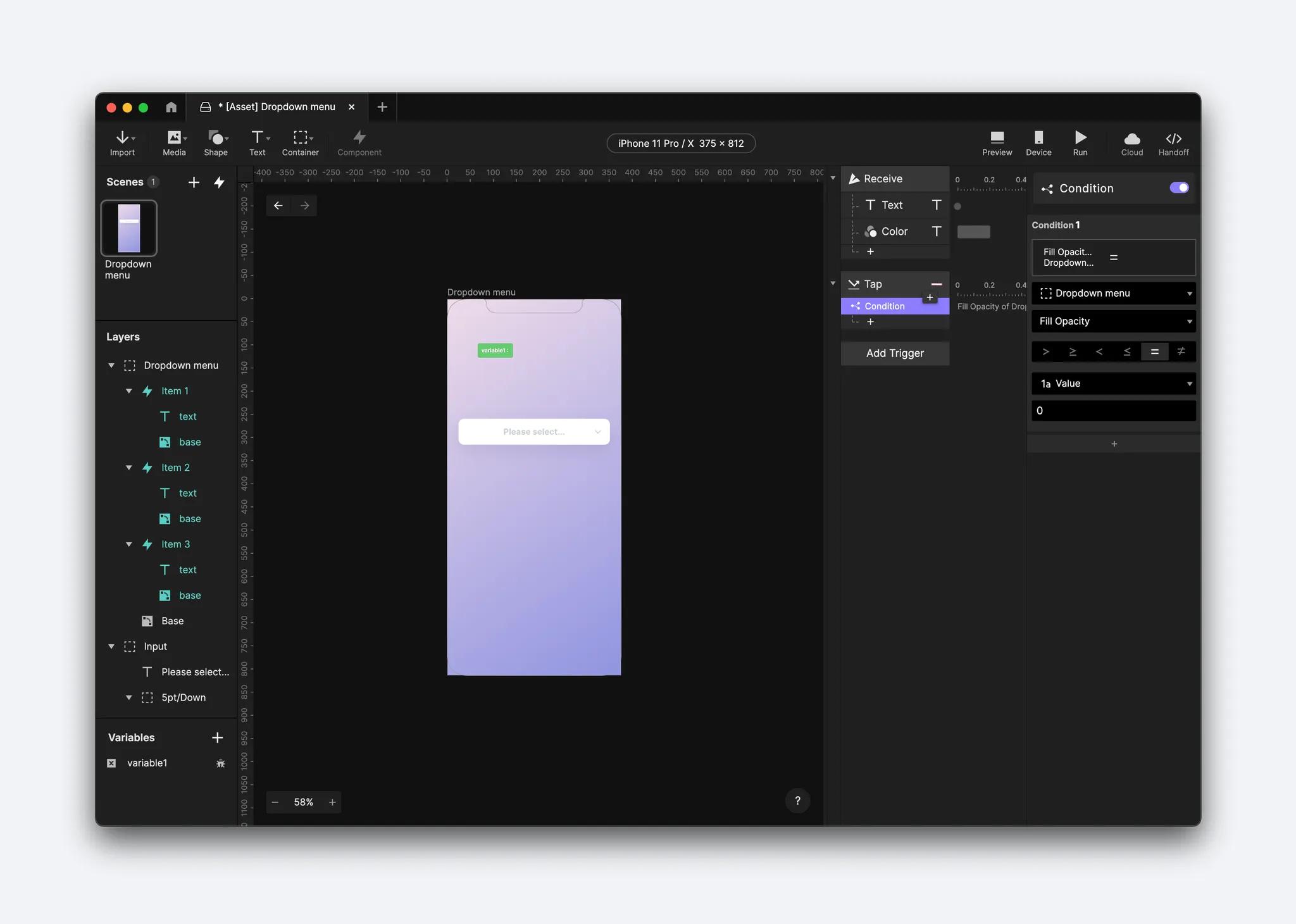
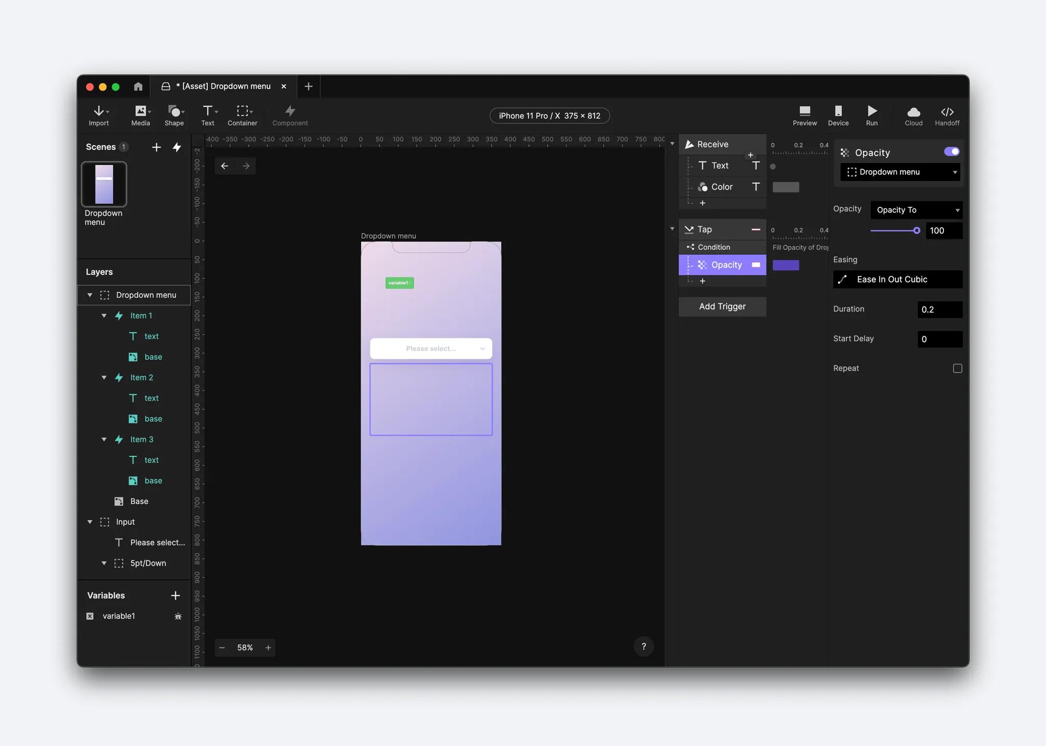
When the condition of the dropdown menu's opacity = 0, we add an Opacity response and set it to 100. In other words, when you tap the input, the dropdown menu will appear.
You can also add a Rotate response to the small arrow for an additional micro-interaction. Do this by adding a Rotate response to the Tap trigger and select the arrow.
You will need to change the arrow's origin point to be in its center. Rotate the arrow to the degree you want, in this instance, 180 degrees.
To reverse this sequence, duplicate the condition, change the new condition's opacity property to = 100, and change the Opacity and Rotate responses to 0.
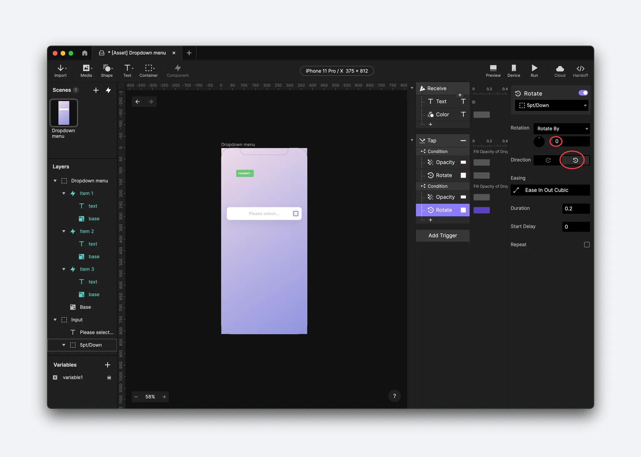
💡 Tip: You can also use Reset to change the opacity to its initial state.
In this case, you can't use reset of rotation because a reset response doesn't allow you to choose a rotate direction.
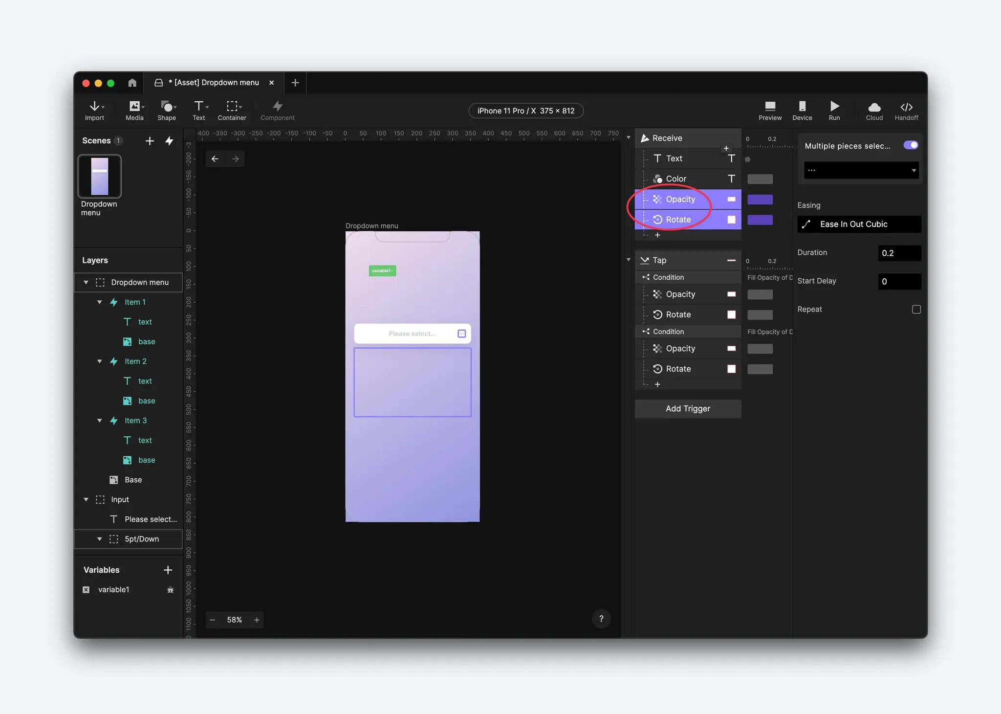
Step 5. Make the menu disappear on selection
Don't forget to also make the menu disappear when an item is selected. To do this, duplicate the interactions you just made and move them into the Receive trigger.
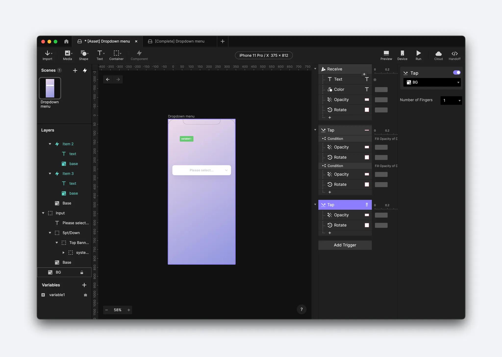
You can add one more interaction to make the menu disappear when clicking outside the component. To do this, add a Tap trigger on the BG layer and duplicate the interaction you just made into this Tap trigger.
Congratulations!
You've learned how to create a dropdown menu using components. You included beautiful interactions that will make your prototypes sing!
We’d love to see your creative experiments! Create your prototype and share it on X or Instagram using the hashtag #MadeWithProtoPie.