

DSLR user interfaces don't have to be mundane; they can be a canvas for innovative design, blending functionality with an engaging aesthetic to enrich the photography experience.
In this article we share tips for designing an interactive, modern UI prototype, from adjusting focus and brightness to zoom effects and photo capture. Explore a new approach to DSLR interfaces using the power of ProtoPie!
Overview
Create a DSLR interface prototype
Set focus and brightness
Create zoom in & out effects
Capture a picture
Navigating the gallery
Picture controls component
Airdrop Modal
Design incredible camera interfaces with ProtoPie
Create a DSLR interface prototype
Our tutorial takes you on a journey to design an interactive, iOS-inspired prototype, injecting fresh, modern energy into camera UI design. Get started with the tutorial to transform your interface concepts into dynamic realities like the DSLR UI demo below.
Set focus and brightness
To create similar focus and brightness settings to the iOS camera, we created the focus container which contains the yellow square and the sun icon representing the brightness slider.
Apply a Tap trigger on the camera container to move and fade in the focus container to show where the user is focusing on at the moment. Using stop responses before makes sure the animations are not interfering when tapping fast.
Use a** Drag **trigger on the sun icon to move the sun vertically. This value is chained to the opacities of the white and
blackoverlays in the camera container, which creates the brightness adjustment effect. Dragging down will make it darker, and up will make it lighter.
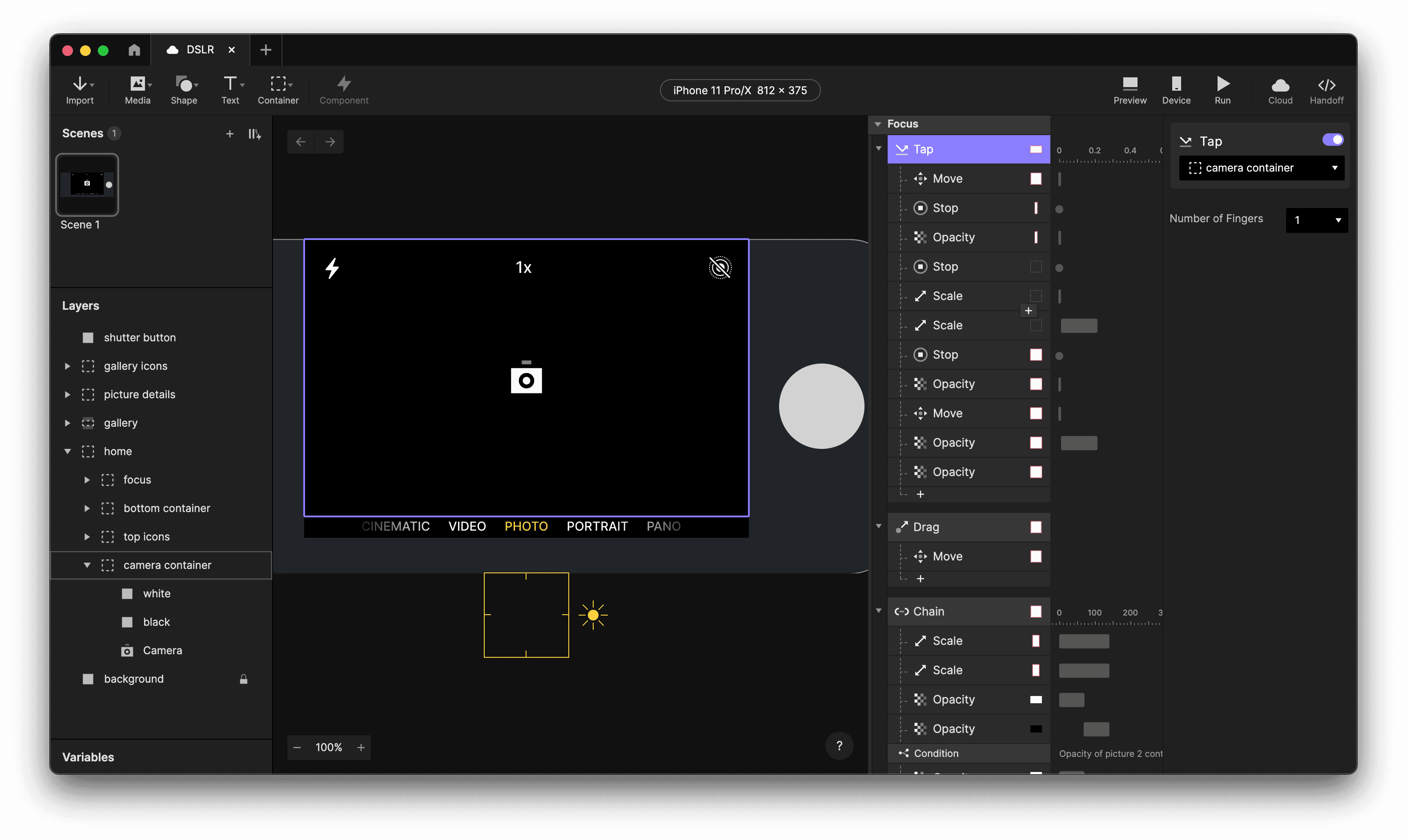
Set focus and brightness
Camera focus.
Create zoom in & out effects
To create a zoom effect, we are simply scaling up and down the camera object.
Use a** Pinch **trigger on the Camera to scale it relative to its origin. We only set a minimum to prevent the image from becoming smaller than the screen.
Apply a** Detect** trigger on the width of
Camerato adjust the zoom indicator, the “1x” on the top centre. It uses the following formula to do so:format(Camera.width / 500, "#.0") + "x"
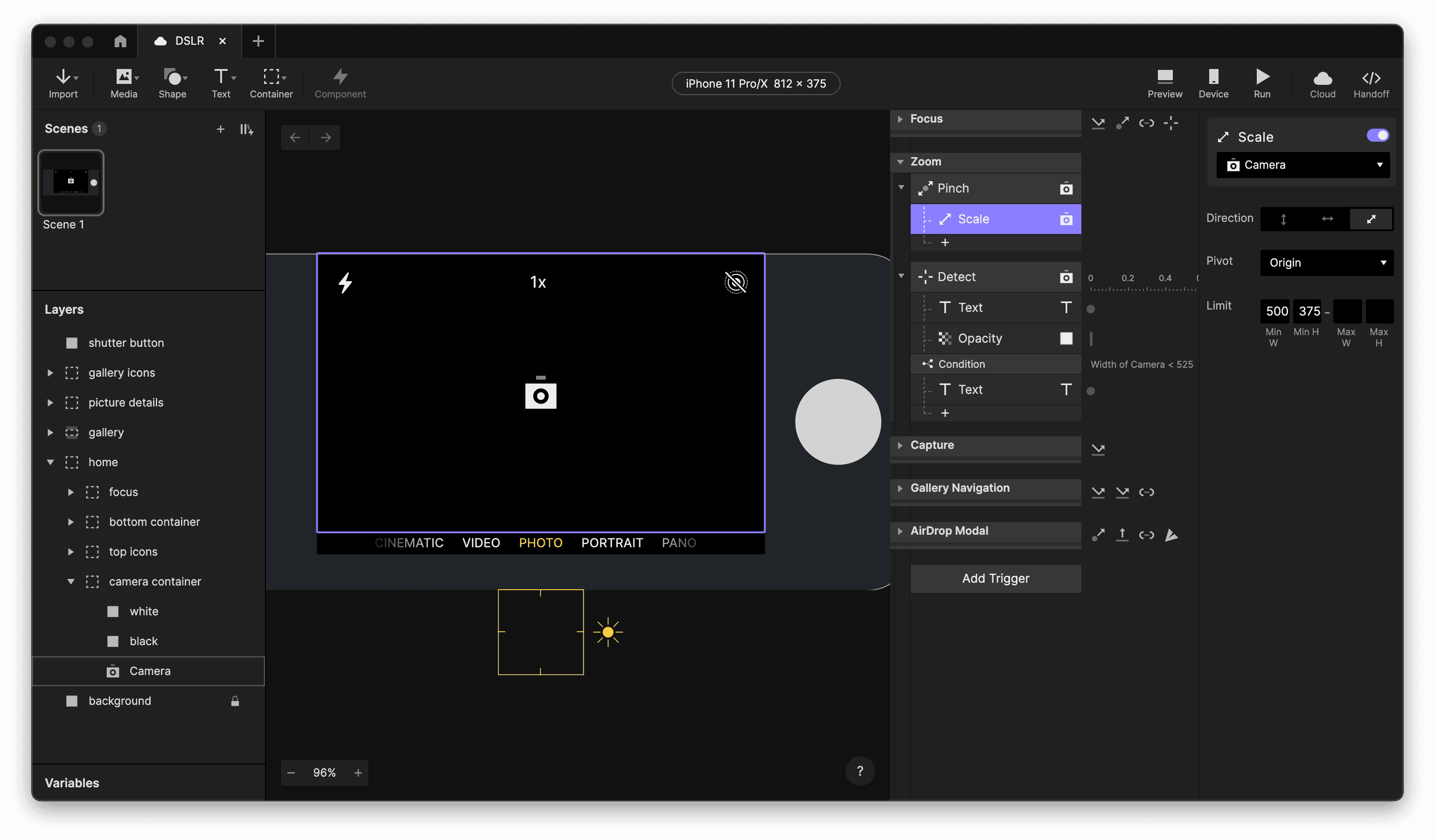
Create zoom in and out effects.

Camera zoom.
Capture a picture
In a DSLR camera, the shutter button would be a physical button so for this mockup we replaced that with the grey circle on the right. If you want to connect your prototype to an actual physical button, you can of course do that with ProtoPie Connect.
Apply a **Tap **trigger on the
shutter buttonto stop the camera in the container in the back, and animate it to the front. These are thepicture 1 containerandpicture 2 containerinsidepictures.
In theory we only store one image, even if we take multiple photos. The other container is moved to the back and the camera inside starts capturing again. If we take a picture again, it will stop the camera in the container in the back and animate it to the front.
This creates an infinite animation with just two items. For this demo, storing one image is enough, but if you need more you can add more picture containers.
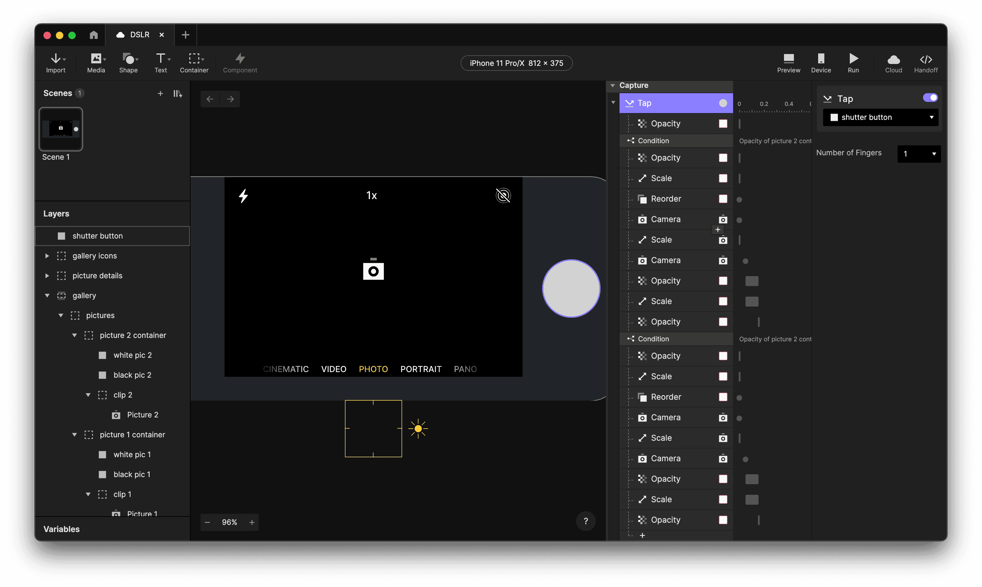
Capture a picture.

Image capture.
Navigating the gallery
The pictures contains the image you have taken. We will animate this into the gallery view when it’s tapped. Similarly, the back chevron will do the reversed action.
Use a Tap trigger on the
picturesto open the gallery with the scaling and moving animation. If the gallery is already open, it will open the picture details.Apple a** Tap** trigger on the
back chevronto reverse the previous. If the picture details are open, it goes back to the gallery, otherwise it closes the gallery and goes back home.
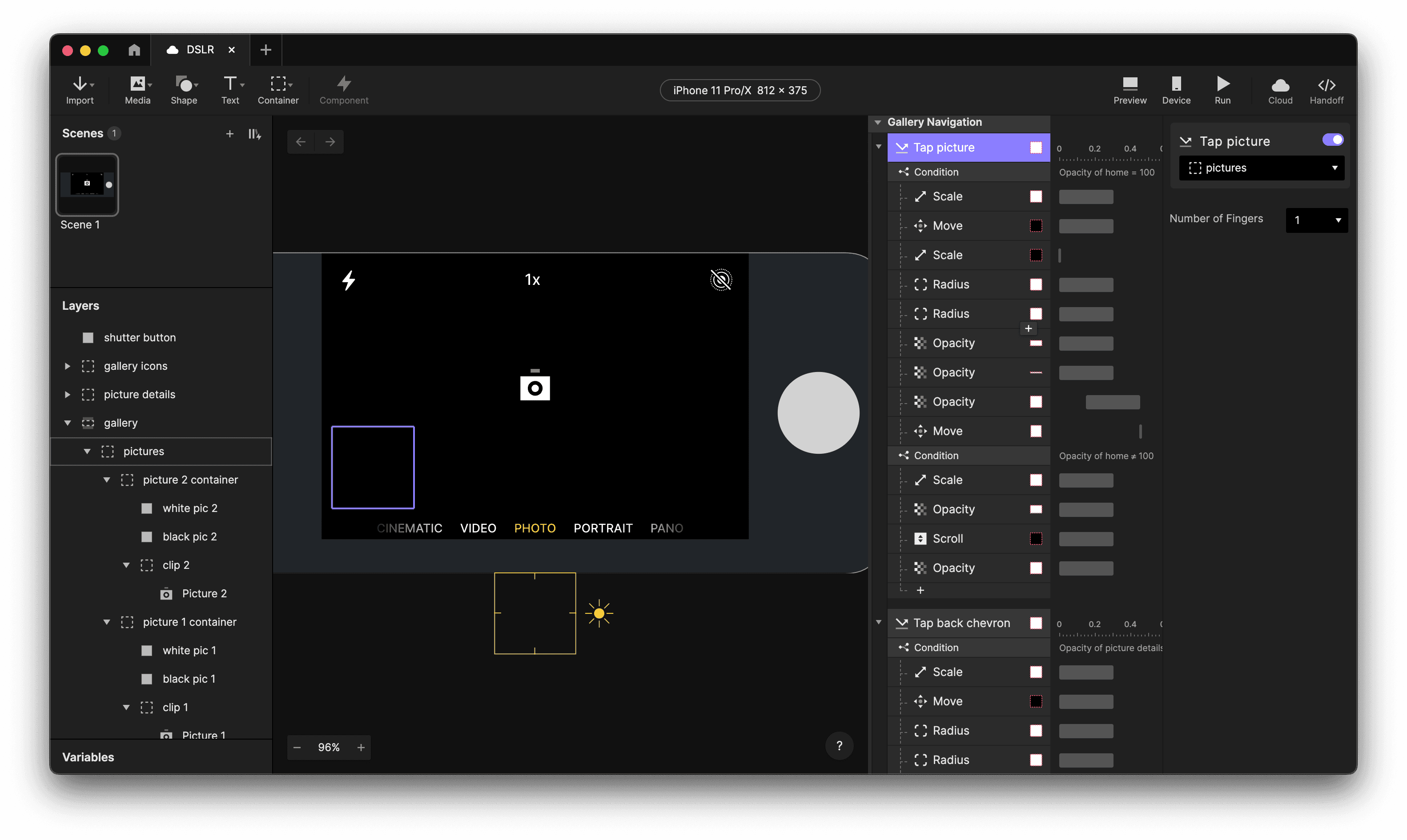
Navigating the gallery.

Picture gallery.
Picture Controls component
The Picture Controls component is the object that comes into view when a user selects the picture in the gallery.
Apply a Tap trigger on the
sharebutton to send “share” to the current scene and open the Airdrop Modal.Use a Tap trigger on the
heartbutton to toggle the icon between empty and filled
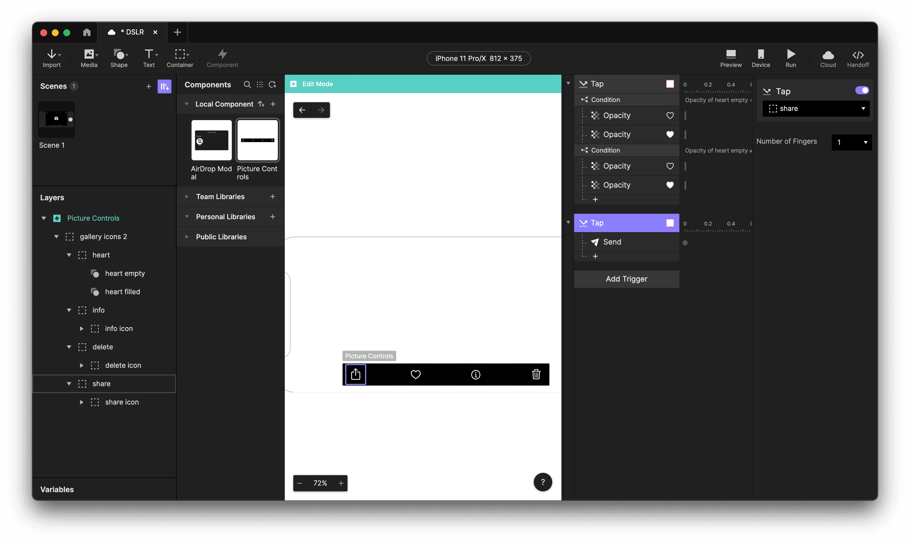
Picture controls.
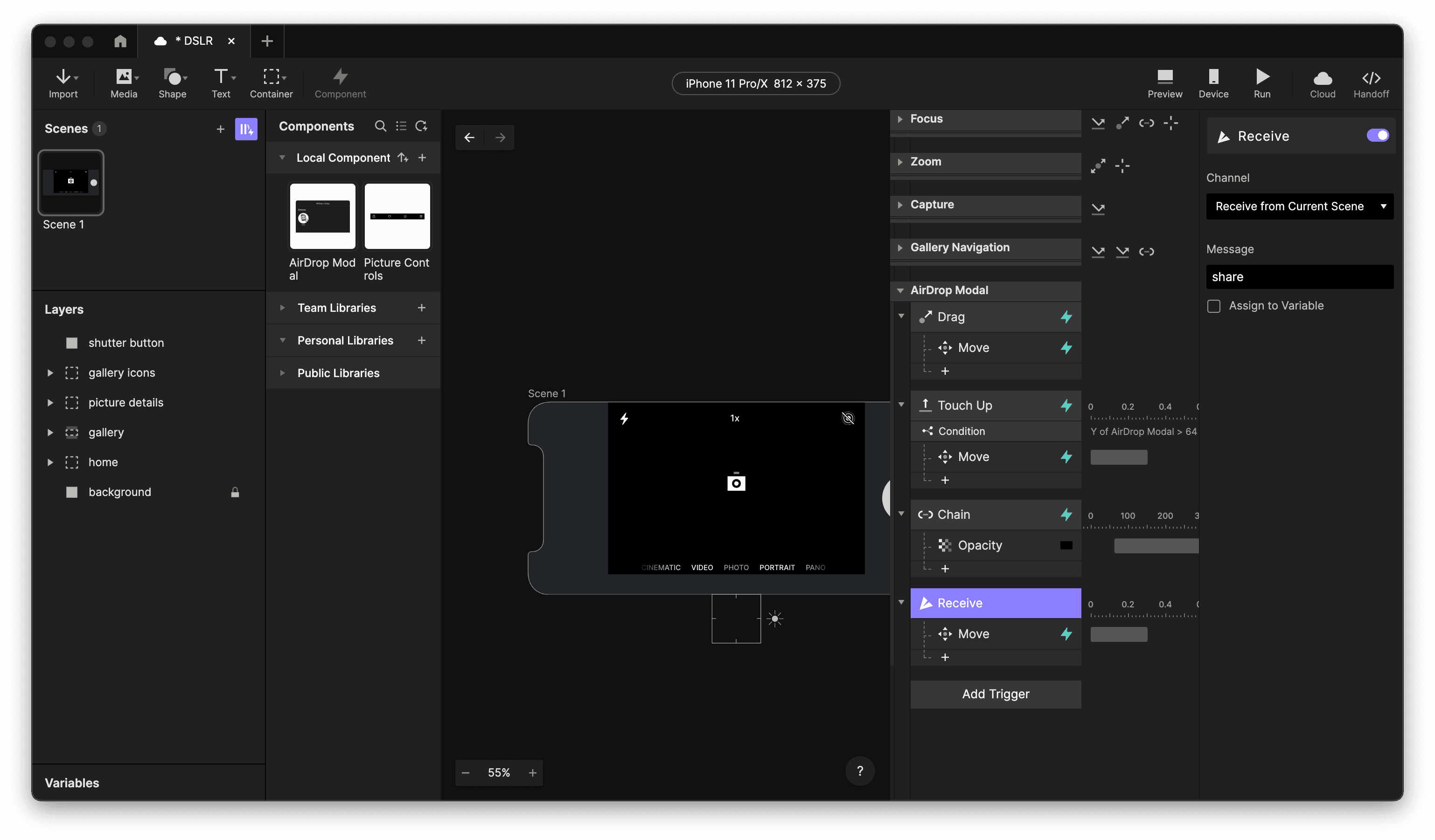
Airdrop Modal
The Airdrop Modal appears when the user taps the share icon in the picture controls.
Use a Receive trigger in the main scene to move the
Airdrop Modalcomponent up so it’s in the viewport.Apply a Drag trigger on the modal, to move it up and down
A Touch Up trigger will make it move down if it is not in the top position
Chain the Airdrop Modal’s Y position to the opacity of an underlay to create a darkened background if the modal is opened.
Airdrop modal.
Inside the Airdrop Modal component we handle the logic for the sharing animation.
Add a Tap trigger on the Memoji to start the sending animation by fading in and rotating the
loaderobject 360 degrees and changing theStatustext to “Sending”. After the rotation is done, we change the text to “Sent” and make it blue. We also fade out the loader object.Chain the rotation of the loader object to a left and right mask to create the circular progress bar effect.
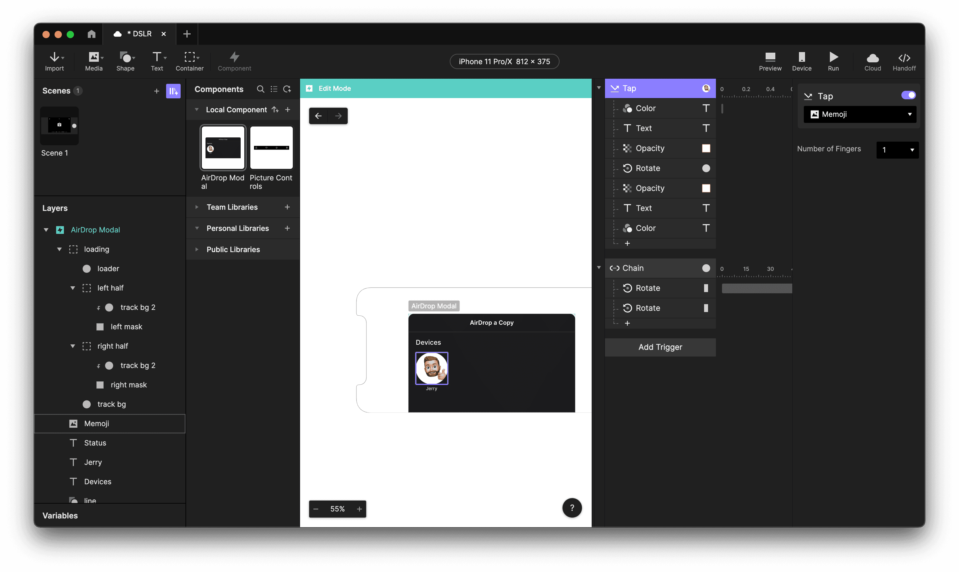
Sharing animation.

Airdrop a picture.
That’s it! 🥧
The overall structure of the Pie is pretty straightforward. Feel free to dig into the Pie file yourself and see how everything works exactly, or try making your own version!
Design incredible camera interfaces with ProtoPie
Infuse camera interface designs with a modern, dynamic feel. ProtoPie simplifies bringing your design ideas to life. Easily simulate interactions, test user experiences, and refine your creations. Start for free and explore your creative potential!


