A Guide to Creating Reusable Components in ProtoPie - Part 1
A Step-by-Step Tutorial by David Gilmore for Better Team Collaboration.

There have been discussions recently about team collaboration in ProtoPie and what kinds of best practices there might be. One of the strengths (and weaknesses) of ProtoPie, much like Figma, is that there are often multiple ways to achieve the same result. While this is beneficial for rapid development, it can pose challenges for team collaboration.
Developing component libraries is a crucial step in simplifying collaboration. Learning to build well-structured, reusable components is a key skill for effective teamwork. This tutorial will demonstrate some best practices for constructing reusable components within a ProtoPie library.
For this guide, I will be using components within a local pie. However, for team collaboration, these would ideally be built in a shared library. This allows updates to be shared among the team, ensuring consistency across all pies.
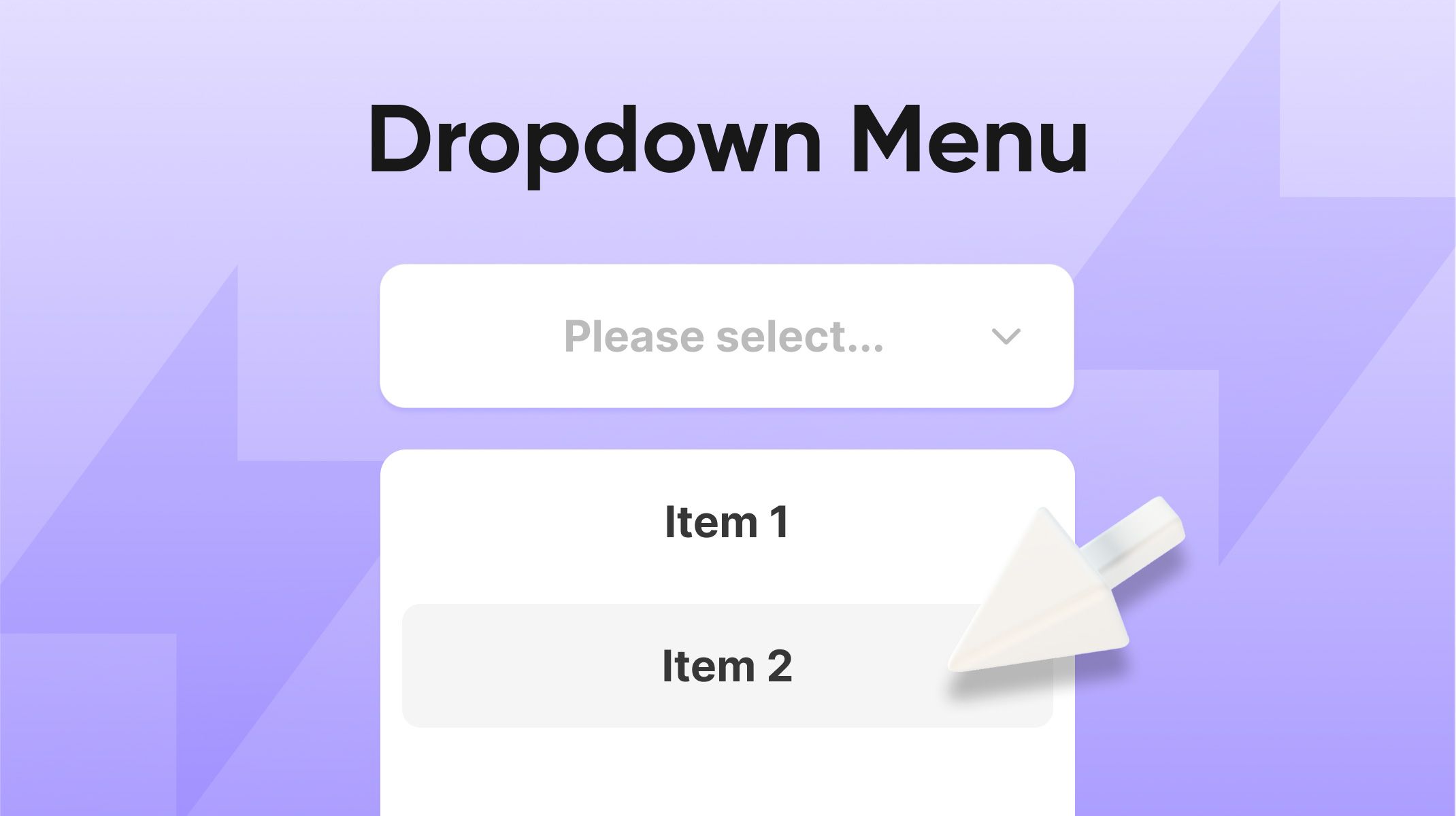
To keep things simple and make the core concepts clear, I'll use the humble radio button as our example. Imagine a game with an initial screen where the user must choose a player ('Player 1' or 'Player 2') or a difficulty level ('Easy' or 'Hard').
Download the starter pie here.
The starter Pie for this tutorial has this exact setup, but it's all hard-coded, with no attempt at reusability. If you examine the file, you’ll immediately see the potential for reusability, as the code for all four of the radio buttons is essentially the same.
To truly understand the value of components, try adding a third difficulty level ('Moderate') to the starter pie. You'll find that this requires numerous edits, and it's easy to miss a small change and break the prototype. Furthermore, as you add more buttons, the list of triggers and responses for the scene becomes increasingly congested, and that's just to make the radio buttons work, without even considering the interactions that react to their input.
Once you're convinced of the benefits, we can proceed with the following steps.
Step 1: Create the Component
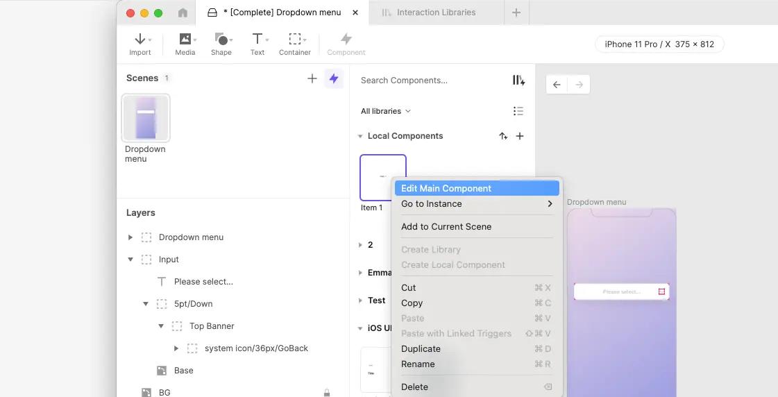
Select the container named “Name Buttons” and choose Create Component. Rename the component to “Radio Buttons” and begin editing it. Ensure the Container Layer is set to Auto Layout (Hug and Hug). Finally, change the name of the text variable “Name” to “Value”.

Step 2: Duplicate the Buttons
Select "Button 1," copy it, and use “Paste with Linked Triggers” five times. You should now have six radio buttons, with layers named from Button 1 to Button 6.

Step 3: Rename Your Layers
Go through all the layers within the component and edit the layer names to be accurate. For example, the "Label" field in "Button 4" should be renamed to "Label 4" instead of "Label 1."

Step 4: Update Triggers and Responses
Next, review the list of triggers and responses. Change the descriptions to accurately reflect what each one needs to do. It's much better to do this before editing the responses, as it makes it easier to review each action against its description.


Step 5: Edit Triggers and Responses
Now, edit the actual triggers and responses. The assignment of a label to the 'value' variable needs to be adjusted for reusability. Instead of "Player 1," use expressions like ‘Label 1’.text. With six buttons, you'll also need to ensure that five buttons are turned off when one is turned on. This means the response for setting the opacity of 'On 2' to 0 needs to be duplicated four times for the additional buttons.

Step 6: Preview the Component
Preview the component to ensure that the new buttons update the correct indicator.
Step 7: Send the Updated Value
We need a way to send the updated value back to the main scene. To do this, add a trigger for the 'value' variable and use it to send a new message (let's call it NEWVALUE) to the parent. Include the 'value' variable as a parameter in this message. After setting this up, you can return to the scene.

Step 8: Update the Scene
Back in the main scene, delete the old “Difficulty buttons” container.

Drag a new instance of the “Radio Buttons” component into the scene and name this layer “Difficulty buttons.”

The instance that is already there should be renamed to “Name Buttons.”

Step 9: Receive Messages from the Component
Add a Receive trigger to the scene to listen for the NEWVALUE message from the child component.

Assign its parameter to the appropriate variable.

Then, duplicate this trigger and configure it for the other child component and the other variable.

Step 10: Final Configuration
In the "Name buttons" instance, decide how many player options you want and hide the remaining radio buttons. Change the labels for the visible buttons as needed. Repeat this process for the "Difficulty buttons" set.

You should now have a functioning prototype with two sets of radio buttons. You can preview the pie and see the correct values being assigned to the 'Name' and 'Difficulty' variables. While the button labels are correct now, we will explore further customizations next time.
You can download the ending pie here!
Conclusion
If you compare our starting point with our final result, we now have a scene with very simple triggers and a robust component that can deliver any set of 2-6 radio buttons as needed. Adding a third set of buttons is now a straightforward task.
In the next tutorial, we will enhance this component further, adding the ability to display selected buttons differently and perhaps even incorporating different selection behaviors.
Video Tutorial
For an even more in-depth guide, see the full process in action in this video walkthrough by David Gilmore: ProtoPie Reusable Components Tutorial Part 1
.jpg?fm=webp)
.jpg?fm=webp)
.jpg?fm=webp)