The New ProtoPie Design System
Introducing the new ProtoPie Design System—a shared language and visual consistency throughout the ProtoPie ecosystem.


ProtoPie 6.0, released in October 2021, introduced some major changes that our users were delighted with. Beyond just productivity-boosting features, like the dashboard and tabs, we also implemented many visual changes which we believe has vastly improved how ProtoPie looks. These all stem from the new ProtoPie Design System, which was created to deliver a more robust brand and user experience. Let’s delve into the story behind these changes.
Time to face reality
The ProtoPie ecosystem consists of several products: ProtoPie Studio for the actual prototyping, ProtoPie Player for trying out prototypes on smart devices, and ProtoPie Cloud for collaboration and sharing. Users go back and forth between these products all the time when working on their prototyping projects.

However, each of these products used to live their own lives. They had their own visual elements (such as icons and colors) and their own UX. As a result, we were providing an inconsistent experience across the ecosystem. For example, the website and ProtoPie Player would use coral as a primary color, whereas ProtoPie Studio and ProtoPie Cloud used different shades of indigo. This mismatch led to a confusing experience for our users. In order to solve this, we had to face reality and create a single design system for the entire ProtoPie ecosystem.
The ultimate priority: design principles
We brought together all of ProtoPie’s brand and product designers to consider two questions:
- What core design values does ProtoPie want to promote?
- What kind of design principles should ProtoPie itself adhere to?
To decide on the appropriate next steps, we realized that we needed to first create an environment where designers with different opinions could come together and find common ground.

We began by compiling all relevant keywords that came to mind. We then explored the kind of brand that we wanted ProtoPie to be—and the value that we wanted to provide to our users.

This process helped us narrow down to the three keywords shown above. In the end, we found that the common values that each keyword shared were you (the user) and your ideas (the user's ideas). As ProtoPie is a productivity tool, the most important thing for us is creating products that make users' ideas shine, increase their productivity, and make users happier.
Design foundations

We began the process by going through the atomic design methodology. This methodology states that you should start the design process by focusing on the smallest element possible, before expanding by trying different combinations of elements together. We therefore started by defining the smallest design elements that would serve as the foundation of our overall design efforts.
We tried to blend our product principles—directly and indirectly—into each of our elements. Below, we’ll delve into more details about the thought process behind our decisions. Let’s take a look at 4 of the elements that make up the ProtoPie Design System: colors, iconography, typography, and layout.
Colors
Our first step was to integrate two colors, coral and indigo, into one primary color. This might sound simple—but it was surprisingly complex.
If we chose to also use coral, our initial brand color, on our product, our brand would stand out more. However, coral is typically associated with warnings or even danger. Therefore, using coral as a primary color could backfire from a UI perspective.

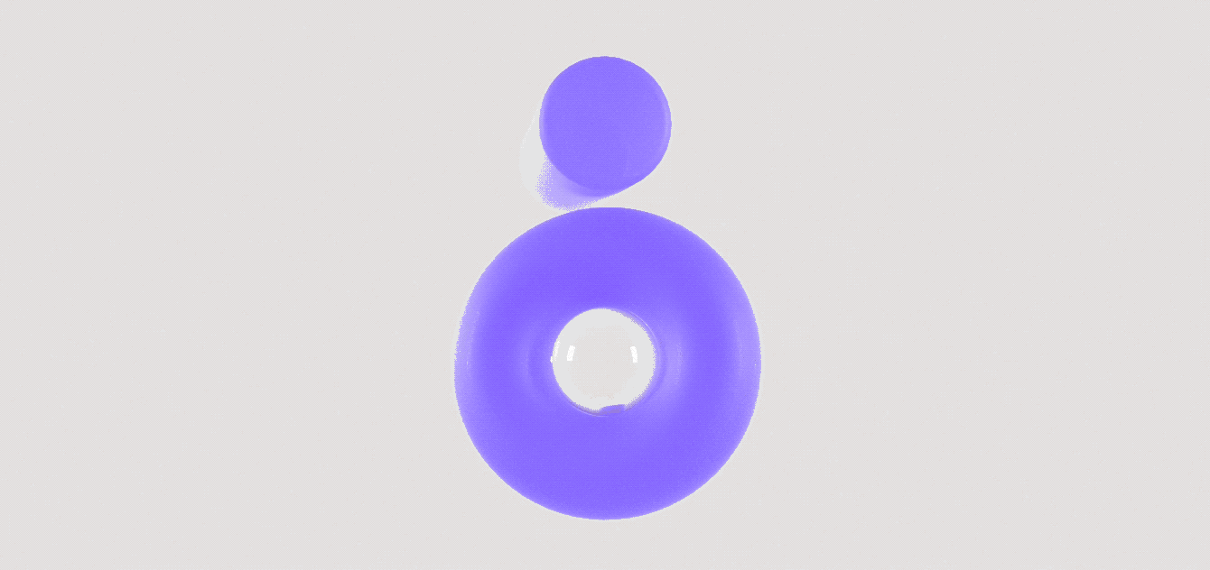
We decided to use purple as our new primary color. It’s fairly similar to our current brand color and is perceived as being fairly neutral. We also changed our product color from blue-gray to neutral gray, reflecting our goal to make our users’ ideas shine without being distracting.
With this in mind, we also introduced two new themes: light and dark. Users can pick and choose which theme to use depending on the type of work environment they want to create, or what they feel most comfortable using.

We tried to maximize each theme’s readability by setting the same color in subtly different shades as a pair. For example, you might notice that the purple is slightly darker and more saturated in the dark theme compared to the light theme.

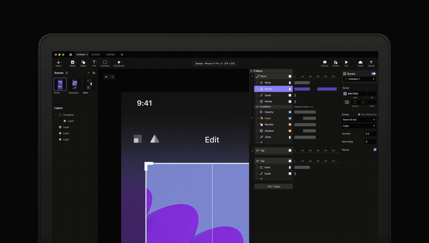
Digital environments have bidirectional interactions between a product and its users, so it helps to clear visualize how state changes appear. While the rules for state changes across ProtoPie’s products used to be inconsistent, we made sure to standardize and integrate them in this update.
Iconography

We established new iconography to accompany our logo typeface. As you can see, this iconography is bold and geometric while also unifying the various different styles from our products. We paid close attention to creating a universal shape that can be intuitively understood by our diverse group of users working across various product domains, beyond simply mobile app design, (e.g., automotive and wearables.)

We created each icon with a clear silhouette so that they would be clearly distinguishable regardless of their size. The ProtoPie icons often need to convey complex metaphors. To intuitively communicate their meaning, we used a two-tone style that differentiates primary and supporting parts using different tones.
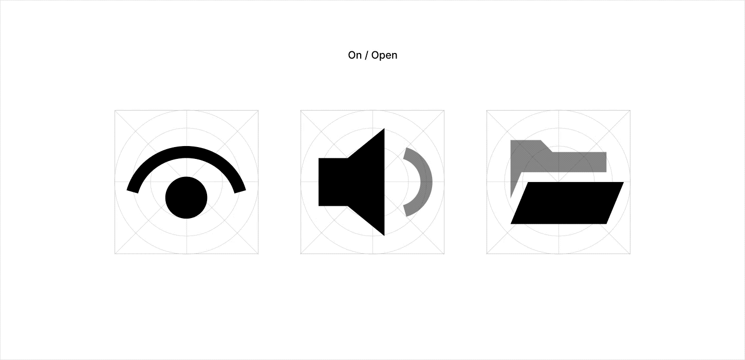
We consolidated icons that had different shapes but the same meaning into one. Then, we created icon shape variations to indicate different states—and to intuitively convey what each state means.
Typography

Gilroy, ProtoPie’s brand typeface, is a beautiful and high-quality font that fits our brand identity. However, it has strongand decorative characteristics. We therefore wanted to find another supporting font that would not draw unnecessary attention—but would instead help make our users’ prototypes stand out more.

Hence, we adopted Inter as our secondary typeface. Created by Rasmus Andersson, it’s a highly readable, more standard typeface that’s carefully crafted for computer screens. We applied Inter to the entire ecosystem except for the title area, where we still wanted to prominently display our brand identity. In summary, we use a total of three fonts throughout ProtoPie. These are all based on our design system guidelines, including the one for code snippets.

Furthermore, to ensure a certain level of readability, we enforce restrictions for the maximum and minimum size of fonts used throughout.
Layout

In terms of the layout, we came up with a series of guidelines to ensure an immersive user experience. We considered the number of items in a row and the ideal size of each item to maximize user engagement.

We also established breakpoints that all products could share so that it feels like a single, continuous experience across the ProtoPie ecosystem. We applied the same responsive design to our website, to ProtoPie Cloud, and to ProtoPie Studio.
Finding consensus

We made sure to continuously explain these guidelines and changes to all the teams involved in updating our design system, from designers to engineers. Whenever they had questions or queries, we took the time necessary to explain our thinking—and to communicate how these changes would have a positive impact on our users.
These guidelines—from the basics of our elements and the rationale behind each style, all the way to steps to further expand the design system—serve to form a consensus between our teams and solidify the design principles that we had previously established.
What’s next?
The introduction of ProtoPie 6.0 has provided our users with a better, more consistent, and more recognizable experience across the entire ProtoPie ecosystem. We strive to ensure that the design values that we want to convey in our products resonate with ProtoPie users.
But establishing consistency across the ecosystem is just the beginning. Establishing the ProtoPie Design System eliminates unnecessary decisions and allows us to focus on more important matters with a higher level of agility. In other words, these changes have given us the momentum to fuel further improvements going forward. Stay tuned for more features and improvements that will make ProtoPie an even more effective, and enjoyable, prototyping tool for your team.

.jpg?fm=webp)
