Designing for Gestural Interactions
Our design icons, how we designed for finger gesture interactions.

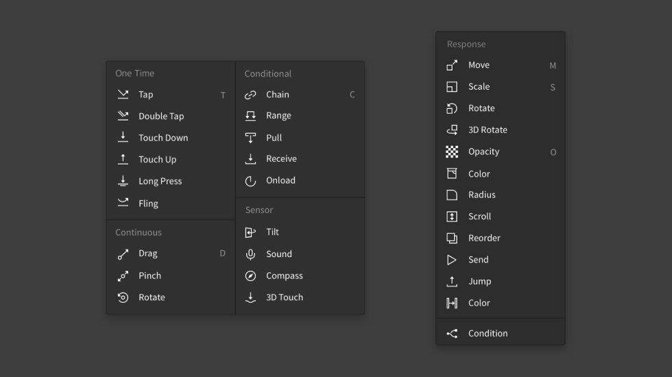
ProtoPie is a WYSIWYG tool that uses a GUI through which a user can easily and visually access all aspects. Subsequently, coming up with the right icons was no easy feat.

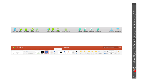
You can see from the above image the icons for the Trigger and the Response Piece. Today, I’d like to talk about the process we took in creating the gesture icon set. It is not easy to express a gesture in 2D, and we always desire for even better icons, so this is an opportunity for our Pie lovers to provide us with your much-valued feedback.
Why do we need gesture icons?

Simply writing out the names of the Triggers and Responses is not enough to clearly convey what’s happening, thereby necessitating icons. Furthermore, since it’s possible to change the names of each Piece, there was a need to show the original properties of a Piece. Furthermore, an icon set seemed like a good idea for conveying the concept of ProtoPie, the concept of creating Interactions with sets of Triggers and Responses.
Understanding the limitations
Most gesture icons use a finger metaphor, and such icons are very easy to understand. However, with ProtoPie, there are space limitations, and we plan to add more Triggers and Responses. Hence, we need to stay consistent and express gestures in a more minimalist manner. Besides that, here are a few other limitations.
Some constraints that we need to keep in mind when creating Interaction icons.
- Icons must be 14px by 14px or smaller.
- Similar gestures can be visually grouped, while different gestures must be clearly differentiated.
- One icon cannot have three or more metaphors.
- The icons must be in a single color.
Classifying gestures
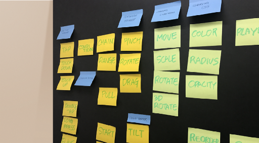
Before creating icons, we decided to classify the Triggers and Responses based on their properties and arrange them based on certain rules. Our reasoning was that if the Triggers and Responses are arranged in a uniform manner in the list menu, users will be able to easily understand Triggers based on context, not to mention find their desired Triggers and Responses quicker, and more efficiently create Interactions.
In other words, while common Interactions like Tap or Move may pose few problems, it may not be enough to give text-only labels to new types of Interactions that ProtoPie has introduced, such as Chain or Range, or Interactions that may be known under different names elsewhere, such as Fling (known as Flick).
Based on this reasoning, we created four categories of Triggers.
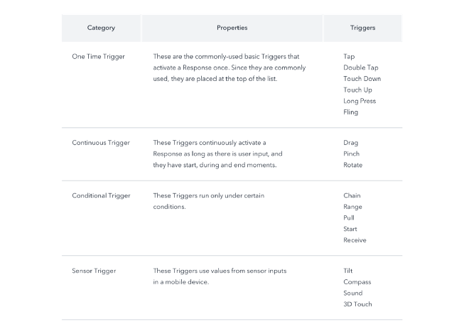
The look and feel of the icons needed to be the same as those of icons seen in different areas of ProtoPie. ProtoPie prioritized on the clarity and readability of icons over icon aesthetics, as the software is one that provides productivity, not service. The size limitations for the icons helped naturally determine the eventual looks of icons. Instead of going for rounded corners, which may give a cute look to icons, we opted for angled corners. We used narrow lines so that the icons don’t look stifled with limited sizes.
Now, let’s cover the features of each Trigger icon. Visually.
Showing the properties in the icons
One-time Trigger and Continuous Trigger
One-time Triggers and Continuous Triggers run upon screen input. Therefore, we could use a common touch action metaphor. We went with an arrow to substitute for the finger, and one advantage is that we could use the arrow to show directions and a sense of motion. The screen’s representation was minimized as much as possible, and the icon reflects what a person would see when he or she is facing someone who is touching a screen with a finger.


A Double Tap is a Trigger that is made up of two consecutive Taps, so the Double Tap icon features similarities with the Tap Trigger icon. It’s also designed to give an idea of the Trigger’s function.

The Touch Down, Long Press and 3D Touch Triggers differentiate from one another based on pressure or time. Hence, showing a difference of the screen metaphor can differentiate among the different Triggers. Subsequently, even though the 3D Touch Trigger is a Sensor Trigger, its icon is designed to look similar to the icons of other One-time Triggers.

Fling Triggers can run only if a swipe is done at a certain speed or distance. A curved arrow helps represent this prerequisite.

Unlike One-time Triggers, Continuous Triggers start when the screen is touched, and have a process that continuously runs until there is no more physical contact. Hence, the icons use a trail metaphor that shows how a finger could leave a trail on the screen. Unlike the One-time Triggers, the icons for Continuous Triggers represent what a person would see if the person were to look at the action from the top.

Conditional Trigger

Conditional Triggers activate secondary responses based on changes in the properties. Subsequently, instead of input action, the icons must show the properties of each Trigger.
Chain Triggers always activate secondary responses based on a change in properties. We realized that we were using the term “Mapping” in the process of defining a Chain Trigger. We naturally used a chain metaphor to show how two properties are connected to each other.
Range Triggers can be set up so that they can react based on changes in properties, just like Chain Triggers, but one difference between Range and Chain Triggers is that Range Triggers activate Responses when they enter a predefined range of values. We opted for perpendicular lines in the icon to indicate placement settings in the Property panel. Hence, we used a perpendicular line metaphor for the Trigger icon.
Sensor Trigger

The icons for Sensor Triggers depict which sensors in a mobile device are used. ProtoPie currently supports 4 types of sensors.
The Tilt Trigger detects how much a device has tilted on the X or Y-axis. Tilting has been a particularly difficult gesture to express, and a search on Google shows icons depicting a mobile device being rotated along the Z-axis, which can be very deceptive and give the impression that Z-axis rotation is being implied. Therefore, it is correct to portray a device to show a perspective.
The Compass Trigger uses the mobile device’s compass sensor to determine the angle of the device in relation to the absolute north, hence the compass icon.
The Sound Trigger measures the loudness of sound around the device, hence the microphone metaphor.
Response
When it came to designing Response icons, we deemed it important to highlight the features of each Response instead of adhering to a set rule. Most Responses have metaphors commonly seen in drawing tools, so we made sure to maintain universality.
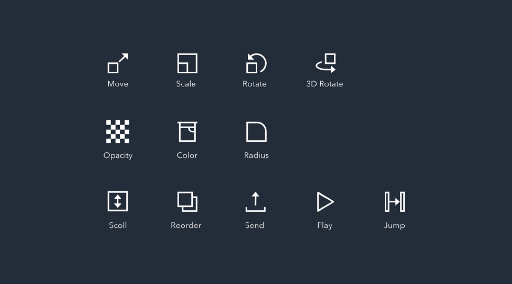
There is a set standard for listing the Responses. The Responses are arranged with frequency of use in mind, placing Move, Scale, Rotate and 3D Rotate at the top since they all allow for the changing of coordinates for layers. After that, there are the Opacity, Color and Radius Responses which modify the visual characteristics of a layer.
Complete icon set
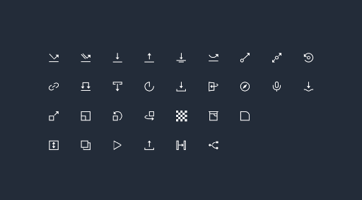
With suitable metaphors and a common design language, icons can polish a product. Icons do not take up a significant amount of space on the screen, but they can significantly influence productivity and usage. That is why we always inspect and refine the icons used in ProtoPie.
These completed icons are currently used in other contexts besides ProtoPie Studio for other uses. The icon set was used to create a pattern that was printed on invitations to the ProtoPie launching event. Furthermore, these icons appear in the tutorial to help users understand concepts.
We are sharing the SVG files and icon fonts in the hopes of helping other designers who are interested in expressing gesture interaction.
