Components
Components allow you to save sets of layers and interactions, making them reusable throughout your entire prototype. Select the layers and interactions you want to reuse, convert them into a component, and create instances across your scenes.
Here's why components are a game-changer:
Eliminate Repetitive Work: Say goodbye to recreating the same elements and interactions repeatedly. Components let you create once and reuse anywhere, saving you valuable time and effort.
Enhance Readability: With Components, your scenes become cleaner and easier to understand. Instead of cluttering your prototype with redundant elements, you can use instances of components for a more organized and efficient design.
Accelerate Workflow: By reusing components, you can rapidly build and iterate on your prototype. Make changes to the original component, and all instances automatically update, ensuring consistency across your entire design.
Using Components
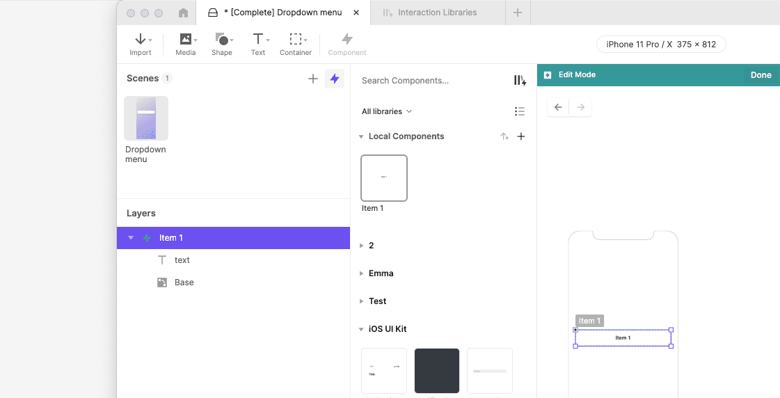
Creating Components in a Scene
Transforming layers into components is a breeze with ProtoPie. Follow these simple steps:
Select the layer(s): Choose the layer or multiple layers you want to turn into a component.
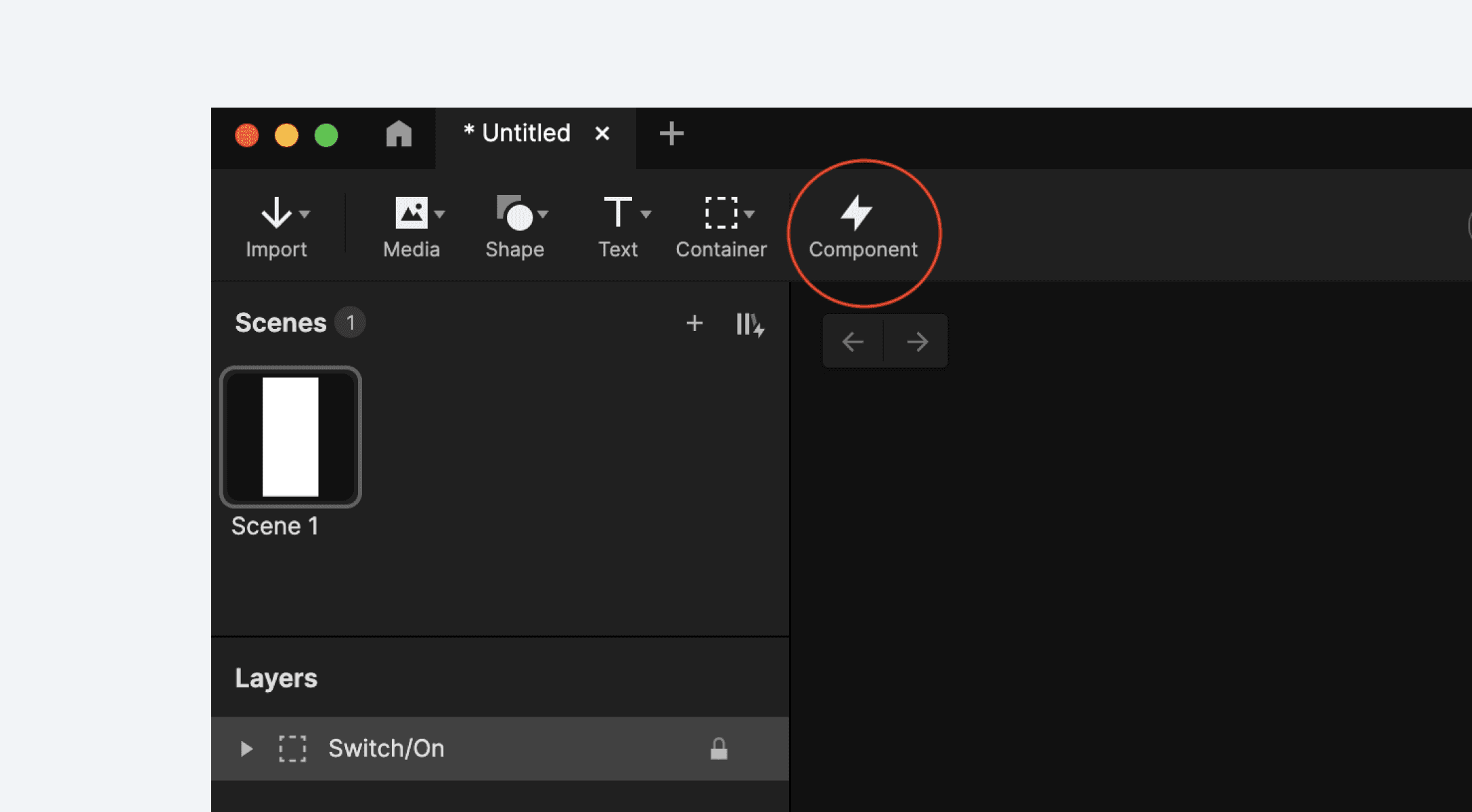
Click the "Component" icon: Look for the component icon in the toolbar and click it. Alternatively, you can right-click on the selected layer(s) and choose Convert to Component from the context menu.
Voila! Your component is ready: ProtoPie automatically creates a component with the selected layer(s) and their corresponding interactions. The original layers are replaced by an instance of the component.
Creating Components Directly
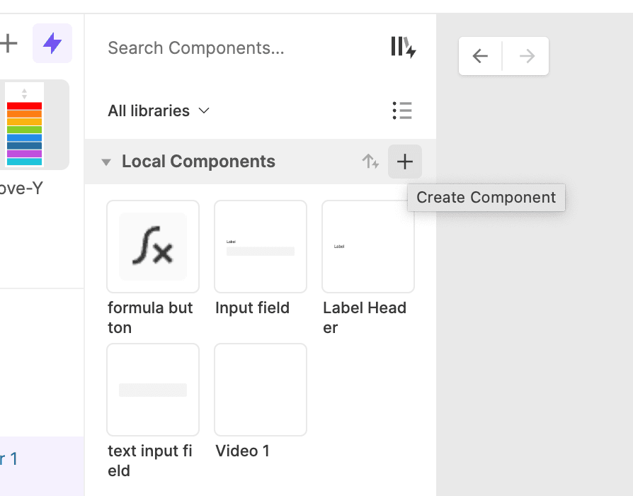
Components can also be created from scratch. Open the component panel on the left side and click the plus icon. This creates an empty component that you can start customizing.
Adding Component Instances
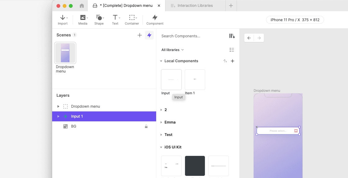
You can create an instance of a component by dragging a component from the Component panel to the canvas of the active scene.
Editing Components
Editing the Main Component
To edit a main component, you must open the component editing mode. To activate this mode, click on a component from the Component panel, or right-click on an instance of the component and select "Edit Main Component" from the context menu.
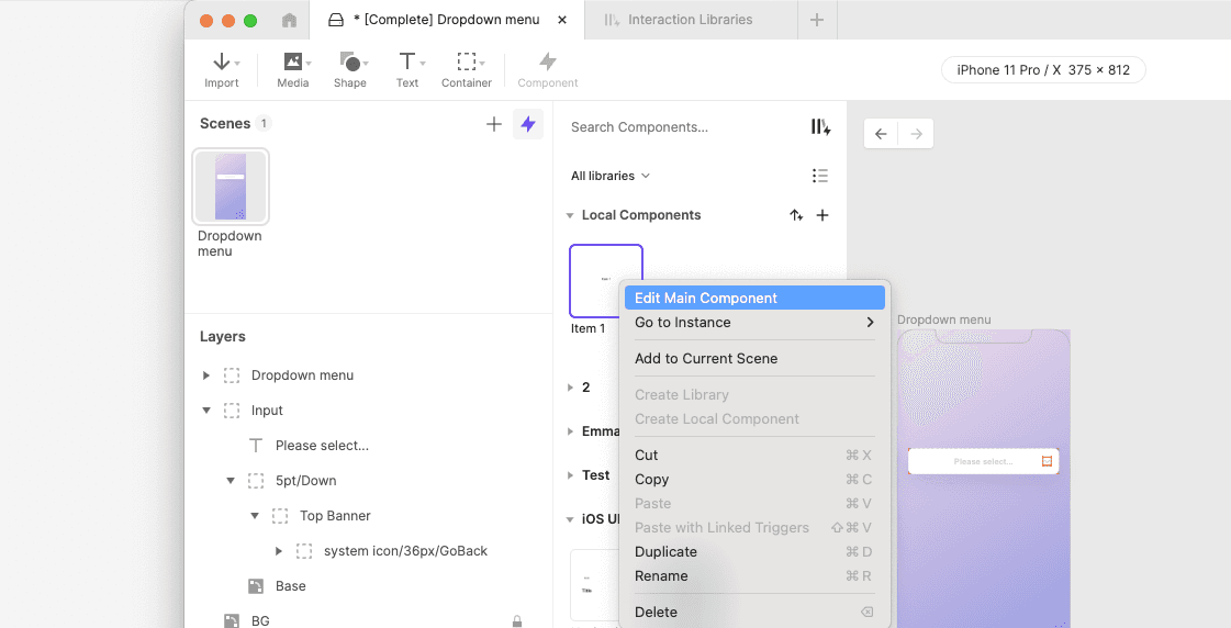
Editing a main component is similar to editing a scene. You can create, modify, and delete the component's layers, variables, triggers, and responses. The changes you would make are applied to all instances of the component.
Once you have finished editing the component, you can return to the scene by clicking on the "Done" button or by clicking on the left arrow button (←) located in the top left corner of the screen. Alternatively, you can navigate to any scene by clicking on a scene in the panel.
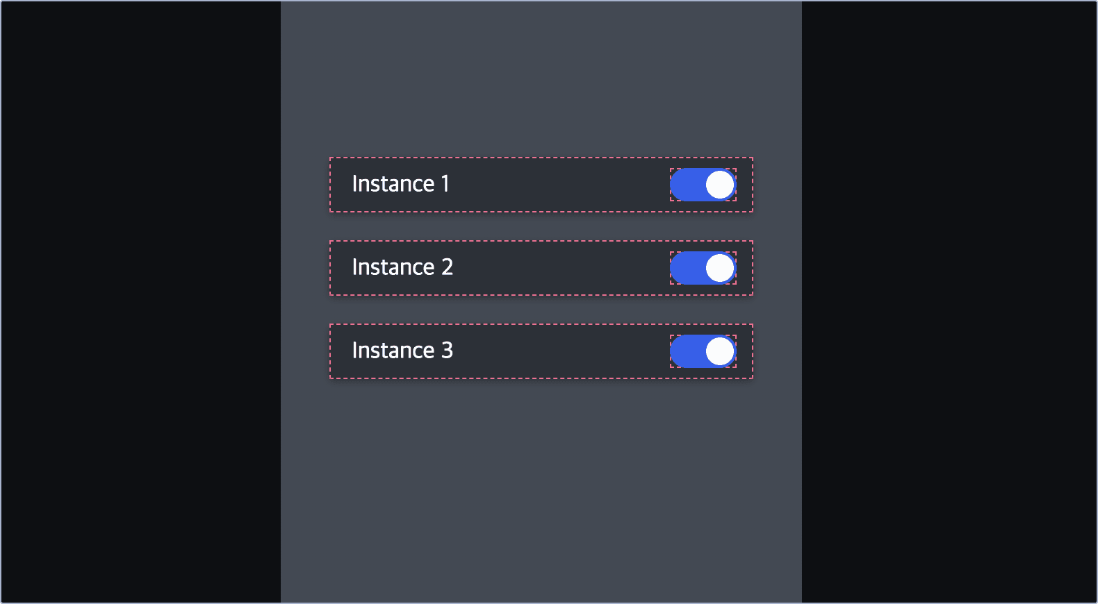
Editing an Instance
In ProtoPie, modifying the sublayer properties of a component instance is a breeze. Here's how it works:
Override with ease: When you change a property of a sublayer within a component instance, you're simply overriding that specific property. These overrides are unique to the instance and don't affect the main component. This allows you to customize each instance independently, giving you flexibility while maintaining the core component structure.
Keep changes intact: Even if you modify the main component, the overridden properties in the instance will remain unchanged. This means you can freely experiment and iterate without worrying about losing your customizations.
Reset with a click: Need to go back to the original settings? No problem! Right-click on the instance and select "Reset Overrides" from the context menu. All overrides will be cleared, and the instance will revert to its original state, mirroring the main component once again.
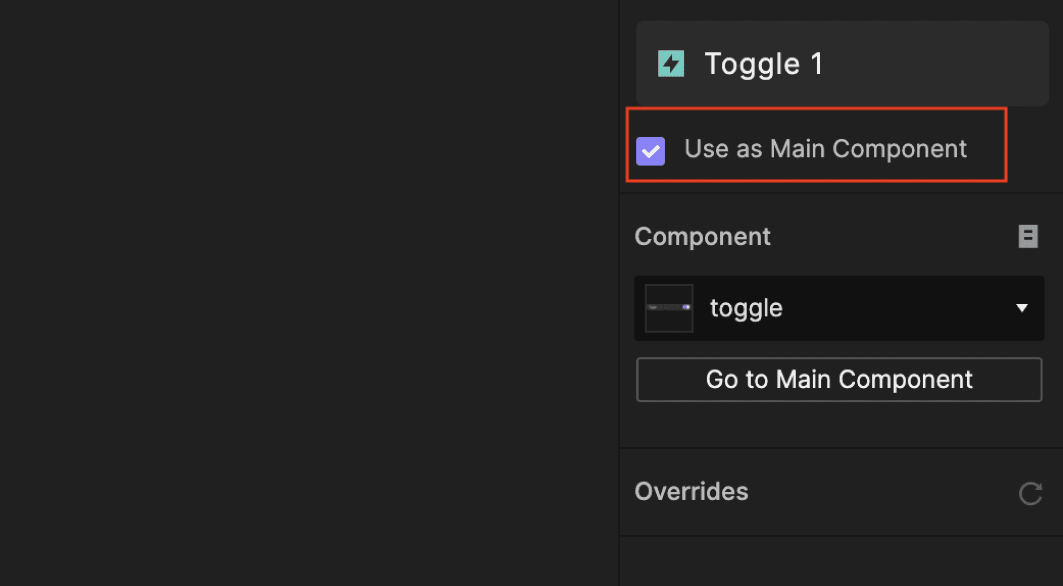
Use as Main Component
You can link an instance of a component with its main component. This allows you to edit the main component by editing the instance without being in the component editing mode.
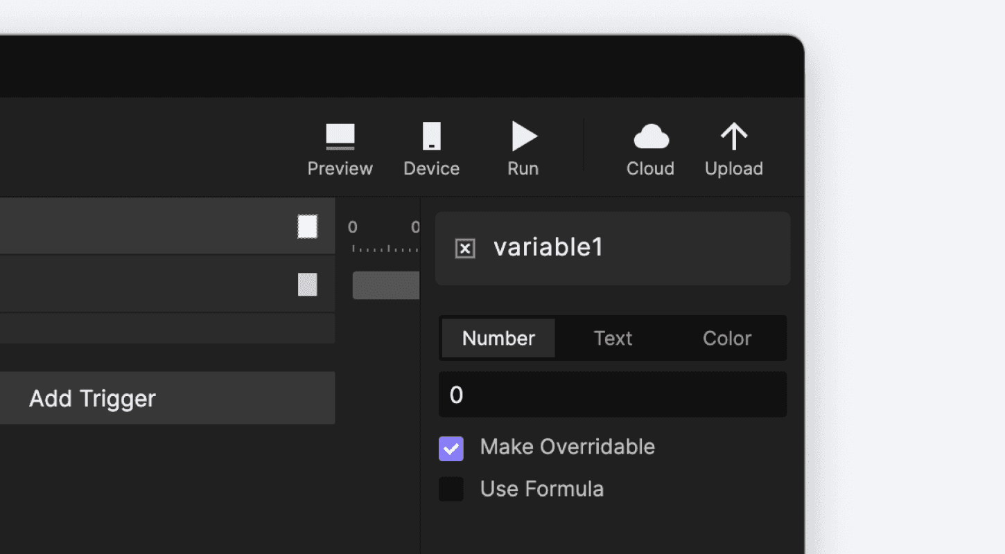
Variable Overrides
It's possible to override the initial values of variables. You can do so by enabling the "Make Overridable" option in the variable in the main component. After enabling, you can modify the variable value in the property panel of the component instance.
Detach Component Instance
Detaching breaks the connection with the component and turns the instance into a container. You can do this either from the property panel or the context menu. Ensure that you have enabled the feature in Labs before use.
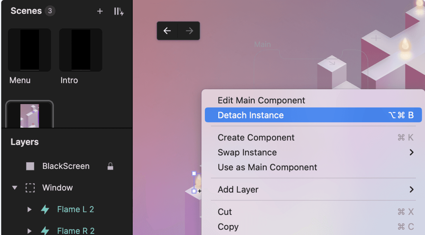
Detach component from the context menu
Right-click on the instance
Click on Detach Instance
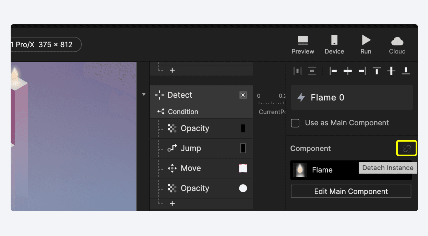
Detach component instance from the property panel
Select a component instance
Click on the Detach Instance icon in the property panel
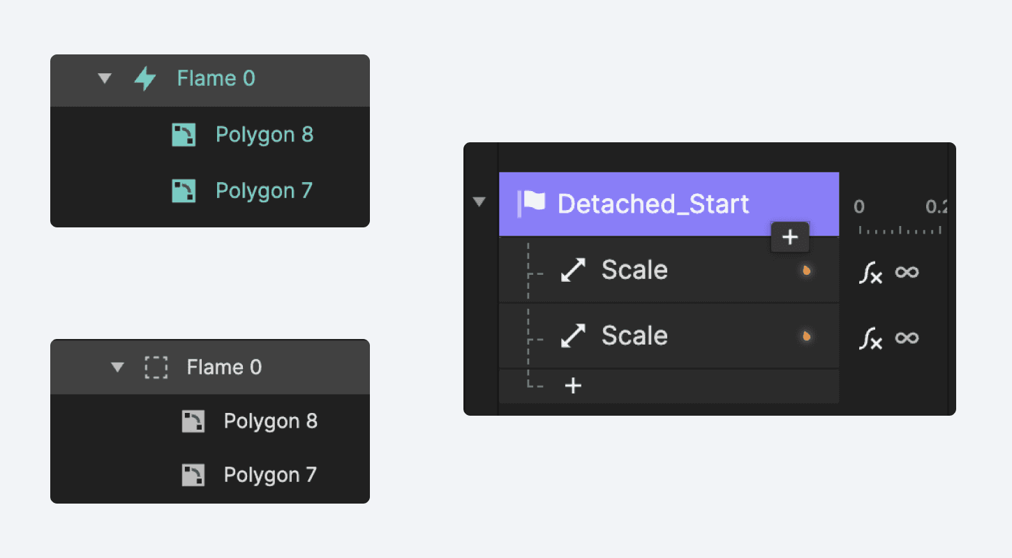
Once the instance has been detached, the Detached_ prefix will be automatically added to the detached interaction’s name. Easily identify whether an interaction stems from a detached instance or not.
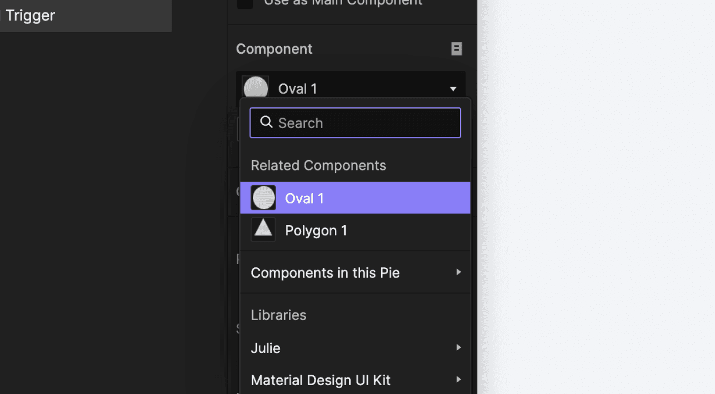
Swap Component Instances
In the right-side property panel, you can effortlessly swap any component instance with another in just a few clicks.
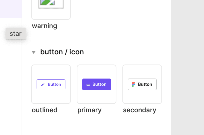
Grouping Components
Groups can be created or separated using the slash "/" in the component name. For example, if the name of the first component is "Button / Primary / Normal" and the name of the second component is "Button / Secondary / Normal", they would be grouped as shown below.
Are you ready to take your prototyping skills to the next level?
Join the Digital Dashboard Masterclass and gain expertise in organizing assets, creating reusable components, and implementing smart logic.
If you want to learn how to reduce work duplication, build efficiently, and scale interactions effortlessly, join the newest Mobile Game prototyping masterclass.
With this advanced knowledge, you can focus on the more critical tasks and take your projects to the next level, ultimately leading to a polished and robust final product.
Don't miss this opportunity to improve your skills and become an expert in prototyping!